

Effective healthcare web design shares health-related information, like available services, and doubles up as a communication channel. It creates a space where medical professionals can showcase both their specialized knowledge and service delivery strengths, but remain accessible and reachable.
Strong healthcare websites are built not only to look professional and share vital facts, but also to create trust, improve usability, and help patients take the appropriate next step. The following healthcare website examples show that it’s very much possible to create a website that makes proper healthcare feel within reach.
What Good Healthcare Website Design and Medical Web Design Actually Require
Healthcare web design services serve one fundamental purpose: making it easier for people to trust, understand, and act. The following web design practices will help ensure that the design never becomes an obstacle between a patient and the care they need.
Trust, Credibility, and Reassurance
A worldwide report from 2026 reveals that the level of trust in the healthcare industry is on the decline and has dropped from 73% to 71%. While trust is important in other industries too, healthcare websites are dealing with sensitive patient data. If your credit card details get leaked, you can always request a new one. However, once sensitive details about your personal health are out in the open, you can’t exactly request a clean bill of health. As such, it’s crucial that healthcare websites immediately communicate professionalism, legitimacy, and reliability.
To do this, you can include trust signals like:
- The healthcare provider’s details and credentials
- Consistent healthcare branding
- Reviews
- Testimonials
- Clear contact information
- Security protocols
Pages should be easy to find and quick to load, irrespective of if the patient is using a smart phone, tablet, laptop, or big-screen desktop. Then, each page should have a strong information hierarchy using a clear heading structure and logical flow.
Features like a search bar, online booking system, and patient portal can also create a clear patient navigation and encourage patient interaction. Take a patient portal, for instance. Not only does it improve the site’s accessibility, but also make key information like personal health records easily accessible.
Then, when you allow patients to update their appointments here, you can avoid missed appointments. In fact, one study found that patients with an active patient portal were 21.5% less likely not to show up than those without one.
Clear Actions and Conversion Paths
A patient landing on a healthcare website usually has one of the following needs:
- To book an appointment
- To cancel or reschedule an existing appointment
- To call the right department
- To find a specific doctor or specialist
- To download or submit a form
- To get directions or parking information
- To understand what to do before a procedure
Good design will ensure that these paths are front and center so that they can be completed fast. Then, when a form fails, a search returns no results, or a booking isn’t confirmed, there should be clear explanations as to what’s the next step.
Healthcare Website Design Examples: What Works in Medical Web Design
Example 1: A Homepage That Builds Immediate Trust
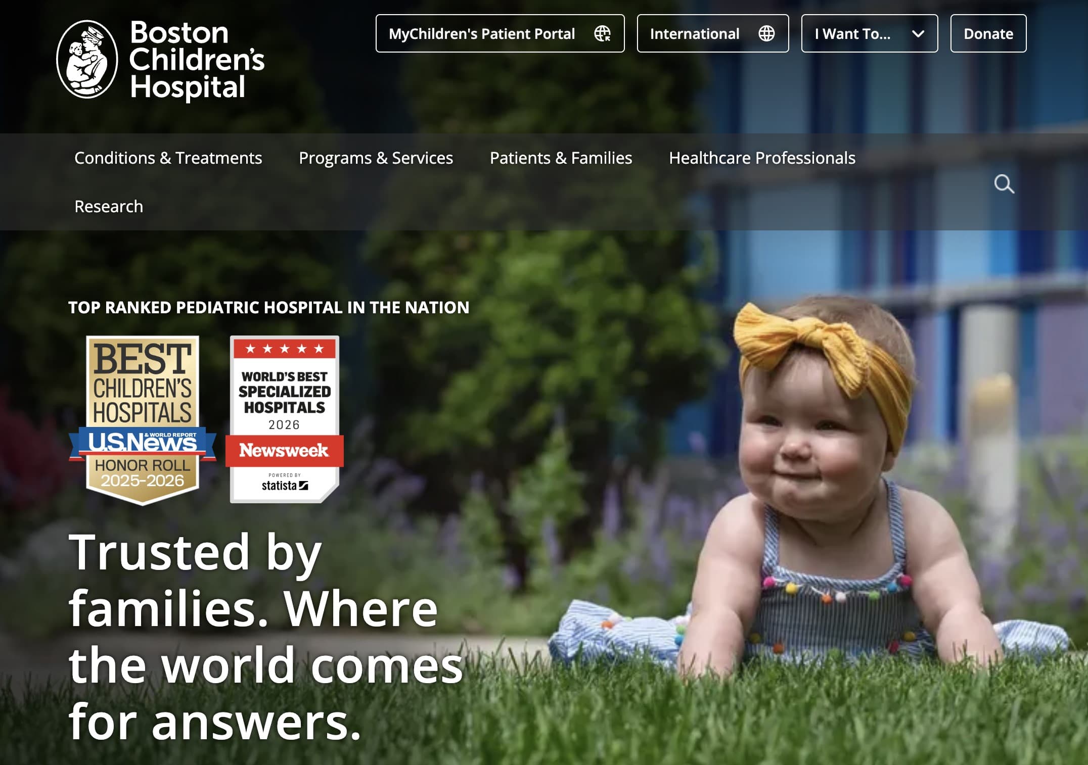
The homepage of the Boston Children’s Hospital is a strong example of trust-focused healthcare design. Ranking credentials from reliable sources like U.S. News & World Report and Newsweek are surfaced immediately (along with a link to its Awards and Accolades page directly on its homepage). This makes phrases like “top-ranked pediatric hospital”, “3,000 award-winning researchers and staff”, and “trusted worldwide” earned.
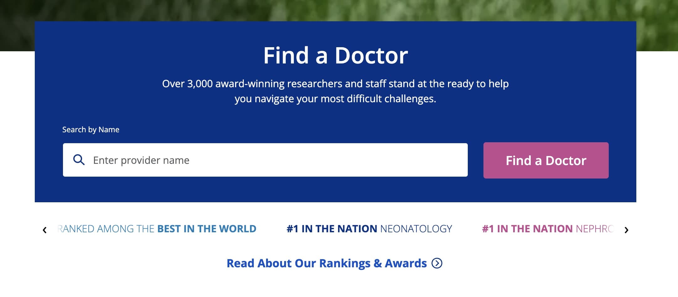
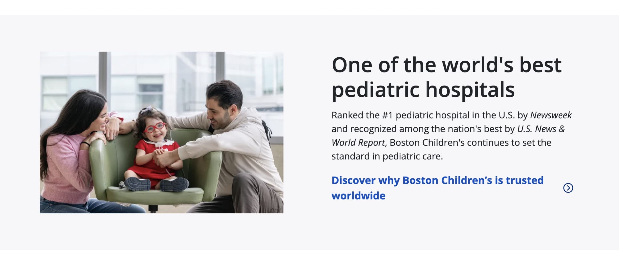
That said, it’s more than merely incorporating trust signals like these. It uses a restrained color palette (blue, white and pink) and generous white space that create a calm visual language. The fact that the photos avoid clinical settings, but rather feature children who are active and smiling add warmth over sterility. This way, the homepage creates the first impression of a safe, warm professional environment that avoids overwhelming parents, suggesting that in-person visits will be similar.
Example 2: A Website with a Clear Appointment Journey
From the hero image, Cambridge Private Doctors give patients three clear paths to book an appointment. They can either book a specific service or GP, or alternatively, schedule a quick appointment by selecting the type of appointment conveniently from a drop-down menu.
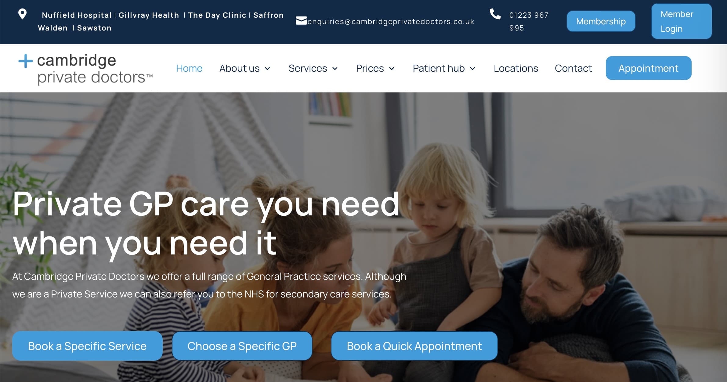
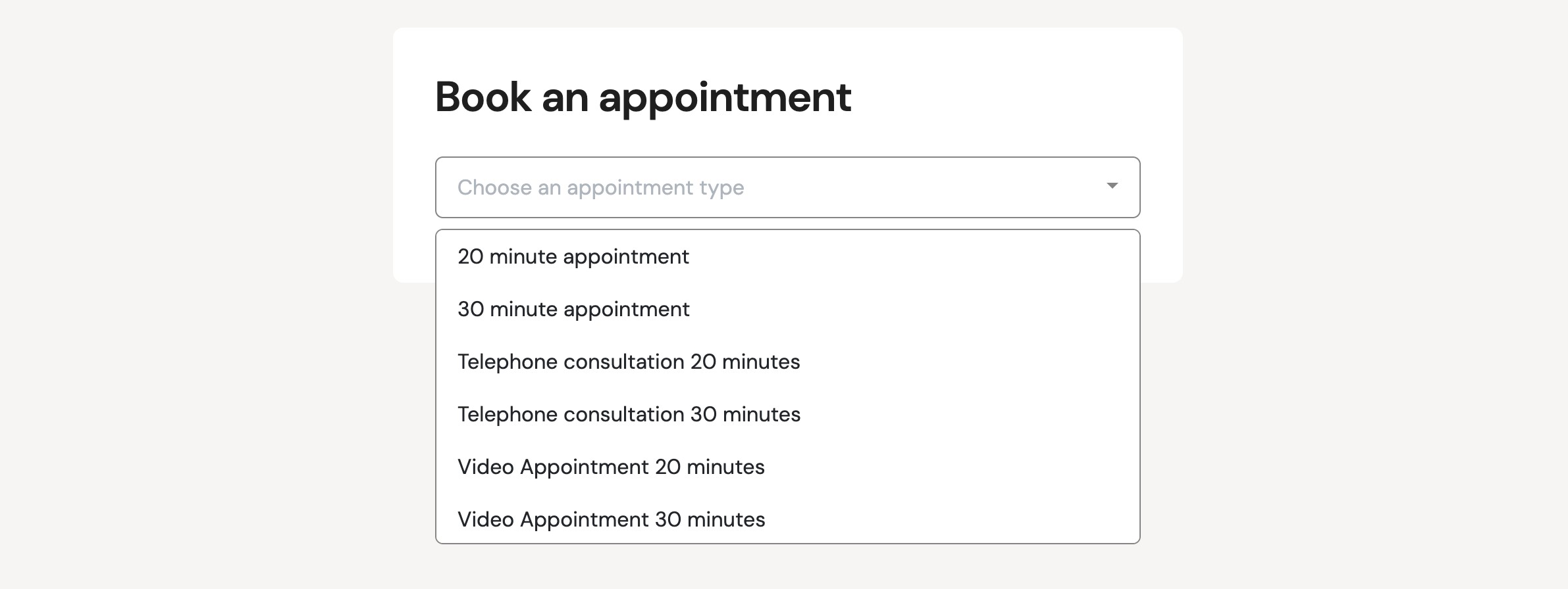
In fact, its entire website design is built around appointments. There’s the standalone “Appointment” button in the top navigation bar, “Need a health check” call to action at the very bottom of the page, and a numbered graphic further on the homepage. This reinforcement means that a patient is never more than one click away from starting a booking, regardless of where they are on the website.

The “Appointment” button in the main navigation deserves special mention. It’s the only navigation item that’s styled as a button, making it impossible to miss regardless of the page you find yourself.
In addition to appointment visibility, the copy also works hard to reduce friction. For example, the phrase “No membership required” and “same-day appointments available”, remove financial means and availability, common perceived barriers to healthcare, from the equation.
Example 3: A Multi-Service Healthcare Website with Strong Information Architecture
Kaiser Permanente’s website shows how strong healthcare information architecture can break down genuine complexity. The challenge that it faces is that it serves an unusually diverse audience, including prospective members shopping for plans, enrolled patients managing their health, employers buying coverage, and referring physicians. On top of that, via a single platform, it needs to handle healthcare delivery and insurance simultaneously.

Where many healthcare websites typically group content according to service, Kaiser Permanente’s main navigation is built to prioritize tasks around real-world user needs e.g. pay bills or shop (insurance) plans. This works because it automatically translates a need into a category.
Then, each menu reveals submenus with more specific options. For example, from the Health and Wellness page, you can jump to sections like health tools and health articles. This way, detail is revealed gradually preventing decision fatigue upfront.
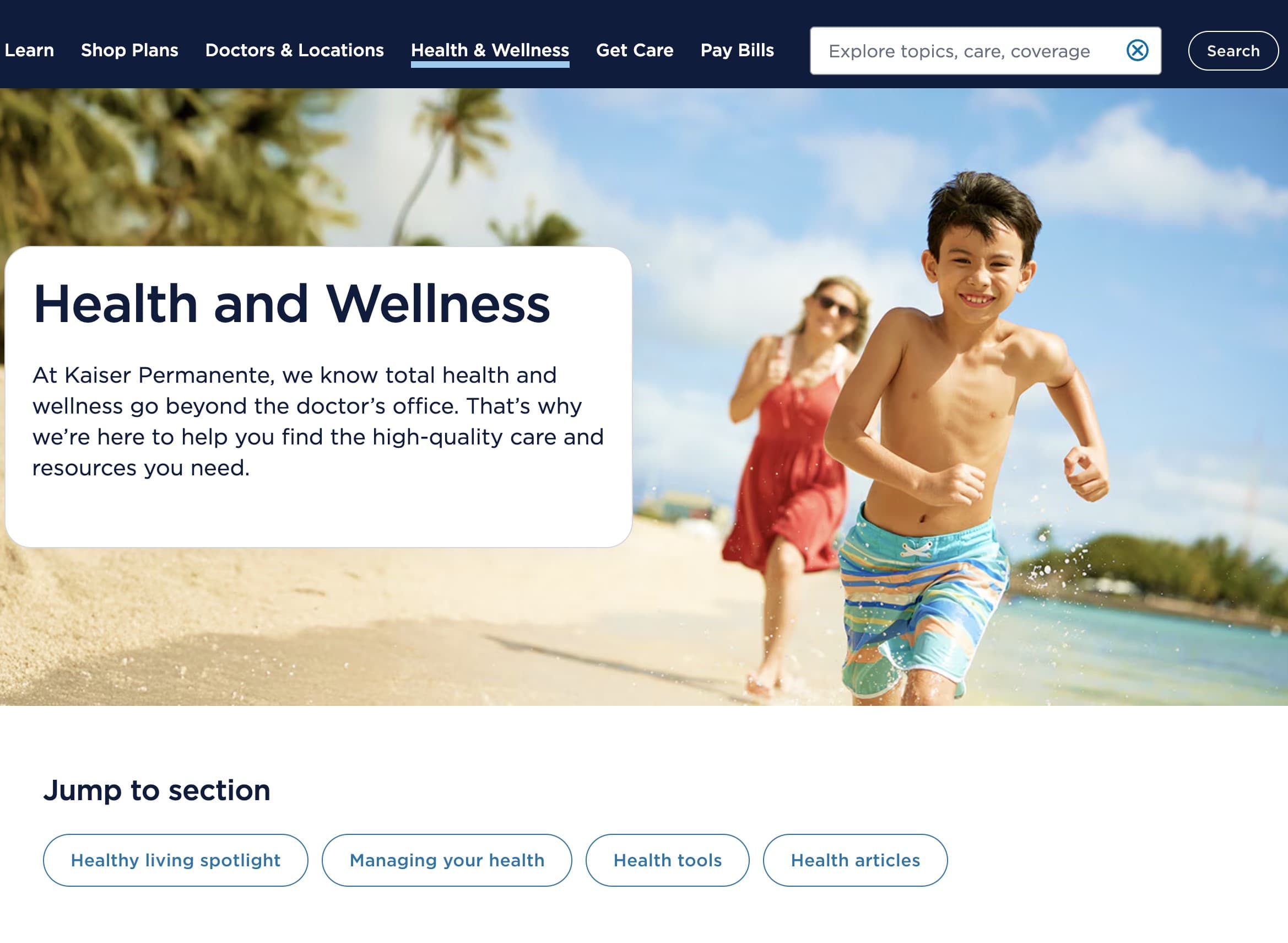
Lastly, it also treats search as a core navigation tool. The search bar is placed prominently at the top across all pages and shares quick links and suggestions. The latter is especially useful in a multi-service setup where the users may not know the correct terminology.
Example 4: A Mobile-Friendly Healthcare Experience
Mayo Clinic’s website doesn’t just “fit” content onto a smaller screen. It restructures the experience around how people actually behave on mobile. For example, multi-column layouts become single-column flows, aligning with how mobile users scroll vertically.
It uses generous spacing and clear separation between elements. Buttons and links have enough white space around them to make it easier to tap. This creates a clean healthcare interface that feels calmer and more controllable.
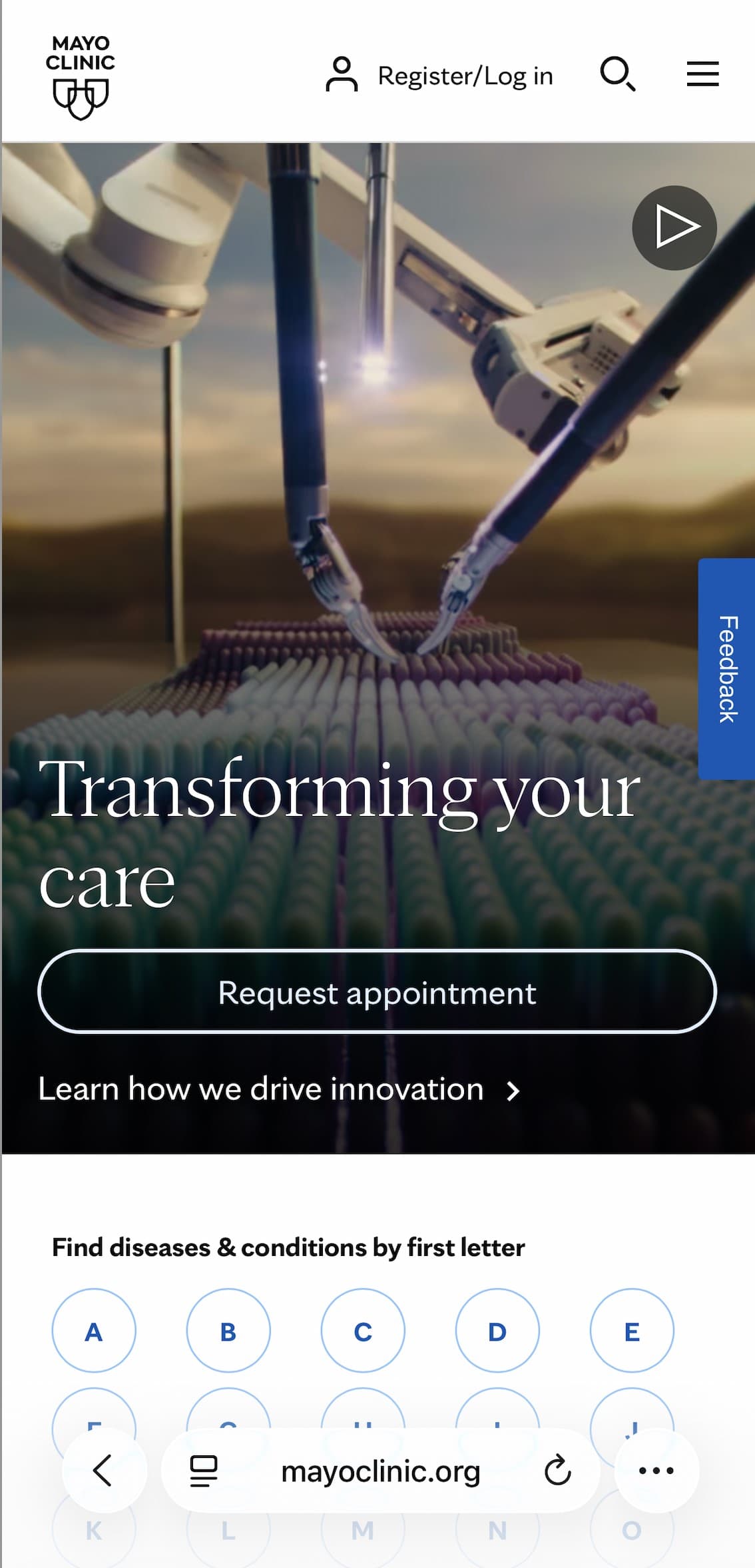
Not only is the mobile-friendly patient journey designed to improve usability, but also readability. The layout is built for fast scanning, using short paragraphs, clear headings, and high contrast between text and background.
Example 5: How We Helped Shift the Perception of Denti.AI
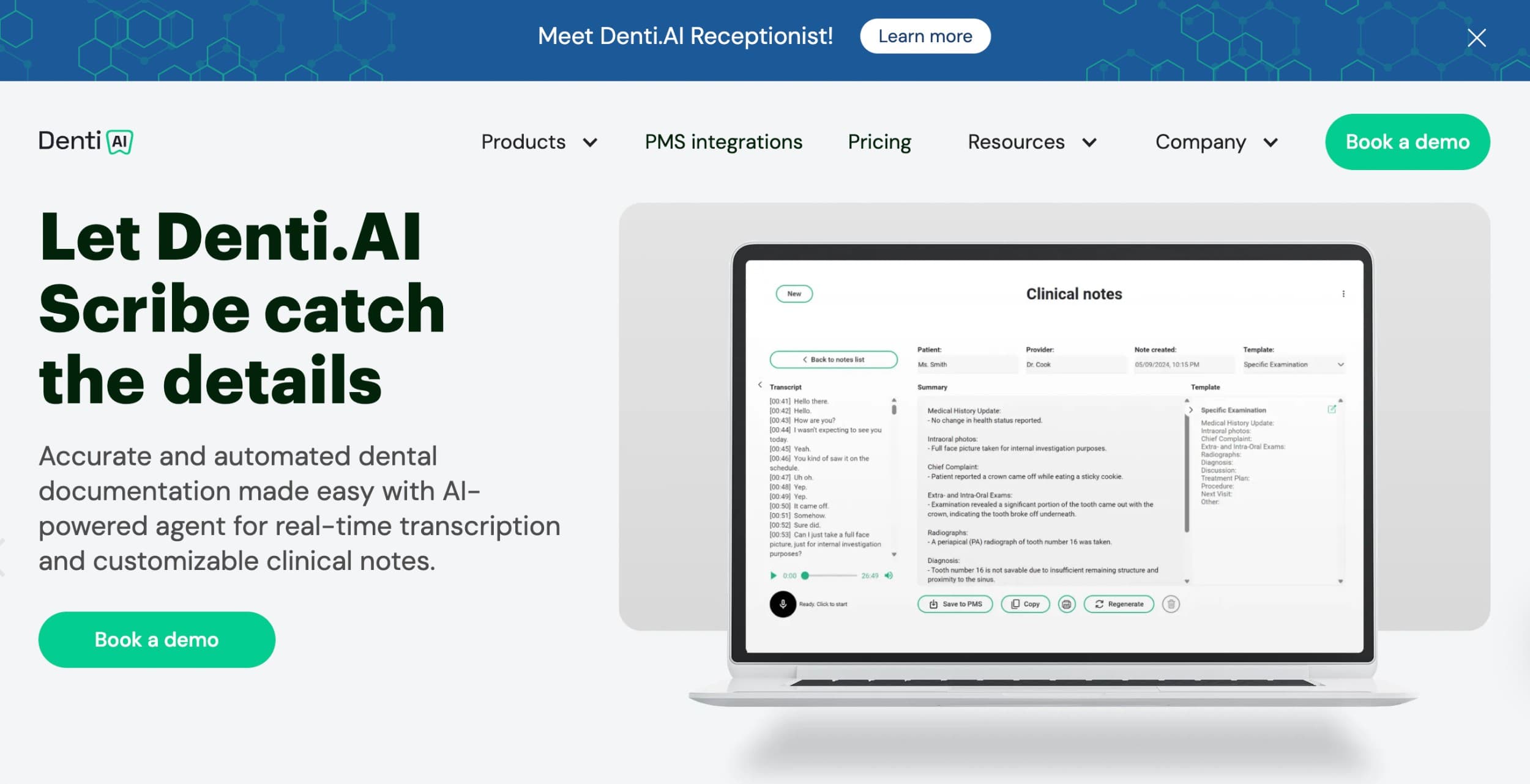
Denti.AI’s website incorporates several web design tips that have helped establish it as a credible medtech solution for B2B healthcare. These include using:
- Intuitive navigation to create an easily accessible medical website
- Clear visual hierarchy to create a logical path
- Short paragraphs to create easily readable healthcare content
- A simple contact form to encourage action
- Clear calls to action like “Book demo” and “Talk to sales”
The website mirrors the product itself. It’s structured, efficient, and outcome-focused.
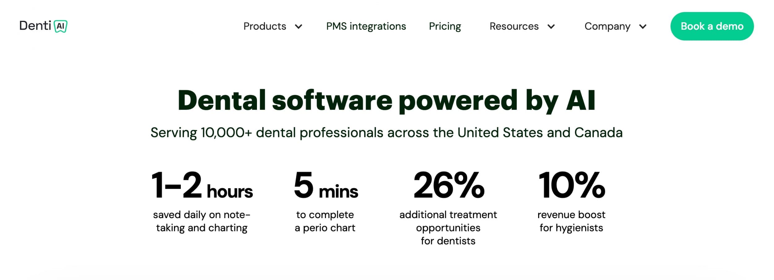
When you land on the homepage, you’re welcomed by a hero slider that lists the software’s benefits. Rather than dwelling purely on brand language, it quickly shifts from claims to evidence and leads with concrete outcomes (e.g. 10% revenue boost). This way, the value proposition is clear. Plus, leading with outcomes is more effective than feature-focused copy as it’s more persuasive.
Then, as you read your way through the rest of the website, the messaging reflects real clinical pain points while the flow matches real clinical processes. This means that potential users intuitively understand how the products connect without needing a diagram.
Book a Call
Common Mistakes to Avoid in Healthcare Website Design
A healthcare website design company will typically tailor its web design process to ensure that trustbuilding and patient actions are the main focus and avoid common mistakes like these:
| Common Mistake | Ways to Avoid It |
| Prioritizing style |
|
| Hiding patient actions |
|
| Weak trust signals |
|
| Poor mobile experience |
|
Prioritizing Style Over Clarity
A polished healthcare website can actively harm patient outcomes when esthetics make it harder to find or understand information. Here are a few common examples of how it can go wrong:
- Hero images are the main focus, while critical contact details about how to contact the real heroes get buried below the fold (or, worse, limited to the footer).
- Animation and cinematic scroll effects mean that mobile users have to wait four seconds for pages to load.
- Contrast is sacrificed for elegance making it harder for older patients or those with visual impairments to find the information they need independently.
- Brand-heavy copy like “world-class care solutions” is preferred over plain, direct language.
- Menus are organized by how the organization thinks instead of needs or symptoms.
A core differentiator of medical website design is that users are trying to solve something urgent. They’re not casually browsing. If the design choices get in the way of speed, trust disappears quickly.
Hiding Important Patient Actions
Patients are usually looking for very specific actions like “book an appointment”, “find a doctor”, or “check symptoms”. Creative menus and vague labels like “explore care” or “your journey” force users to think too hard.
It’s not just the wording that can hide patient actions, but also the design of buttons. Booking appointments, completing forms, making calls, and getting directions are the four primary actions that matter most. Calls-to-action buttons, like “schedule an appointment”, “get help”, or “speak to a specialist” should stand out and be repeated consistently, not styled to blend in with the visual theme.
A patient action might be easily distinguishable from the rest of the website content, but if the path they need to complete is too long, you can expect a low conversion rate too. After clicking, users shouldn’t first have to read long pages or complete multiple screens just to make an appointment, for example.
Then, also reconsider if an account is truly necessary. Forcing patients to create an account before they can access a form or book adds friction at the worst possible moment. Rather give them two paths: log in or proceed as a guest.
Weak Trust Signals or Poor Mobile Experience
Healthcare users arrive with higher anxiety than typical web visitors as the decisions they need to make can have a lasting impact on their health. This makes healthcare trust signals like accreditations and social proof as essential as the service.
That said, it’s more than simply adding a badge and testimonial and calling it a day. Common mistakes that doctors’ website design often make include:
- No provider profile pages or vague bios without photos, qualifications, and specializations
- Hiding registration numbers, board certifications, and regulatory body logos in the footer
- Using generic stock photography of doctors instead of photos featuring the actual practitioners in the real setting
- Not listing a physical address, local phone number, and practice hours
On top of that, the decisions often need to be made in a hurry and on the go. When it’s an emergency, you’re going to be reaching for your phone, not your desktop. Common mistakes like the following create weak mobile usability:
- Calls to action are too small or closely placed
- Phone numbers, location and directions access aren’t clickable
- Long intake or appointment forms with tiny fields and no progress indication
- Heavy user of image carousels and unoptimized media that slow down the page load times
Final Thoughts
To create a better experience for patients, websites need to build around trust signals and real problems. Accessible design, clean navigation structure, and clear calls to action work together to ensure that whether it’s the actual patient or loved one will find the information, and, more importantly, next action to take easily, even when in emotional distress.