Simply having a functional website is not enough any longer. From accessible website design to interactive elements, there are guidelines and modern aesthetics to consider.
Plus, the poor impression that browsing an outdated site creates can let website visitors question the credibility of your business. Dropbox is a good modern website design example that illustrates how web design impacts credibility.
Imagine having to explain to earlier generations that one day you would feel completely comfortable storing your most precious photos with a company that has no brick-and-mortar locations. That’s the power of effective design. With the following important tips to improve your web design, you too can tick all the boxes like Dropbox.

The Importance of a Website Optimized for Current Technologies and Trends
The ways consumers search, shop, and interact online are constantly changing. Modern users don’t just expect your website design to look good or load properly. They demand user-centered design, a clean user interface (UI), and fast-loading pages. If your competitors have newer, more polished websites, your target audience may perceive them as the better option—regardless of the quality of your services or product.
Search engines, like Google and Bing, are also continuously updating their algorithms to prioritize high-quality, user-friendly websites. A website that isn’t optimized risks being left behind in search engine results pages (SERPs), making it harder for potential customers to find you.
Not only does an optimized website drive growth by being discoverable and encouraging interaction once visitors land on your website, but it also lays the foundation for seamless upgrades. If you continuously optimize your website for current technology, you can, for example, upgrade payment systems, add API integrations, or launch new product categories to keep your business relevant. Plus, considering that marketers have identified websites and blogs as the channels which have resulted in the biggest ROI, according to HubSpot’s The State of Marketing 2025 report, it’s an asset that you want to scale.
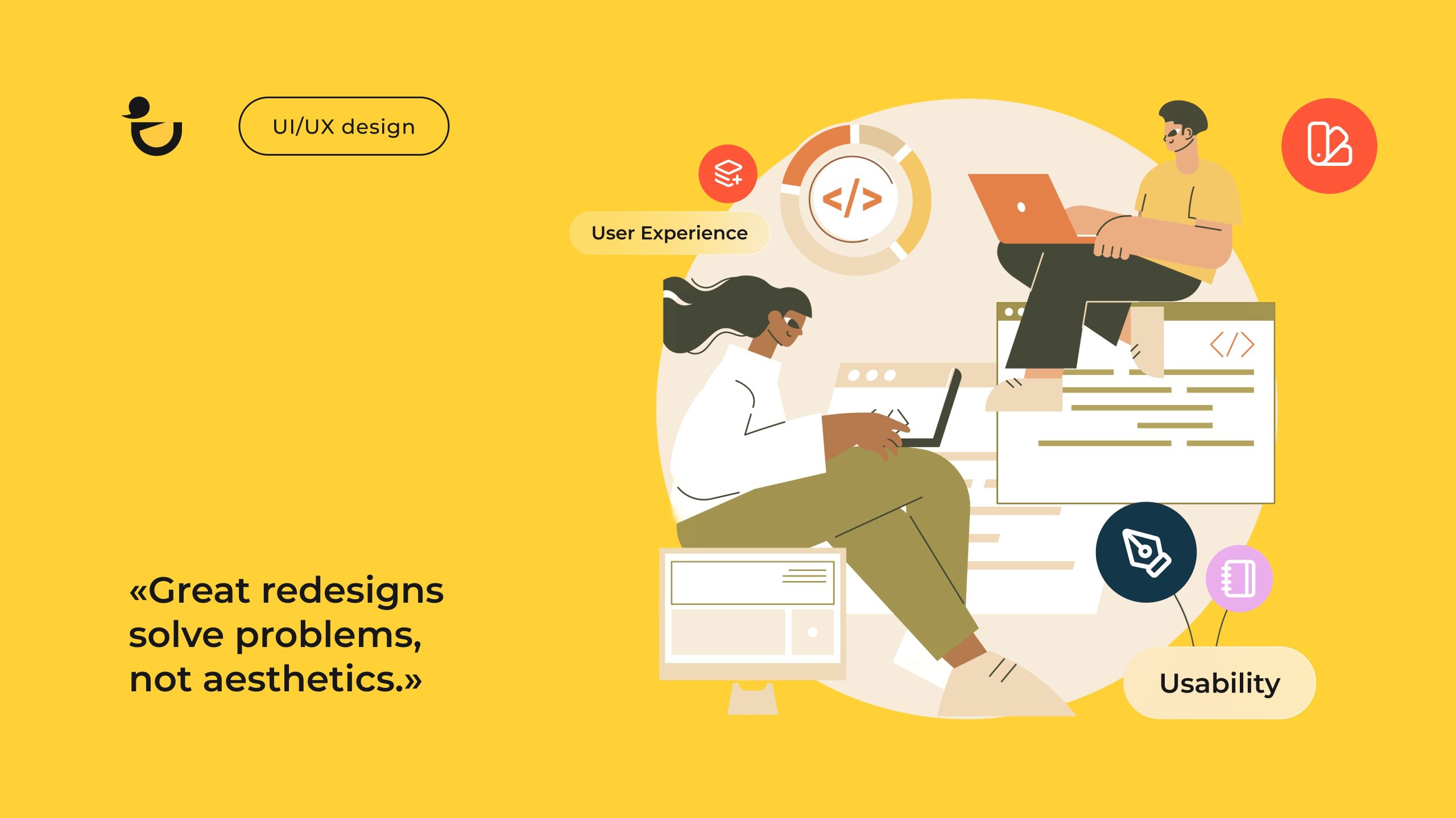
Key Elements of Modern Website Design: What Makes a Site Stand Out
To ensure your website is different from the billion other sites and meet current browsing habits, double-check that it includes the following essential elements:
- A clean, minimalist layout
- Responsive design
- Intuitive navigation
- A strong visual hierarchy
- Consistent branding
- Micro-interactions and other interactive elements
- Engaging visuals
- Social proof and reviews
- Security features
- Clear calls to action (CTAs)
- Good typography
- A fast-loading speed
- Copywriting that resonates with your target audience
Read Also: Website Improvement Guide: How to Improve a Website Effectively
Best Web Design Tips to Make Your Website Modern and High-converting
Choose Colors and Styles That Align With Your Brand’s Personality
Your website is an online extension of your brand. It should work in harmony with your other branding elements such as your logo, business cards, and social media profiles so that your website represents your brand authentically.
If the colors and style you use in your web design don’t align with your brand’s personality, you risk delivering a fragmented or confusing experience.
Brand recognition and user experience aside, colors and styles also evoke emotions, which play a big role in how users interact with your website. Take color, for instance. Each hue conveys specific emotional messages.

While you should incorporate your brand’s color palette into your design, it’s best that any bright colors are used sparingly as these can be overwhelming. A neutral color palette works best as it keeps distractions to a minimum and creates a calm, professional look. According to Adobe, white, gray, and blue are the top background colors, while white, gray, and black are the preferred font colors.

Blend Aesthetics With Functionality for a User-friendly Experience
It’s tempting to prioritize aesthetics over functionality or vice versa. However, both are equally important.
Eye-catching visuals captivate attention, while a sleek, professional design communicates credibility and trustworthiness. Then, to ensure that you convert this attention and your business delivers on its credible image, you need smart functionality so that the users’ experiences are smooth, frustration-free, and there’s an easy path for them to take action—whether that’s purchasing a product, booking a service, or signing up.
A truly user-friendly website ensures accessibility for all users across all devices. As such, ensure your website is optimized for smaller screens, images have alt text, and you’ve used sufficient color contrast, for instance.

Aside from the primary goal of improving usability, these extra, yet essential, steps will also improve your SEO and show that your business values inclusivity.
Use Minimalist Design to Enhance Focus and Usability
With design, especially web design, less is often more. Minimalistic design, which focuses on simplicity and functionality, reduces clutter, strips away unnecessary distractions, and directs users’ attention to what really matters—your core messaging or CTA.
Aside from enhancing focus, it can also improve the user experience (UX). Streamlined layouts are easier to navigate, helping visitors find what they’re looking for quickly. Plus, as it typically means using fewer elements, you can expect faster page load speeds and a seamless experience across devices.
To incorporate minimalist design, you need to be intentional about your design choices.
You’ll also need to use white space liberally. Also known as negative space, it’s the empty area around your other elements like text blocks or images. Far from being wasted space, it allows your content to breathe, making it more readable and visually appealing.
Read Also How to Design a Product Page: Best Practices and Examples

Leverage Visual Hierarchy to Improve Content Flow
Visual hierarchy is how design elements are arranged to influence the order in which information gets processed. The way you organize and present information significantly impacts your audience’s experience.
A visually busy page can feel chaotic and confusing. On the other hand, a clear, intentional visual hierarchy makes browsing enjoyable. Visitors stay longer, explore more, and are more likely to engage with your content. In fact, 34.6% of participants in a GoodFirms survey have listed poor content structure as the top reason for leaving a website.
Book a Call
What’s more, by guiding your visitors’ eyes through your website, you can direct attention to what matters most, making your content flow naturally and effectively. This way, users will see the most critical information first.
To pull it off, you need to use various design principles, including size, color, spacing, and placement. The following web designing tips will help you to create logical paths for your website visitors:
- Use large, bold headlines, followed by smaller fonts for subheadings and deeper explanations
- Add clear distinctions between headings, subheadings, and the body of the text
- Use muted backgrounds and white space to make important elements pop
- Opt for button styles to emphasize clickable elements, such as “Get started” or “Buy now”
- Incorporate progress indicators to improve navigation
- Add directional imagery to draw visitors’ eyes subtly
- Use contrasting or bold colors to let focal points like CTAs stand out
- Position focal points at the top of the page and pair them with a strong visual to maintain emphasis
Integrate Microinteractions to Increase User Engagement
Microinteractions are subtle, functional animations or responses triggered by user actions. While they might seem tiny or even trivial, they’re one of the most popular web design trends and have the potential to make a huge difference, in particular on the navigation.
They’re the small details that make digital experiences intuitive. For example, a vibrating password field offers instant feedback that an incorrect password was entered.
Without specific instructions, microinteractions can guide users through tasks and offer subtle feedback that help them feel confident about where they’re clicking. When visitors receive acknowledgement for their actions (like buttons that change color when hovered over or a subtle glow around a shopping cart icon when an item is added), they’re more likely to continue engaging with your website.
Thoughtfully executed microinteractions can also inject personality into your website. Take loading screens, for instance. While these are inevitable, they don’t have to be wasted time. You can use a spinning logo, progress indicator, witty message, or simple animation to entertain users and reinforce brand recall during wait times.

Website design tips for incorporating these types of animations are to keep it simple and use them sparingly. It’s function over fun. Yes, they can be both, but only if they match your brand personality and serve a purpose.
Your website’s navigation isn’t just a menu at the top of the page. It’s the backbone of the user experience (UX). Simplified navigation can make the difference between a frustrated user abandoning your site and one who becomes a loyal customer, with 61.5% listing it as the main reason for leaving a site.
Visitors want quick and easy access to the information they need. Plus, intuitive, clear navigation helps search engines crawl your pages more effectively, improving your site’s visibility and rankings.
One of the easiest ways to simplify navigation is by reducing clutter. Make menus simple and clear. Stick to seven top-level menu items max. Then, group related content under logical subcategories so users don’t have to hunt through an overwhelming number of options.

If you’re designing for mobile, use collapsible menus (like a hamburger menu). Also, ensure that touch targets are large enough for fingertip accuracy.
It’s also recommended that you use a sticky menu (like the one on our website). It stays visible as users scroll, keeping important links consistently accessible. This way, visitors can easily explore various pages on your site no matter where they scroll.

That said, many users know exactly what they’re looking for and won’t bother clicking through multiple pages to find it. This is why a search bar is essential. It’s especially important on content-heavy and eCommerce sites.
Like your menus, your search bar should be easy to locate. Then, to improve its functionality further, set it up so that it offers relevant, auto-suggested results.
These are just a few website design tips that generally simplify navigation. Let your ideal customer guide you.
What are they coming to your site to do? During your web design process, you should take the time to create user personas and map out the paths they might take. This will help you organize your architecture around their needs, rather than your assumptions.
Design Intuitive Forms to Enhance User Experience
Forms are a notorious point of friction. That said, they’re essential as they often act as the bridge between visitors and your business objectives. From understanding customer preferences to tracking inquiries, high-quality data is essential for informed business decisions.
Like with good website design, less is also more when it comes to creating website forms. Ask only for the information that’s absolutely necessary. For example, instead of asking for a physical address when signing up for a newsletter, an email address is enough.
At the same time, avoid making too many fields mandatory unless absolutely necessary. Clearly indicate which fields are required by using an asterisk (*) or other visual cues. This prevents users from guessing and ensures a smoother experience.

If your form requires multiple fields, group related items together logically. For example, contact information fields like “Name,” “Email,” and “Phone” should be positioned together.
For longer forms, separating it into sections or steps can also make them less overwhelming.
Other web design tips when it comes to creating forms include:
- Using microinteractions like a red cross and/or tooltip to indicate and explain errors in real time
- Adding placeholder text, for example “Enter your email address – [email protected]”, for additional guidance
- Using dropdown menus, pre-filled data or autofill for common fields
- Displaying a confirmation message when a form is submitted successfully
With more users accessing websites on their phones, your forms must also be mobile-friendly. Ensure the layout adjusts for different screen sizes and use finger-friendly buttons for a smooth mobile experience.
Schedule a Call
Craft Unique, Readable Content for Stronger User Retention
Unique, engaging content grabs attention, while readable copy ensures visitors actually stick around to digest your message. That said, readable content doesn’t mean “dumbing it down”, but rather to organize it logically and present it in an accessible way.
Website content should be scannable. Avoid large blocks of text. Instead, use short paragraphs (and sentences) which are separated with strategically placed subheadings. Where possible, you can also incorporate bulleted lists.
As for your language, avoid jargon, unless it’s widely recognized in your industry. You’re writing for your audience to understand, not to impress your competitors.
Don’t forget the visual aspect. Choose legible fonts and contrasting colors to improve readability further.
In fact, not all visitors want to engage with written copy. Expanding into other forms of content, like videos, infographics, and podcasts, can make your content more accessible and appealing to a wider audience. A quick testimonial video that serves as social proof, for example, can improve website conversion. Considering only 30% of small business home pages use videos and even less (24%) use customer quotes, these types of content can let you stand out.
Every piece of content you create should solve a problem, answer a question, or bring value to your audience. If your content is useful, entertaining, or educational, users are more likely to bookmark your site, share your content, or come back for more. Returning visitors often become loyal customers when your website becomes their go-to resource for answers, ideas, or solutions.
When your content offers original insights or valuable information, it also positions your business as an expert in your field. Users want to trust the companies they engage with, and providing interesting, thought-leadership content strengthens that trust.
You’re always writing first and foremost for your target audience. That said, you must also keep in mind search engines and voice assistants like Siri or Alexa. As such, you’ll need to incorporate keywords. Optimizing for long-tail keywords specifically will help you to pop up in voice searches.
Then, regularly audit and refresh your website to ensure accuracy and relevance. Sometimes, refreshing a popular existing post with new stats or techniques can do more for retention than publishing an entirely new article.
Avoid Distracting Elements Like Blinking or Flashing
Blinking or flashing elements command immediate attention, but they often end up being counterproductive. Not only can they detract from the user experience, they also divert a potential customer’s focus away from the content or actions that truly matter such as reading your product descriptions, filling out a form, or clicking a “Buy Now” button.
Flashing or blinking elements can also make your website design inaccessible to certain users, particularly those with visual sensitivities or neurological conditions like epilepsy.
Instead, there are other tips for web design that you can use to capture attention like color contrast and strategic positioning or best web design practices like customized typography. These design elements might be subtle, but they’re actually more effective as they can draw attention to specific areas of your site without overwhelming visitors.
Don’t Be Afraid to Use Unconventional Elements on Your Website
The rise of drag-and-drop website builders has made it simpler for businesses to create beautiful sites using pre-made templates. However, this convenience has also led to a landscape of websites that, frankly, look the same.
Adding unconventional design elements, like bold color schemes, dynamic animations, or asymmetrical layouts, can express your brand’s personality, helping to set it apart and. That said, if it’s done incorrectly, it will go against several tips for website design mentioned earlier that emphasize intuitiveness.
This is one reason why it’s a good idea to outsource web design to an agency. They know whether custom web design or a template suits you best and apply high-converting, visually appealing elements to both types of websites. Not only will they know how to prevent unconventional elements from becoming chaotic or confusing, but they also won’t use cookie-cutter templates.
Crafting User-Centered Web Experiences for Your Business with Duck.Design Team
Our web design services are fast and high-quality at the same time, enhancing the look of your website. We’ve developed our own proprietary software so that we can efficiently coordinate a high-volume of design projects.
As every plan includes unlimited requests and revisions, there will also be more than enough time to incorporate everyone’s feedback. Not only does this package feature make us a client-centered agency, but also an affordable web design agency for your next business website.
This collaborative approach has, for example, helped us to grow Poke23’s brand recognition and user satisfaction by 70% and 89% respectively.

Eating healthily doesn’t need to be boring. To get health-conscious foodies excited about Poke23’s on-the-go meals, we used bold typography and a vibrant color palette. Then, to refine the design, we conducted usability testing and incorporated user feedback.
We also work only with experienced website designers who know that clean design still leaves plenty of room for creativity and your brand’s personality. While visual communication is key for website design, we also understand that we need effective client communication. That’s why we embrace real-time collaboration and use tools like Trello for smooth project management.
When working with us, you’ll get assigned an art director, middle/senior designer as well as a project manager who will bounce ideas off each other.