


Key Findings
- Purposeful motion reduces cognitive effort by preserving interface context.
- Timing and easing influence perceived realism more than visual complexity.
- Staggered motion improves hierarchy in dense interfaces.
- AI accelerates production, but designers still define motion intent.
- Core animation principles remain effective across 2D, mobile, and spatial interfaces.
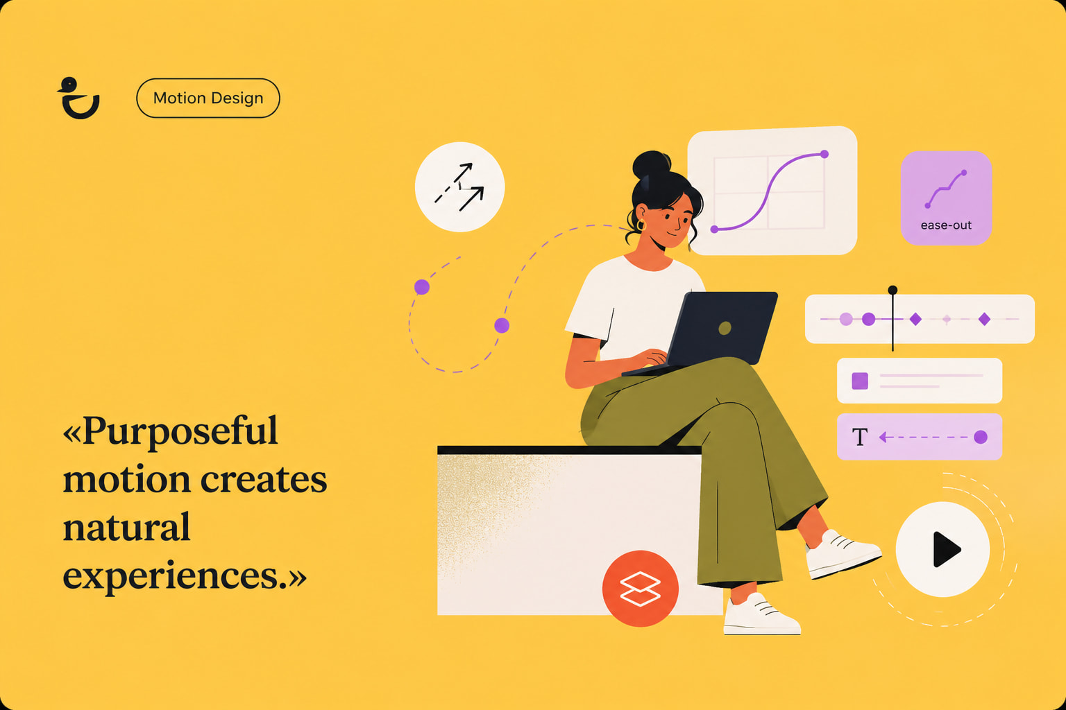
Motion design uses purposeful movement to explain actions, guide attention, and improve digital experiences. Natural animation feels believable because every movement follows clear visual logic instead of relying on decorative effects. This guide explains the motion design principles behind realistic animation. It also shows how designers can apply them across digital interfaces.
The Evolution of Motion Design: What Defines It Today
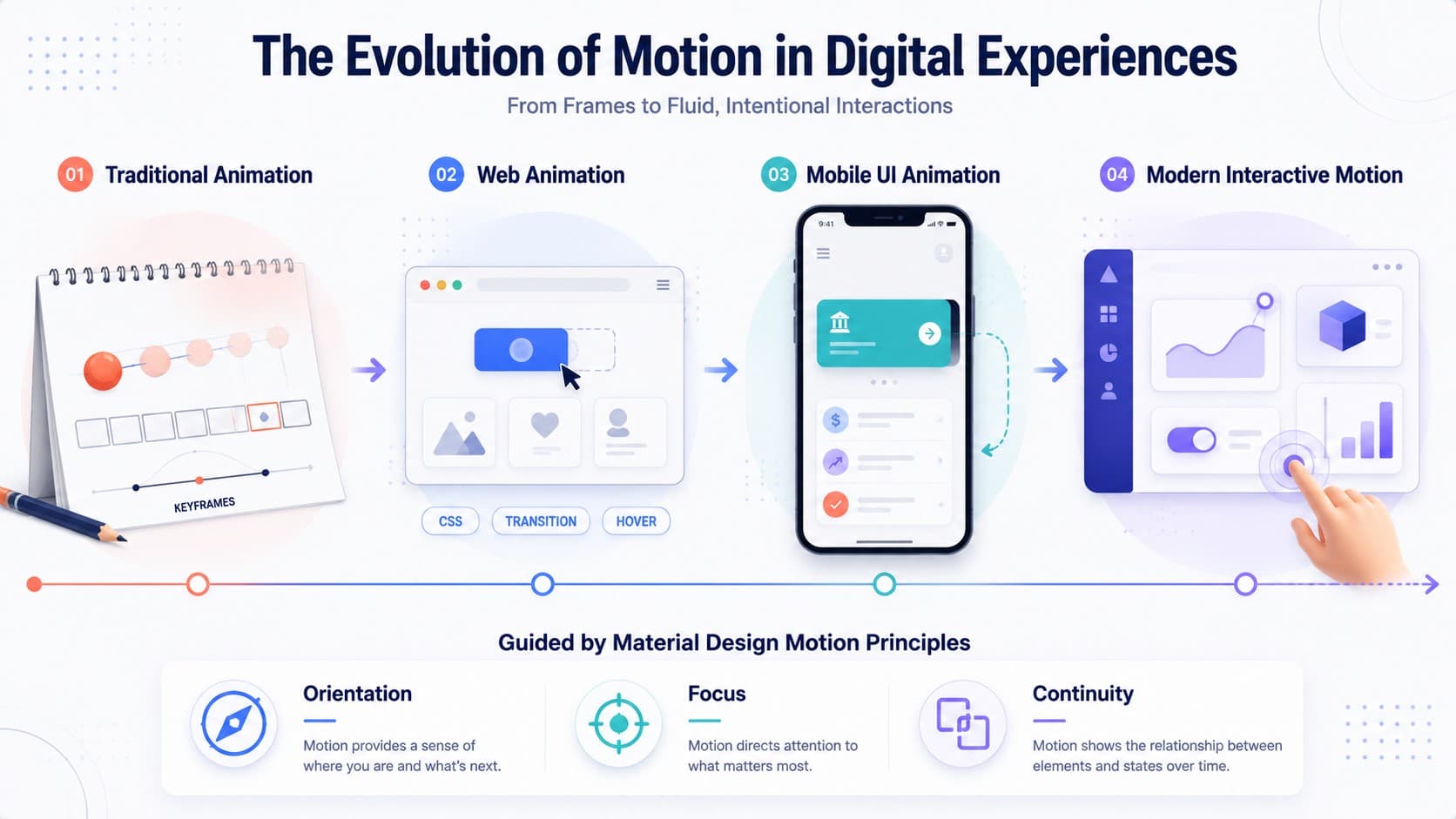
Motion design has evolved from traditional film animation into a discipline focused on digital interaction. Designers now create movement that improves navigation, explains interface changes, and reinforces user decisions. Successful animation supports usability rather than competing for attention.
Earlier animation focused on storytelling within fixed scenes. Modern interfaces require motion that responds instantly to user input. Buttons expand, menus slide, and notifications appear because movement helps people understand changing interface states.
The shift toward interactive products also changed design priorities. Visual polish still matters, but clarity has become the primary objective. Applying the principles of motion helps users predict what happens next instead of interpreting unexpected animations.
Purpose now defines successful motion more than complexity. Small transitions often create greater value than dramatic visual effects. A subtle animation can confirm an action faster than additional text or interface elements.
Several characteristics distinguish modern motion design from purely decorative animation.
| Characteristic | Why It Matters | Practical Result |
| Purposeful movement | Every animation supports an action | Less visual noise |
| Smooth transitions | Reduces cognitive effort | Easier navigation |
| Visual hierarchy | Directs attention naturally | Faster decision making |
| Interactive feedback | Confirms user actions | Greater confidence |
| Consistency | Creates predictable behavior | Better usability |
Motion also influences emotional perception. Abrupt movement often feels mechanical or distracting. Smooth transitions create confidence because they resemble natural physical behavior. Google’s Material Design guidelines emphasize continuity. Consistent movement helps users maintain context between interface states.
Modern interfaces also combine multiple disciplines. Designers frequently blend illustration, typography, interaction, and design into one cohesive experience. Understanding motion graphics becomes easier when animation functions as part of a complete visual system.
Modern motion design typically supports:
- Clear navigation between interface states.
- Immediate feedback after user actions.
- Visual hierarchy during complex interactions.
- Consistent behavior across reusable components.
- Better orientation within digital products.
As products become more interactive, designers use user-centered design principles to decide when motion should appear. They also decide when it should remain invisible. The best animation often succeeds because users notice the experience rather than the animation itself.
A familiar example appears in modern mobile operating systems. When users open an application, interface elements do not simply appear on screen. They expand, fade, or slide into place to preserve orientation and reinforce spatial relationships. Similar patterns appear in products like Notion and Figma. Carefully timed transitions help users understand layout changes without interrupting their workflow. These examples demonstrate that effective motion reduces cognitive effort rather than increasing visual complexity.
The Essential Principles of Motion Design Explained
The principles of motion design explain why certain animations feel believable while others appear artificial. These concepts originated from animation, yet they now shape websites, mobile applications, dashboards, and product interfaces. Learning them helps designers create movement that improves understanding instead of adding visual decoration.
| Principle | Primary Purpose |
| Timing & Spacing | Controls speed, rhythm, and perceived weight |
| Easing | Creates natural acceleration and deceleration |
| Anticipation | Prepares users before movement begins |
| Offset & Delay | Establishes hierarchy between elements |
| Follow-Through | Makes movement settle realistically |
| Squash & Stretch | Adds flexibility and energy |
| Transformation | Explains changing interface states |
| Staging | Directs attention toward important actions |
Although every project differs, designers usually improve animation by following several consistent practices.
- Define the purpose before creating movement.
- Match animation speed to user expectations.
- Keep transitions consistent across similar components.
- Test motion with real interaction scenarios.
- Remove animations that add no functional value.
Timing & Spacing: Control Speed, Weight, and Rhythm
Timing determines how long movement lasts. Spacing controls how far an object travels between frames. Together, they form one of the core principles and shape perceived weight.
Fast movement suggests light objects or urgent actions. Slower timing creates stability and importance. Designers should adjust both values according to user expectations rather than personal preference.
Practical application includes:
- Slow important confirmations.
- Speed up repetitive interactions.
- Keep related transitions consistent.
- Test animation across different devices.
- Adjust duration according to travel distance.
Poor timing often creates confusion before users recognize the interface itself. Correct timing quietly improves every interaction without attracting unnecessary attention.
Designers often validate timing through usability testing rather than intuition alone. A transition that feels smooth during prototyping may become frustrating after hundreds of daily interactions. Even reducing a frequently repeated animation by a fraction of a second can noticeably improve perceived responsiveness without affecting visual quality.
Easing: Make Every Transition Feel Natural
Real objects rarely begin or stop moving instantly. Easing introduces acceleration and deceleration that resemble physical movement. This animation technique removes the robotic feeling common in linear animation.
Linear transitions work for loading indicators or technical diagrams. Most interface animations benefit from easing because users naturally expect gradual movement. Apple Human Interface Guidelines recommend subtle acceleration because it preserves continuity during interface changes.
Different easing curves communicate different intentions. Gentle curves feel calm and controlled. Sharper curves create urgency or responsiveness. Consistency matters more than variety across an interface.
Practical recommendations include:
- Use ease-out for interface entrances.
- Apply ease-in before elements disappear.
- Reserve linear movement for continuous progress indicators.
- Test curves with real interactions instead of previews.
- Avoid mixing unrelated easing styles.
Anticipation: Prepare Users for What Happens Next
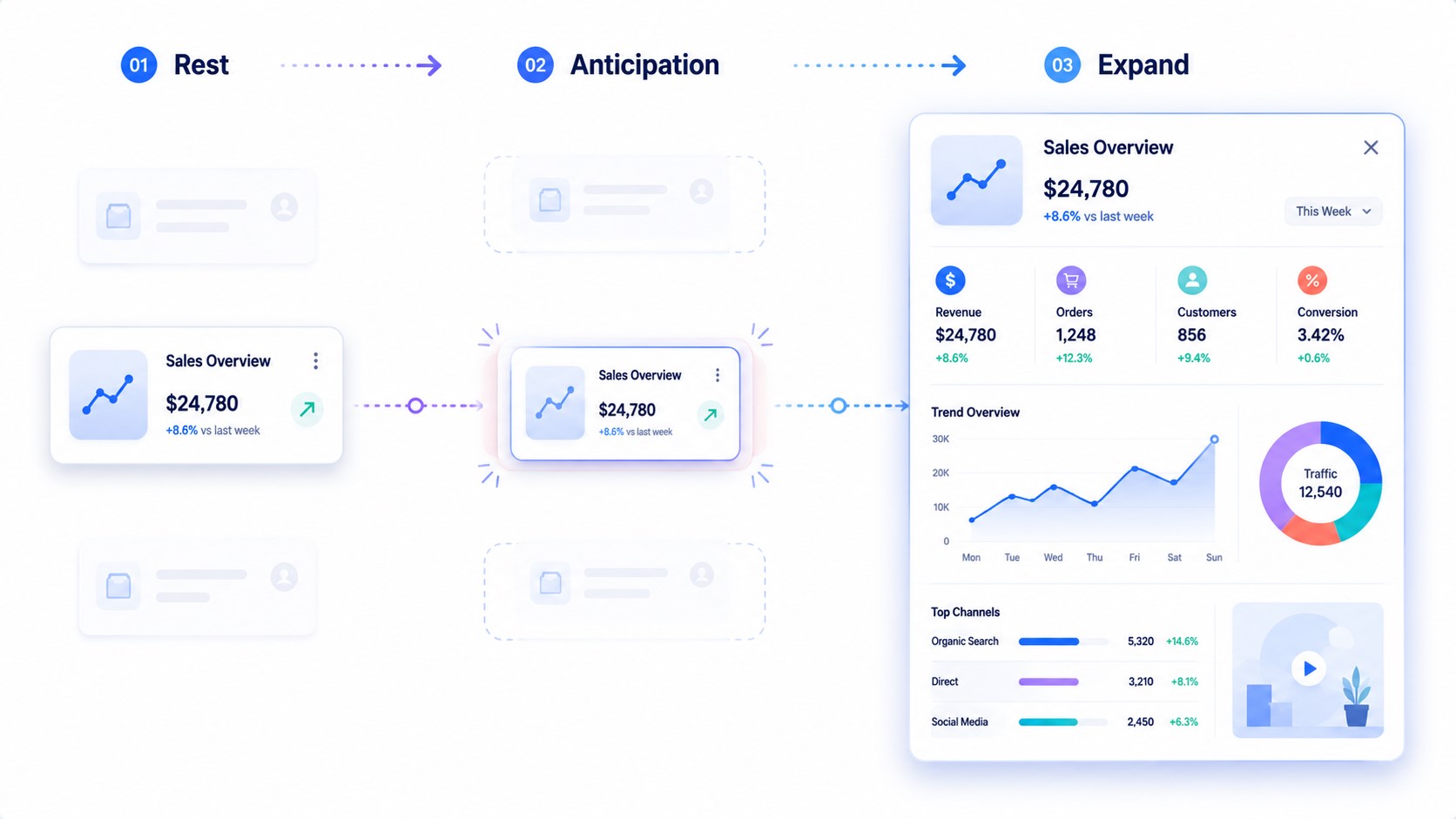
Anticipation prepares viewers before movement begins. It gives people enough visual context to understand the next action. Among modern animation techniques, anticipation reduces surprise while improving comprehension.
Simple examples appear throughout digital products. Buttons respond before opening menus. Cards slightly expand before revealing additional information. These subtle cues reduce uncertainty without delaying interaction.
Effective anticipation should remain brief. Excessive preparation slows workflows and weakens responsiveness. Designers should communicate intention without creating unnecessary waiting.
Practical actions include:
- Indicate clickable elements before expansion.
- Preview directional movement.
- Signal loading before major transitions.
- Highlight selected objects before animation begins.
- Keep preparation shorter than the primary movement.
Offset & Delay: Create Clear Visual Hierarchy
Offset and delay prevent every element from moving at the same moment. Small timing differences create order and improve readability. This is one of the most practical animation techniques for complex interfaces because it establishes a clear visual sequence.
Simultaneous movement often overwhelms users. Staggered animation encourages the eye to follow information naturally. The result feels organized instead of chaotic, even when several components appear together.
Designers can improve hierarchy with these techniques:
- Animate primary content first.
- Delay supporting elements slightly.
- Keep stagger intervals consistent.
- Avoid excessive waiting between elements.
- Test readability on smaller screens.
Offset works especially well in dashboards, onboarding flows, and navigation menus. Small delays help users process information without slowing the overall experience.
Follow-Through: Let Motion Settle Naturally
Objects rarely stop immediately after moving. Follow-through allows animation to finish with subtle momentum instead of ending abruptly. These motion design principles make interfaces feel smoother because movement reflects natural physical behavior.
The effect should remain understated in digital products. Excessive overshooting can distract users or reduce perceived performance. Small adjustments usually create stronger results than dramatic motion.
Designers should apply follow-through when:
- Sliding panels reach their final position.
- Floating elements complete movement.
- Cards expand into detailed views.
- Navigation drawers close.
- Interactive components return to their resting state.
Follow-through should support usability rather than attract attention. Users should notice smooth interaction, not the animation itself.
Follow-through also shapes how users judge product quality. Natural settling creates a stronger sense of precision and reliability. This is especially important in enterprise software and financial dashboards. Small details often influence trust more than complex visual effects.
Book a Call
Squash & Stretch: Add Energy and Personality
Squash and stretch communicate flexibility without changing an object’s identity. This technique belongs to the principles of animation, yet it remains valuable across modern interfaces. Small shape changes help interactions feel responsive and alive.
Microinteractions often benefit from restrained deformation. Buttons compress slightly when pressed. Notification badges bounce after appearing. Loading indicators become easier to notice through controlled movement.
Successful implementation depends on moderation.
| Interface Element | Recommended Effect | User Benefit |
| Button | Slight compression | Clear interaction feedback |
| Notification | Gentle bounce | Improved visibility |
| Toggle switch | Flexible movement | Stronger physical response |
| Loading icon | Elastic motion | Better perceived activity |
| Floating action button | Soft expansion | Increased emphasis |
Subtle deformation reinforces interaction without compromising interface consistency. The same principle also strengthens animated design by making digital elements appear less mechanical.
Transformation: Show State Changes Through Motion
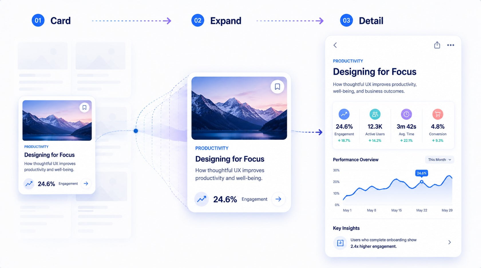
Transformation explains how one interface state becomes another. Instead of replacing content instantly, animation reveals the relationship between both states. This approach reduces confusion because users can follow visual continuity.
Meaningful transformation preserves orientation. A thumbnail grows into a full-screen image. A collapsed menu expands into detailed navigation. A selected card transforms into a dedicated content page.
Useful practices include:
- Preserve visual continuity.
- Animate related elements together.
- Keep movement aligned with layout changes.
- Remove unnecessary decorative effects.
- Maintain consistent transition direction.
Designers using motion graphics principles often improve usability by showing relationships instead of replacing content abruptly. Natural transformation reduces cognitive effort because users never lose context.
Staging: Guide Attention Without Distractions
Staging ensures viewers immediately recognize the most important action. It combines visual structure with motion to direct attention efficiently. Among animation techniques, staging has the greatest influence on clarity.
Poor staging forces users to search for important information. Strong staging highlights one primary action while supporting elements remain secondary. Motion reinforces this hierarchy instead of competing with it.
Designers can improve staging by following these practices:
- Animate one focal element first.
- Reduce movement in background content.
- Combine motion with visual contrast.
- Maintain predictable animation patterns.
- Remove competing visual effects.
Good staging becomes especially important when creating motion graphics design for products with complex workflows. Clear visual priorities shorten decision time and improve overall usability.
Readers exploring broader types of graphic design will see that staging shapes static layouts as well as animated interfaces.
The Future of Motion Design: Will These Principles Still Matter?
The future of motion design will introduce new tools, but it will not replace core animation fundamentals. Technologies will change production workflows, yet the principles of motion will continue shaping natural digital experiences. Designers will still depend on movement that explains actions instead of decorating interfaces.
Artificial intelligence already accelerates animation production. Modern tools generate transitions, interpolate frames, and suggest movement automatically. Human judgment remains essential. AI cannot reliably determine whether motion improves usability or only adds visual complexity.
AI-assisted motion tools can help designers:
- Generate transition variations faster.
- Interpolate frames between key poses.
- Adapt motion to different screen sizes.
- Automate repetitive production tasks.
- Test several movement options quickly.
Spatial computing creates another important shift. Mixed reality and immersive interfaces require movement that exists within three-dimensional environments. Designers must consider depth, distance, and perspective while preserving familiar interaction patterns.
Accessibility will become equally important as immersive interfaces evolve. Many operating systems let users reduce interface motion. Designers should provide alternative transitions that preserve clarity without extensive animation. Flexible motion systems will better accommodate different user preferences while maintaining a consistent experience.
The relationship between technology and animation is evolving quickly.
| Emerging Technology | Design Opportunity | Why Fundamentals Still Matter |
| AI-assisted animation | Faster production | Designers still define purpose |
| Spatial interfaces | Three-dimensional interaction | Clear hierarchy remains essential |
| Wearable devices | Compact interface motion | Timing supports readability |
| Adaptive interfaces | Personalized experiences | Consistent behavior builds trust |
| Voice and gesture control | New interaction models | Visual feedback remains necessary |
Future tools will automate repetitive production work rather than replace creative thinking. AI can generate movement, but it cannot fully understand user expectations or business objectives. Designers still decide when animation should appear, how long it should last, and what message it should communicate.
The growing popularity of immersive products also increases the value of consistency. Users move between websites, mobile apps, dashboards, and extended reality environments every day. Familiar animation patterns reduce learning time because movement behaves predictably across platforms.
Several priorities will continue defining successful motion systems:
- Design movement with clear intent.
- Maintain consistent interaction patterns.
- Adapt animation to different devices.
- Test motion with real users.
- Remove effects that reduce clarity.
The fundamental principles of animation remain effective because they reflect human perception rather than software limitations. People still recognize weight, momentum, rhythm, and continuity regardless of the technology displaying them.
This explains why experienced designers continue studying classic animation theory alongside modern interface systems. The principles of motion graphics create engaging visuals. Timeless animation concepts make those visuals believable and functional. Together they produce experiences that feel intuitive instead of artificial.
Conclusion
Natural animation begins with purpose instead of visual effects. The strongest principles improve usability by helping users understand actions, transitions, and interface changes. Designers achieve better results when every movement communicates information instead of adding decoration.
Technology will continue changing animation workflows, but the principles of motion remain the foundation of believable digital experiences. Designers who master these concepts create interfaces that feel intuitive today and remain effective as new interaction models emerge.