



Real estate UI/UX design is the practice of structuring property websites and apps so buyers, renters, and agents can search, evaluate, and act on listings without confusion or delays. It shapes everything from search filters and property page layouts to mobile navigation and inquiry forms.
A well-designed real estate UI/UX turns a static listing site into a tool people actually want to use, and a poorly designed one pushes serious buyers toward a competitor’s site instead.
User experience decisions directly affect how many visitors save a listing, contact an agent, or book a viewing, making real estate UX design as much a business function as a visual one.
Why UI/UX Design Matters for Real Estate Websites
Well-designed real estate UX and UI shapes whether a visitor becomes a lead or leaves for a competitor’s listing.
According to the National Association of Realtors’ Home Buyers and Sellers Generational Trends Report, 72% of buyers used a mobile or tablet device during their search, and photos were the most useful website feature for nearly 9 in 10 buyers aged 58 and under, making visual, mobile-first design decisions a direct factor in how listings get evaluated.
- Faster property search: clear filters and map views help buyers narrow results in seconds instead of scrolling through irrelevant listings.
- Stronger trust signals: verified listings, visible agent details, and transparent pricing improve how buyers judge real estate website usability and credibility before making contact.
- Lower drop-off at key steps: simplified forms and fewer required fields keep interested buyers from abandoning an inquiry halfway through.
- Clearer paths to action: visible, well-placed CTAs push visitors toward saving a listing, messaging an agent, or booking a viewing instead of leaving them to guess the next step.
- Better mobile conversion: since 72% of buyers search on mobile or tablet, a smooth mobile layout directly affects how many inquiries a listing generates.
- Data that improves decisions: ongoing real estate user behavior analysis shows which pages lose visitors, letting teams fix friction before it costs leads.
Each of these ties back to one outcome: a conversion-focused real estate design turns browsing sessions into inquiries, not just page views.
When Poor UI/UX Starts Costing Real Estate Leads
Poor UI/UX can create friction at almost every stage of the property search journey. Buyers may struggle to find listings, compare properties, narrow their search, or understand what happens after clicking a CTA. Even small usability issues can make the process feel harder than it needs to be.
- Slow-loading pages delay listings, property photos, maps, and other content buyers expect to access quickly.
- Confusing navigation sends buyers hunting for basic sections like listings, saved homes, or agent contact instead of browsing.
- Cluttered listing pages bury pricing, square footage, and photos under ads or unrelated widgets.
- Rigid search filters force buyers to scroll through irrelevant results instead of narrowing by budget, location, or property type.
- Vague CTAs like “Learn more” leave buyers unsure whether clicking takes them to a listing or opens a form.
- Long inquiry forms ask for financing details or personal information before a buyer has decided to engage.
Each point of friction creates another opportunity for a potential buyer to leave. The more difficult the search experience becomes, the fewer visitors are likely to reach the inquiry stage.
UI and UX are not the same thing, as a lot of website designers might think. If you want to know more about the difference, do read our guide on UI vs UX.
UI/UX Practices That Make Real Estate Websites Easier to Use
Good real estate UI/UX design comes down to specific choices: how menus are labeled, how search filters behave, how a listing page presents information. The following practices target common friction points real estate websites need to get right to keep visitors moving from browsing to inquiry.
Navigation is the first test of any real estate interface design. If a buyer can’t find “Listings,” “Saved Homes,” or “Contact an Agent” within a glance, they assume the rest of the site will be just as hard to use.
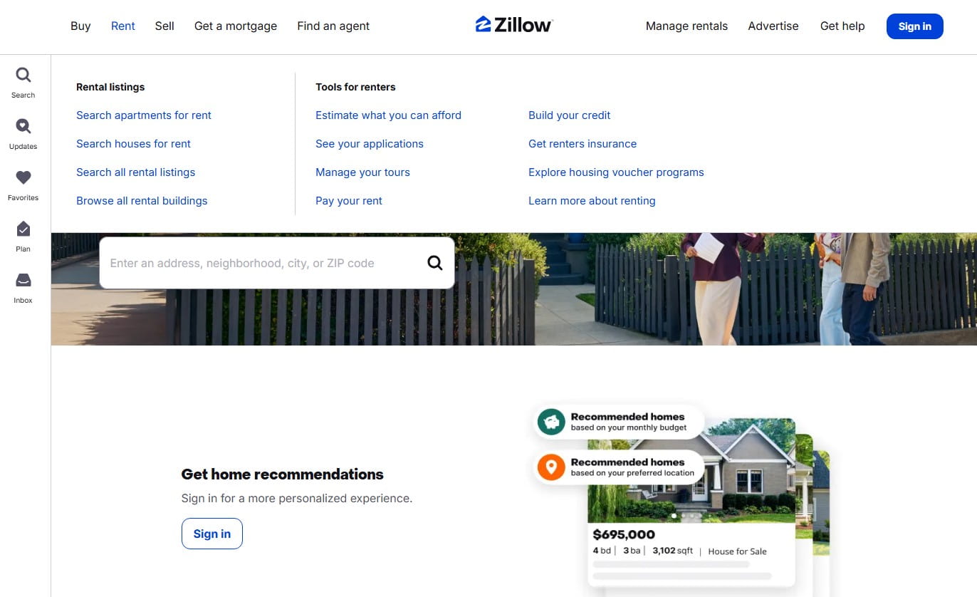
A few practices keep site architecture intuitive:
- Group by intent, not internal structure: buyers think in terms of “Buy,” “Rent,” and “Sell,” not the backend categories a CMS might suggest.
- Keep the main menu to 5-7 items: Zillow limits primary navigation to a handful of labels, pushing filters and secondary options into the page itself.
- Make saved listings one click away: a visible “Saved Homes” or heart icon in the header lets buyers return to shortlisted properties without re-searching.
- Use breadcrumbs on property and location pages: a path like Home > Listings > Austin, TX > 123 Main St helps buyers backtrack without hitting the browser’s back button.
- Keep navigation consistent across devices: a menu that behaves differently on mobile than on desktop forces buyers to relearn the site mid-search.
You have to make the website navigation as frictionless as possible, and keep the most important links/pages as easy to access as you can.
Simplify Property Search and Discovery
A cluttered search experience pushes buyers toward whichever competitor site feels easier to use first. Simplifying the property search experience means cutting the steps between a buyer’s first search and a relevant result.
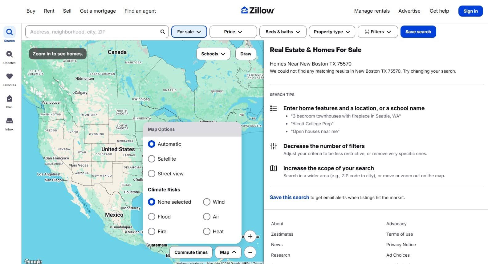
A few practices make search easier to use:
- Limit visible filters to what matters most: price, bedrooms, and location cover most searches, move square footage, HOA fees, and school ratings into an “advanced filters” panel.
- Use map-based search as a default view option: buyers exploring a new area often think in terms of neighborhoods and commute distance before they think in terms of listing IDs.
- Group results into clear categories: “New Listings,” “Price Reduced,” and “Open Houses” help buyers scan for relevance faster than a flat, undifferentiated list.
- Keep filter changes instant: reloading the whole page after every filter click breaks the search flow and adds unnecessary wait time.
- Show a result count before buyers commit to a filter: “42 homes match” tells someone whether to refine further or start browsing immediately.
Fewer, better-placed filters match how buyers actually search, and that alone cuts the time between landing on the site and finding a property worth a second look.
Make Property Information Easy to Scan
A listing page has seconds to convince a buyer it’s worth a second look. Bury pricing, photos, or square footage under agent bios or unrelated widgets, and buyers leave first.
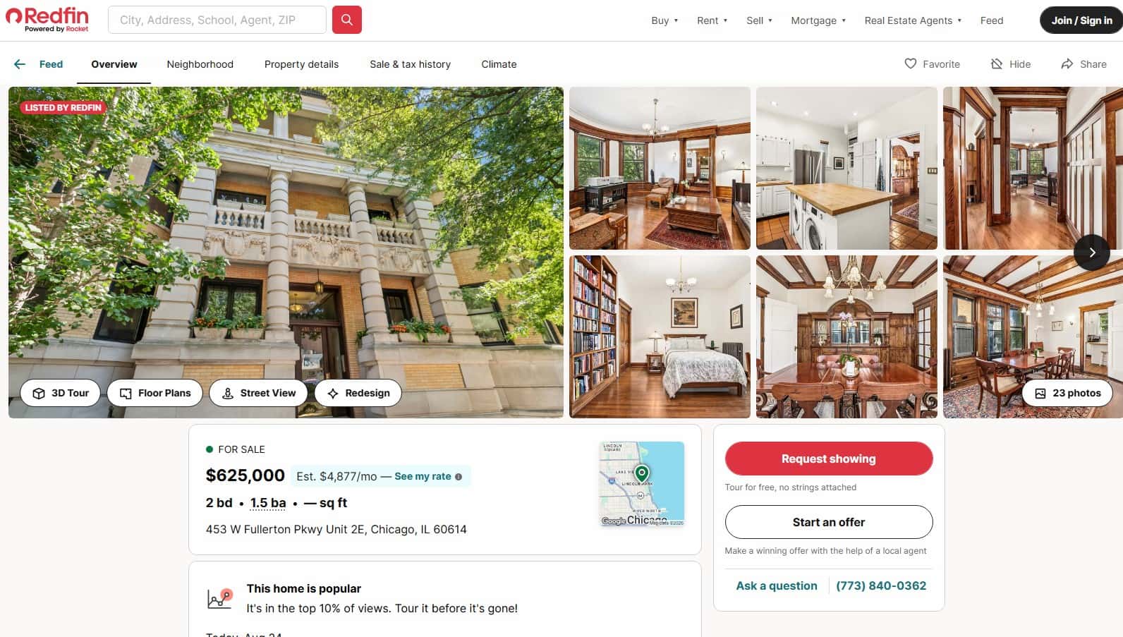
Property pages that scan well follow a consistent order: hero photo, price and key stats (bedrooms, bathrooms, square footage), a short description, then amenities, location, and agent contact, matching how buyers decide: price and size first, features second.
Visuals carry more weight than long descriptions. A gallery of 15-20 well-lit photos with a floor plan and short video tells a buyer more in 30 seconds than paragraphs of text. Key features work best as a labeled row, not a paragraph, so square footage, lot size, and year built sit where a buyer’s eye lands.
Building user-friendly digital interfaces for property websites and apps starts with this page-level discipline, since a scannable page turns a passing glance into an inquiry.
Use Contextual Guidance Throughout the User Journey
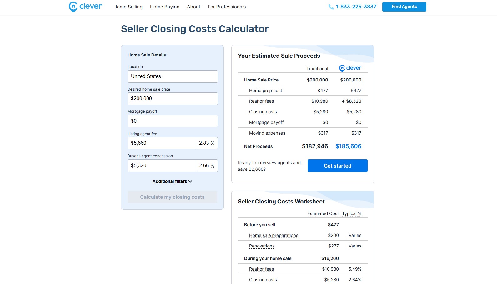
Buyers hit unfamiliar territory more than once during a purchase: mortgage terms, scheduling logistics, inspection steps. Good contextual guidance answers the question before the buyer has to leave the page to search for it, which is the practical outcome of proper user journey mapping for real estate.
| Guidance type | Where it helps | What it does |
| Tooltips | Financing terms, HOA fees, legal disclosures | Defines unfamiliar terms inline, without sending buyers to a separate glossary page |
| Mortgage calculator | Listing pages, pre-inquiry stage | Shows estimated monthly payments based on price, down payment, and rate, so buyers self-qualify before contacting an agent |
| Inline prompts | Search filters, saved searches | Suggests a next step, like widening a price range when a search returns zero results |
| Scheduling assistant | Viewing request forms | Walks buyers through picking a date and time without a back-and-forth email thread |
| Short process explainers | Inquiry and offer stages | Sets expectations for what happens after a form is submitted, reducing follow-up questions to agents |
A single well-placed tooltip or calculator does more for a buyer’s confidence than a page full of instructions they have to read before acting.
Read Also: Real Estate Branding: How to Build a Strong Brand for Property Business
Build Trust Through Transparency
Uncertainty is what keeps a buyer from reaching out. If a listing’s price, photos, or agent details don’t match what a buyer expects to see, they assume the rest of the information might be off too, and they leave before submitting an inquiry.
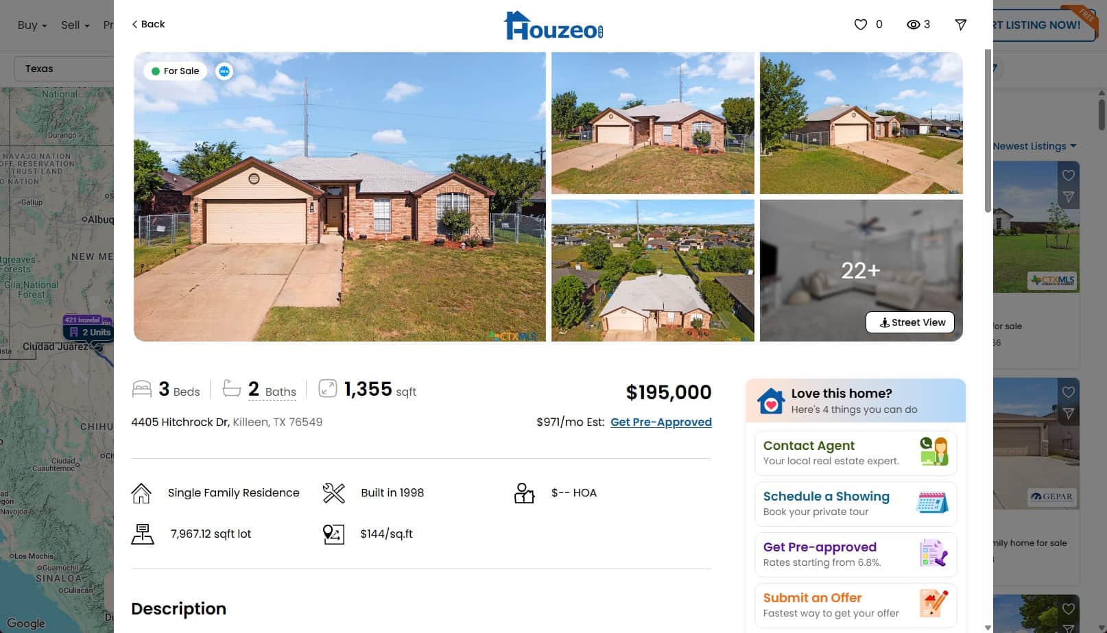
This is one of the clearest examples of why UX is important in real estate: trust signals directly shape whether a buyer takes the next step.
A few practices reduce that uncertainty:
- Verify listing status in real time: a “Sold” or “Under Contract” tag that updates immediately prevents wasted inquiries on properties no longer available.
- Show agent credentials clearly: a license number, years of experience, and a direct phone line next to a listing make an agent feel like a real, accountable person rather than a form field.
- Keep pricing consistent across every page: a price that changes between a search results card and the listing page erodes confidence fast.
- Surface reviews where buyers can see them: agent or brokerage reviews placed near contact information carry more weight than reviews buried on a separate testimonials page.
Accuracy across listings, pricing, and agent details is part of the real estate user experience, and it’s what keeps buyers confident enough to reach out.
Book a Call
Design Frictionless Inquiry and Booking Flows
Every extra field on an inquiry form is a chance for a buyer to give up. A name, phone number, and message are often all a lead needs to get an agent calling back. Fields for financing status or referral source turn a two-minute task into something buyers postpone and forget.
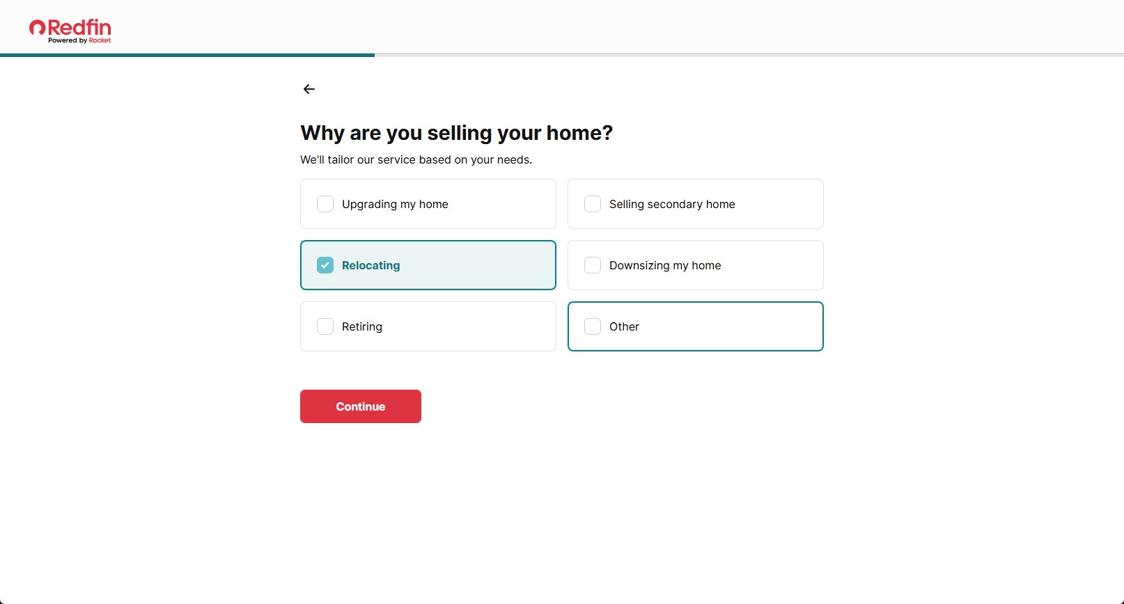
This is where a genuinely user-centered design approach pays off in lead volume. A short form with optional fields collapsed under a “tell us more” toggle lets agents follow up fast while capturing extra context from willing buyers.
Scheduling works the same way: a calendar picker with real-time slots removes the back-and-forth of an email or call. Saved buyer information from a previous inquiry spares returning visitors from retyping details on every listing.
CTAs matter as much as the form. “Request a Viewing” tells a buyer what happens next, “Submit” leaves them guessing.
Read Also: Graphic Design for Real Estate: Creating Visuals That Sell Properties
Optimize Real Estate Experiences for Mobile Users
A responsive layout only solves half the mobile problem. The other half is designing for thumbs, small screens, and spotty connections, not just resizing the desktop layout down.
Mobile-specific practices that hold up in real use:
- Size tap targets for fingers, not cursors: buttons and filter chips need at least 44×44 pixels of tappable space, or buyers miss taps and get frustrated on small screens.
- Support pinch-to-zoom and draw-to-search on maps: buyers often want to circle a specific neighborhood rather than scroll through a rigid list of results.
- Compress and lazy-load property photos: a gallery that loads all 20 images at once on a mobile connection stalls the page exactly when a buyer is deciding whether to keep looking.
- Shrink inquiry forms further on mobile: what’s a reasonable form length on desktop can feel long on a phone keyboard, so mobile forms should ask for even less upfront.
- Keep sticky CTAs visible while scrolling: a persistent “Contact Agent” or “Book a Viewing” button saves buyers from scrolling back up after reading through a long listing.
These details are where real estate website usability is won or lost on mobile, since most buyers now browse listings on a phone rather than a desktop screen.
Help Users Compare Properties and Make Decisions
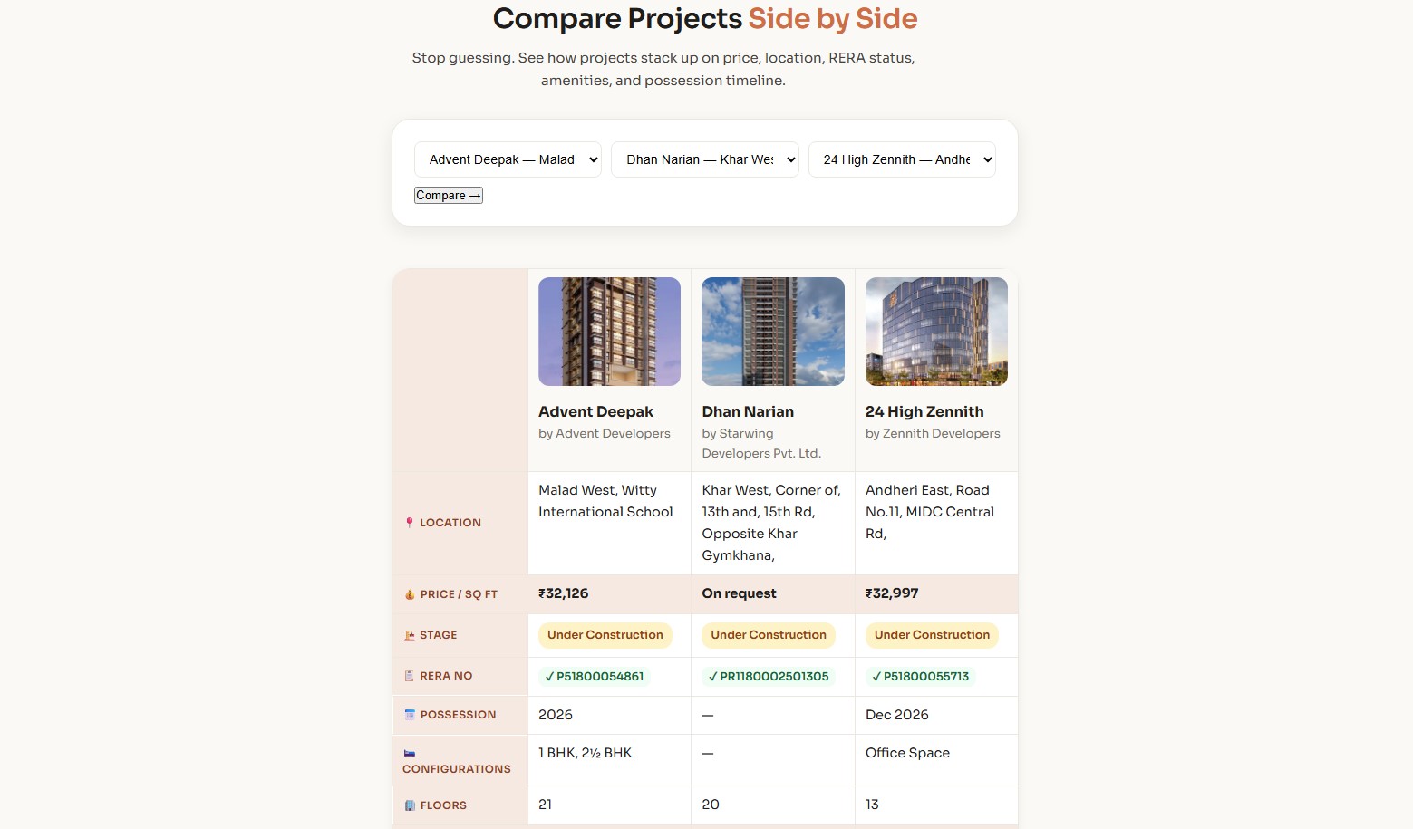
Buyers always shortlist 2-3 properties before they decide to buy one. Provide an intuitive real estate user experience on your site, with tools for weighing options, and you make it much easier for the buyer.
| Comparison element | Why it matters |
| Side-by-side view | Lets buyers place 2-4 saved listings next to each other without reopening tabs or scrolling back and forth |
| Consistent data fields | Every listing should show the same fields in the same order, so a missing square footage number doesn’t look like a red flag |
| Saved properties list | Keeps a running shortlist accessible from any page, so buyers don’t lose track of homes they liked earlier in the search |
| Clear financial breakdown | Estimated monthly payment, taxes, and HOA fees shown per listing let buyers compare true cost, not just list price |
Three or four properties with matching fields and a visible price breakdown are usually enough for a buyer to narrow a shortlist down to one.
Personalize the Real Estate Search Experience
Two buyers searching the same city rarely want the same results: one wants a condo near transit, another a house with a yard in a specific school district. A site that treats both searches the same way wastes time for both.
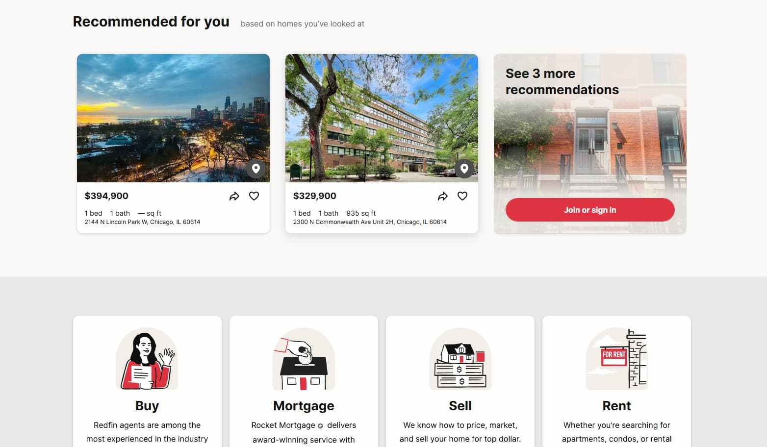
Personalization in real estate UI/UX works best when grounded in behavior a buyer has already shown. Saved searches that re-run and notify buyers of new matches keep people coming back without repeating filters. A “Recently Viewed” section lets a buyer pick up a property search experience exactly where they left it across sessions.
Recommended listings work only when grounded in real signals, price range, neighborhoods, property types, rather than vague popularity metrics that surface mismatched homes and erode trust over time.
How to Test and Validate Real Estate UI/UX Improvements
Assumptions about what buyers want are often wrong. Testing shows what actually happens when real visitors search, browse, and try to contact an agent, which is why validation belongs in every UI/UX process.
A few methods cover most of what matters:
- Usability testing: watch 5-8 real buyers attempt a specific task, like finding a 3-bedroom home under budget, and note where they hesitate or get stuck.
- A/B testing: run two versions of a page, like a short form versus a longer one, and compare inquiry rates directly.
- Heatmaps and session recordings: reveal where buyers click, scroll, or abandon a page, often exposing friction no one expected.
- Post-inquiry surveys: ask buyers who just submitted a form what almost stopped them.
Each method answers a different question, and combining two or three gives a clearer picture than relying on any single one.
If these implementations look like a lot of after-work for you, it’s always a good idea to hire expert real estate UI/UX design services before you start working on your website.
Conclusion
Real estate UI and UX design comes down to removing the small frictions that make buyers give up: confusing menus, cluttered listings, slow pages, and forms that ask for too much too soon. Clear navigation, honest search filters, scannable listing pages, and short inquiry flows all point to the same outcome: a buyer who finds what they need and knows what to do next. Good real estate UI/UX works alongside strong listings and responsive agents, giving buyers the confidence to save a home, book a viewing, or pick up the phone. Testing those changes against real buyer behavior confirms whether they’re actually working.