



A confusing checkout page costs a sale. A confusing healthcare UI/UX design can delay a diagnosis, cause a missed refill, or push a patient to abandon a booking they urgently needed.
Healthcare UI/UX design shapes how patients and clinicians interact with medical websites, portals, and apps, from booking an appointment to reviewing test results. Understanding UX vs UI clarifies why both disciplines need to work together on decisions patients can’t afford to get wrong.
One unclear label or a broken healthcare UX design flow can mean a patient gives up on care entirely. The sections ahead cover navigation, forms, accessibility, and mobile design: the areas where these failures show up most.
How UI/UX Design Improves Healthcare Websites and Apps
Good UI/UX design turns a maze of pages into a system that guides patients toward the right action with minimal friction. Clear information architecture is central to healthcare digital interface design: grouping content around patient tasks, instead of internal department names, cuts search time and improves patient search experience.
Strong healthcare UI/UX shows up in measurable ways: fewer abandoned forms and bookings, accessible layouts for people with visual or motor limitations, streamlined interactions with fewer clicks, and consistent navigation for repeat visits like checking lab results.
Medical website navigation experience also affects trust. A site that’s easy to use signals competence, while a cluttered interface can make an excellent provider feel unreliable. Understanding why UX is important explains why these gains matter: they decide whether someone reaches care on their own schedule.
UI/UX Design Issues That Hurt Healthcare User Experience
Flaws in healthcare UX design do more than annoy users, they block access to care. In a 2026 benchmark of eight major healthcare platforms, difficulty finding information was the single most common complaint across every site, and login friction affected six of the eight. (MeasuringU, 2026)
| Problem | Why It Happens | UX Solution | Example |
| Confusing navigation | Menus follow departments, not patient tasks | Group content by task | “Book a Visit” instead of “Cardiology Dept.” |
| Overloaded screens | Too much text or too many options per page | Split content into clear sections | Separate tabs for results, messages, and billing |
| Unclear labels | Vague text like “Submit” or “Continue” | Use specific, action-based labels | “Confirm Appointment” instead of “Submit” |
| Inconsistent design elements | Buttons and layouts shift between pages | One shared visual system sitewide | Same button style for “Confirm” everywhere |
| Poor accessibility | Low contrast and small targets get missed in reviews | Test with screen readers, add larger targets | 44px minimum button size on mobile forms |
| Complicated forms | Long forms with unclear fields | Group related fields, add guidance | Insurance fields separated from personal details |
Each problem compounds the last: confusing menus lead to cluttered screens, then complicated forms. Teams without in-house design capacity often turn to specialized healthcare UI/UX design services to fix these issues systematically.
Key Elements of Effective Healthcare UI/UX Design
Effective healthcare UI/UX design rests on a handful of elements working together, not on their own. Clear information architecture groups content around patient tasks, so users don’t have to guess where a service lives. Intuitive navigation builds on that structure, using consistent menus and predictable page flows across a site.
Accessible interfaces extend this logic further: readable text, sufficient contrast, and keyboard-friendly controls let elderly patients and people with disabilities complete the same tasks as anyone else. A consistent visual system, meaning the same colors, icons, and button styles throughout, reduces relearning at every touchpoint.
Predictable interactions tie it together. When a button always does what it looks like it will do, patient-centered interface design starts to feel reliable, and that reliability carries digital patient experience design across an entire medical portal, from the homepage to the billing screen.
Effective UI/UX Practices for Better Medical Digital Products
The following practices turn UI/UX principles into concrete design moves. Each one addresses a specific pain point in healthcare products, from disorganized menus to unpredictable forms, with examples you can apply directly.
Organize Medical Information Around User Needs
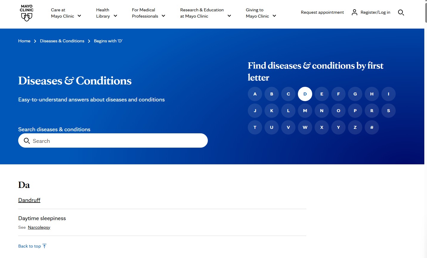
Medical website user experience often mirrors how a hospital is organized internally: by department, specialty, or building. Patients don’t think that way. They think in tasks: find a doctor, understand a condition, book a visit, or check insurance coverage.
Source: Mayo Clinic
Grouping content around these tasks, instead of internal structure, cuts the number of clicks needed to reach an answer. A category-focused website hierarchy improves patient search experience. You can include categories such as:
- Conditions and symptoms
- Treatments and procedures
- Find a doctor or specialist
- Appointments and scheduling
- Billing and insurance
This structure reflects medical user behavior analysis rather than an org chart, and it holds up across a single clinic site or a large multi-hospital network.
Make Appointment Scheduling Simple and Predictable
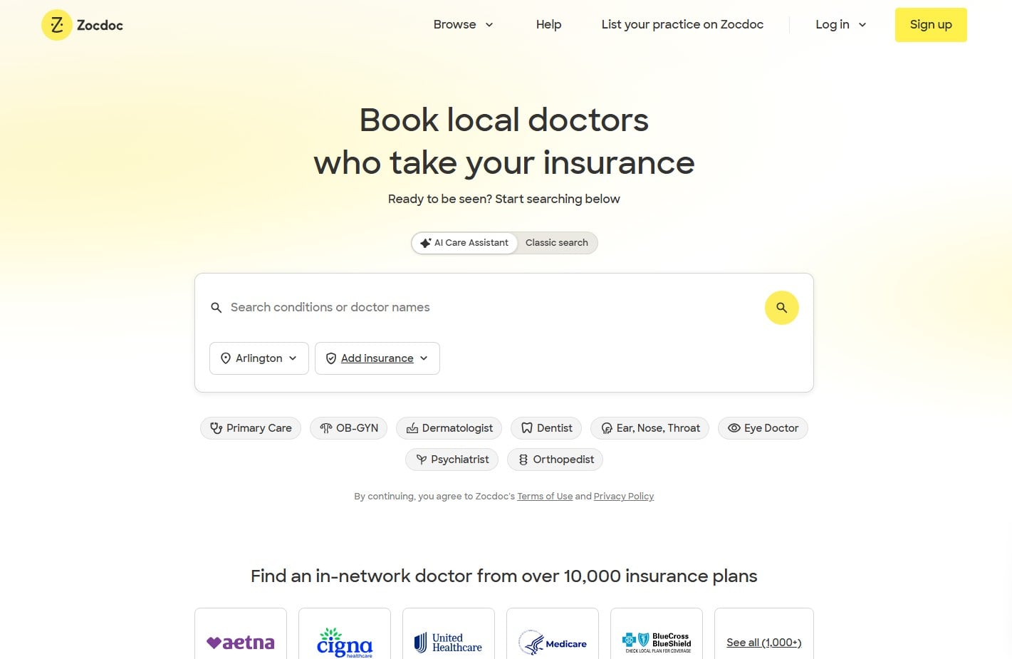
A predictable booking flow reduces abandoned appointments more than almost any other single design change. Patients need to know where they are in the process and what comes next.
Effective scheduling interfaces typically move through clear, visible steps:
- Select a service or reason for the visit
- Choose a provider or location
- Pick an available date and time
- Confirm details and receive immediate confirmation
Source: Zocdoc
Each step needs a visible progress indicator, plain-language labels instead of internal codes, and instant feedback when a patient picks a time slot, so a slot never looks available and then turns out to be booked a screen later.
Removing unnecessary fields, like asking for insurance details before a specialty is chosen, keeps healthcare UI/UX design predictable and shortens the path to a confirmed booking.
Make Service and Provider Information Easy to Scan
Patients evaluating a service or provider decide in seconds whether a page has what they need. A scannable layout surfaces the details that matter most, without a scroll through unrelated text.
| Element | Why It Matters |
| Service name and plain description | Tells patients what the service treats, in everyday words, not jargon |
| Insurance and pricing information | Lets patients gauge cost upfront, before calling the office |
| Provider name, specialty, and credentials | Builds confidence before a patient reaches out |
| Location and availability | Confirms whether the option is accessible to them |
| Photo or short bio | Adds a personal signal that reduces uncertainty before a first visit |
Structuring these details consistently across every service page supports conversion-focused healthcare design, since patients rarely dig for information they cannot find quickly.
Design Interfaces for Healthcare Accessibility
Accessibility in healthcare UX design isn’t optional. Patients managing chronic conditions, older adults, and people with visual or motor impairments make up a large share of medical website traffic, and a design that hampers healthcare website usability fails its basic job.
- Keyboard navigation: every action works without a mouse.
- Skip navigation links: a hidden link jumps keyboard users past repeated menus.
- Focus states: a visible outline shows where keyboard users are on a page.
- Screen reader support: semantic structure lets assistive tech announce content correctly.
- Color contrast: text stays readable for low vision or color blindness.
- Color-independent cues: pair a red error field with an icon, not color alone.
- Text resizing: content reflows cleanly when patients zoom in.
- Large touch targets: buttons sized for fingers, not cursors, reduce misclicks.
- Descriptive labels and alt text: “Schedule a follow-up” and image descriptions remove guesswork.
- Video captions: patient education videos need captions for deaf users.
- Flexible time limits: forms shouldn’t expire mid-entry for slower typers.
- Clear error identification: messages point to the exact field and fix needed.
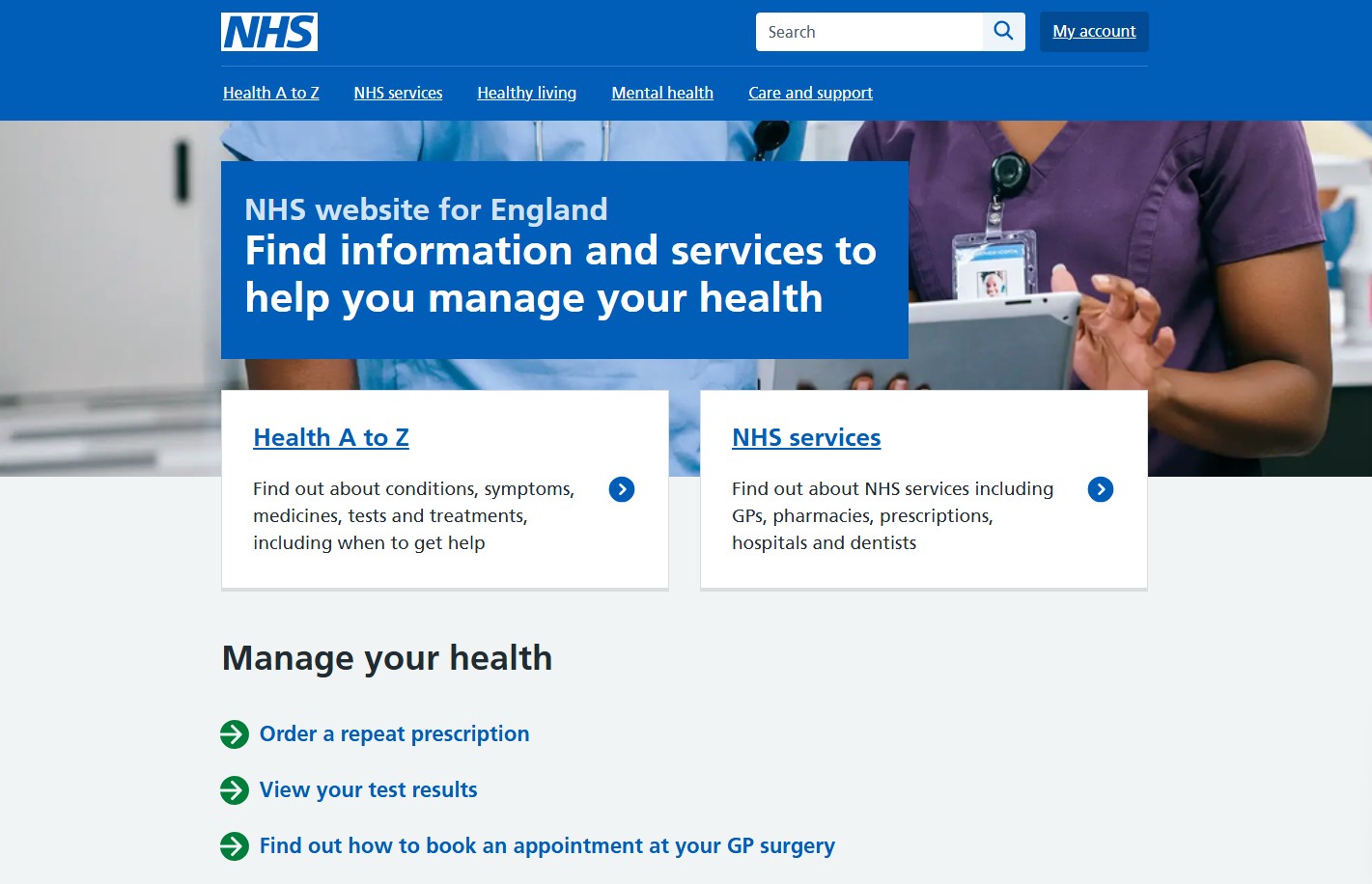
Together, these practices define medical interface usability for the people who need it most. For inspiration, take a look at NHS’ homepage, observe how they have made the website easy to navigate and accessible to almost every patient.
Source: NHS
Build Patient Trust Through Transparency
Patients hesitate to book with a provider they can’t verify. Interfaces that make credentials, pricing, and outcomes visible upfront reduce that hesitation before a patient ever picks up the phone.
A few transparency signals do most of the work:
- Verified provider credentials, licenses, and board certifications displayed on profile pages
- Clear, upfront pricing or insurance-acceptance information, not buried in a PDF
- Accurate, current details on services, wait times, and availability
- Visible patient reviews and ratings, including responses to negative feedback
None of this requires new technology, just consistent placement across every provider and service page. When patients can verify who they’re seeing and what it costs before committing, they trust the platform enough to complete the booking instead of abandoning it to call around.
Book a Call
Present Complex Medical Content Clearly
Medical information is often dense by nature: dosing instructions, procedure risks, lab result ranges. The goal isn’t to simplify the content until it loses meaning, but to structure it so patients can absorb it in stages.
Visual hierarchy does most of the work. Bolding key numbers or warnings, breaking long explanations into short sections with descriptive headings, and using expandable sections for secondary details let patients see the essential point first and dig deeper only if they need to. A lab result page, for example, can show the number and whether it falls in a normal range immediately, with an expandable note explaining what it means for someone who wants more context.
Supportive visuals, like a simple diagram of a treatment timeline, often communicate a process faster than a paragraph of instructions and protect medical website user experience without stripping out information patients need to decide.
Create Clear and Consistent Form Experiences
Patient forms handle sensitive information, so small medical interface usability failures may lead to abandoned registrations or incomplete medical histories. Consistency across every field reduces friction and errors.
| Practice | Why It Helps |
| Consistent field layout | Patients don’t relearn the structure between registration, history, and insurance sections |
| Clear input formats, like date pickers | Reduces formatting errors and rejected submissions |
| Inline validation | Flags a problem immediately, before a patient reaches the final submit step |
| Plain-language error messages | Tells patients exactly what to fix, not just that something is wrong |
| Logical field grouping | Groups related fields, like insurance and emergency contact, so the form reads like a conversation |
Applied consistently across registration, medical history, insurance, and appointment request forms, these practices are core to reliable healthcare UI and UX design.
Build Intuitive Patient Portal Interfaces
A patient portal often holds more information types than any other part of a healthcare product: test results, prescriptions, appointments, messages, billing, and medical records, all in one place. Cramming these into a single dashboard without understanding healthcare user journey analysis overwhelms and annoys users.
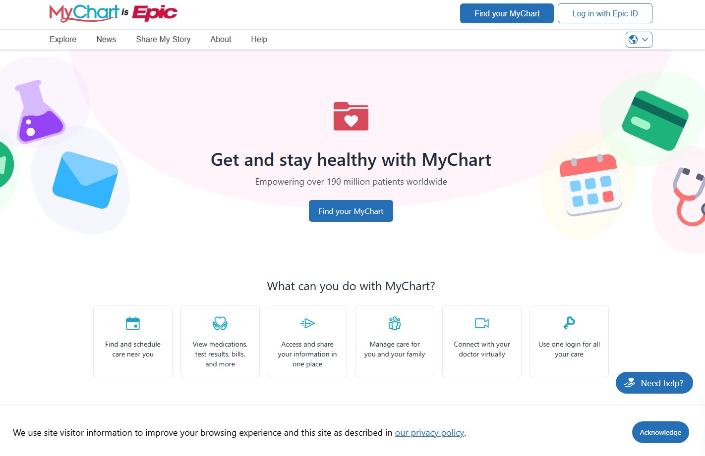
Source: MyChart
A clear dashboard groups these categories into distinct, labeled sections rather than one long scrolling feed. Recognizable interface patterns, like a calendar view for appointments and a simple list for messages, let patients apply what they already know from other apps instead of learning something new. Straightforward medical website navigation experience, such as a persistent side menu, keeps every category one click away regardless of where a patient currently is.
This structure matters most when a patient is managing multiple conditions or checking results under stress. A well-organized healthcare UI/UX design turns a portal into a tool patients actually return to, rather than one they avoid.
Use Visual Hierarchy to Highlight Critical Actions
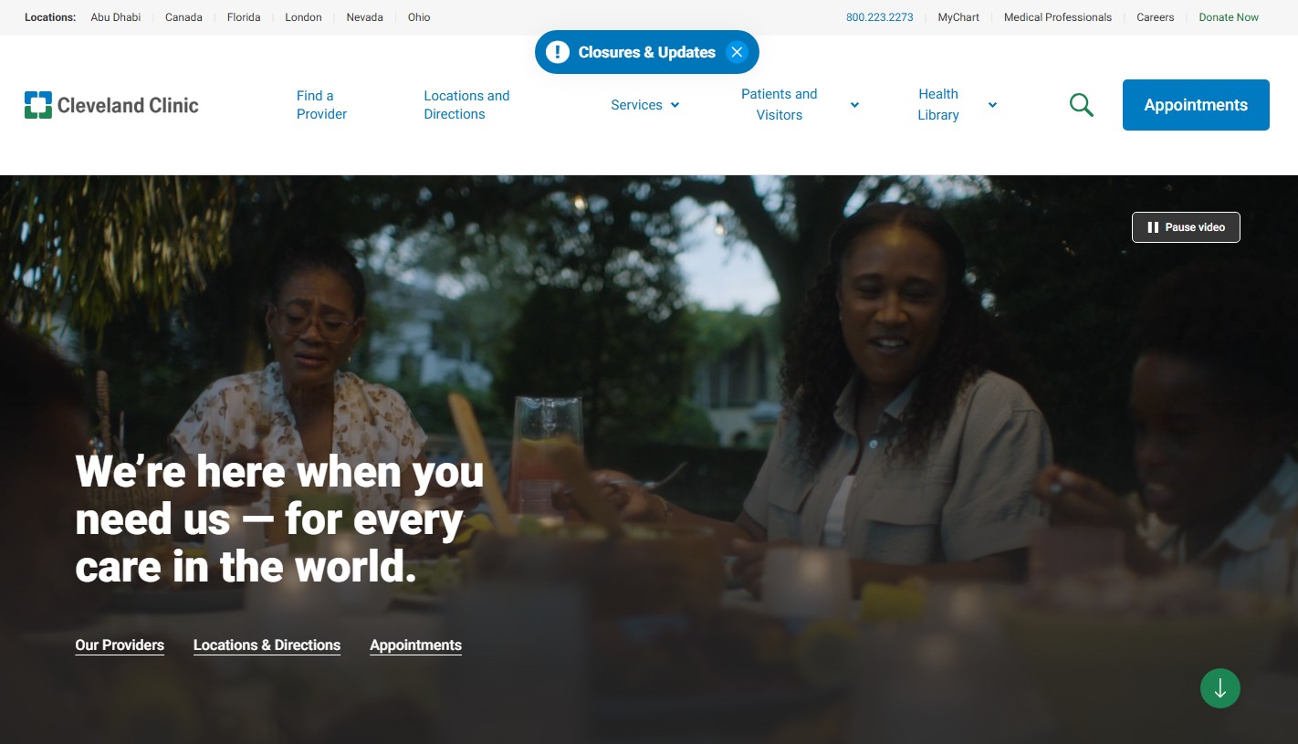
Source: Cleveland Clinic
Not every action on a healthcare digital interface design carries the same weight. Booking an appointment matters more in the moment than reading a privacy policy, and the layout should show that difference immediately.
- Size and placement: put the primary action, like “Book Appointment” or “View Results,” above the fold in a larger, high-contrast button.
- Color and contrast: reserve a distinct, consistent color for primary actions so patients recognize it across every page.
- Whitespace: surround critical buttons with enough space that they don’t compete with secondary links or menus.
- Typography weight: use bolder or larger text for headlines tied to urgent tasks, like results ready for review.
- Limited competing elements: avoid stacking equally prominent buttons on one screen, which forces patients to guess what matters most.
Applied together, these choices support patient journey optimization by making the next right step obvious at every stage.
Design Effective Mobile Healthcare Experiences
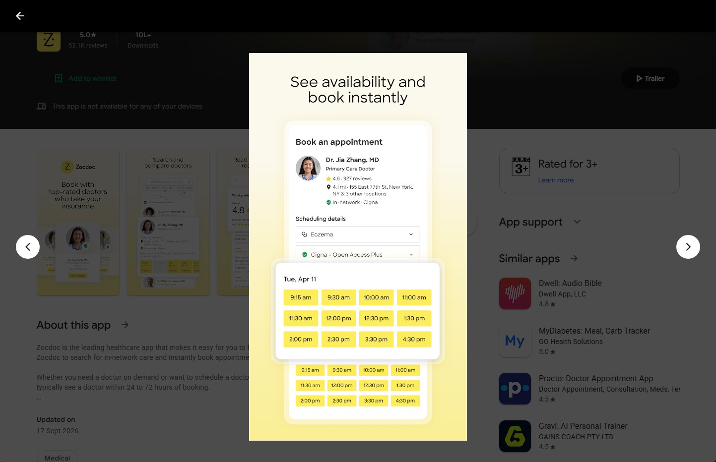
Source: Google Play
Patients often reach healthcare portals from a phone mid-task: at a pharmacy, or checking a result on break. Mobile healthcare UX needs its own tradeoffs, not a smaller desktop layout.
| Mobile Practice | Healthcare Example |
| One-handed booking | Scheduling while holding the phone in one hand |
| Document upload | Snapping and submitting an insurance card in seconds |
| Fast result checks | Test results load without scrolling the portal |
| Push notifications | Appointment reminders without opening the app |
| Telehealth readiness | Video visits launch reliably on mobile data |
| Poor connectivity | Forms save progress if signal drops |
These choices matter more on mobile than desktop, since a frustrated patient on a small screen has fewer ways to work around a clumsy interface.
Provide Clear Feedback at Every Interaction
Uncertainty is dangerous in healthcare interactions. When a patient submits a form, schedules an appointment, or uploads an insurance document, they need to know it worked, without refreshing the page or calling the office to check.
A confirmation message after every submission removes that doubt immediately. Loading states matter just as much: a spinner or progress bar tells a patient the system is working, rather than leaving a blank screen that looks broken. Inline validation catches problems before submission, but clear error handling still matters for the cases that slip through, explaining exactly what went wrong and how to fix it.
Status updates extend this further, showing whether a request is pending, confirmed, or needs action. This kind of feedback loop is basic healthcare UI and UX design, but skipping it turns routine tasks into sources of anxiety at moments when patients can least afford it.
How to Evaluate Medical UI/UX Performance
A redesign means little without proof that patients can actually use the result. The goal isn’t just measuring whether something works, it’s diagnosing why it doesn’t.
Task-based usability studies and healthcare user journey analysis reveal where someone hesitates or backtracks, information no opinion survey captures. Pairing these methods with analytics turns raw numbers into a diagnosis:
| Metric | What It Usually Reveals |
| High form abandonment | Unnecessary fields or confusing input formats |
| Repeated backtracking | A navigation or information architecture problem |
| Long task completion time | An unnecessarily complicated workflow |
| Repeated errors on one step | Unclear labels or mismatched input formats |
| Weak patient journey optimization scores | Too many clicks or dead ends between a goal and its outcome |
| Low task completion rate | Too many steps, or an unclear next action at a key point |
| High bounce rate on a landing page | A misleading entry point or unclear value on arrival |
| High click depth to reach a goal | Weak information architecture burying key content |
Accessibility checks belong in every evaluation cycle, not just at launch. Automated scans catch missing alt text, but manual testing with screen readers catches problems tools miss.
Feedback analysis ties it together. Support tickets and review comments often flag the same issues usability testing finds, just in the patient’s own words. Teams that treat this feedback as ongoing input, not a one-time audit, tend to follow a more consistent UI/UX process that catches problems before they affect a large share of users.
Conclusion
Healthcare UI/UX design determines whether patients complete the tasks that matter most: booking care, understanding a diagnosis, or managing a portal full of results and records. The practices covered here, from task-based navigation to accessible forms and clear feedback, share one goal: reducing the effort between a patient’s need and the action that meets it.
None of these elements work well in isolation. A well-organized information architecture loses value if the accessibility is poor, and a fast booking flow means little if the confirmation never arrives. Strong healthcare UI and UX design treats these pieces as connected, not separate checkboxes.
Evaluating performance regularly, rather than only after a major redesign, keeps a product aligned with real user-centered design principles as patient needs and expectations shift over time.