- Startup UX decisions should prioritize first-value activation over comprehensive feature discovery.
- Early-stage startups can validate critical user flows before committing resources to development.
- Startup onboarding friction becomes measurable through setup abandonment and time-to-value metrics.
- Scalable UX systems prevent navigation inconsistencies as startup products expand beyond MVP functionality.
- Startup UX budgets deliver greater value when research targets high-risk product assumptions.
Startup UX design is the practice of shaping a new product around the needs of its first users. It covers research, user flows, and interface patterns that help people reach value without assistance. For an early-stage company, thoughtful design turns a promising idea into a product customers keep using.
Young products face a specific design problem. Teams work with limited budgets, incomplete data, and requirements that shift after every customer conversation. The sections below explain which principles matter at each stage and how to apply them without slowing development.
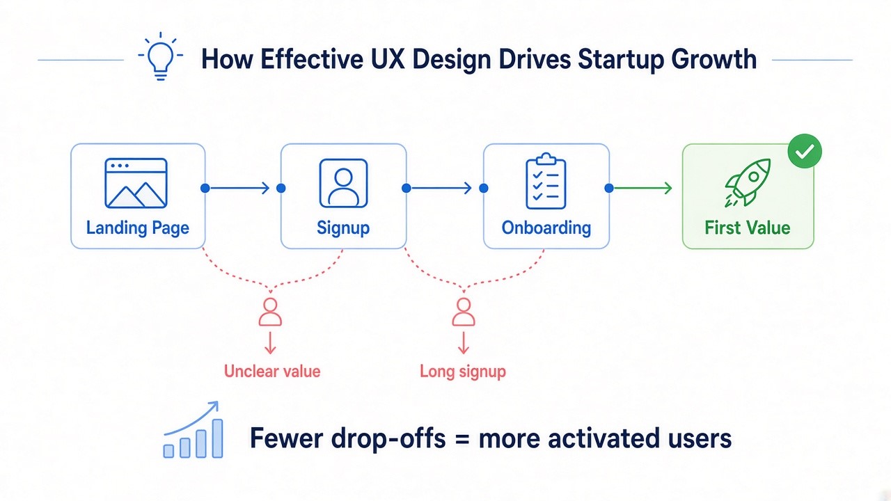
How Effective UX Design Drives Startup Growth
Effective startup UX drives growth by shortening the path from first visit to first value. When people understand a product quickly, more trial users activate and come back. Clear experiences also lower support demand, which matters when a small team answers every ticket.
Founders who see why UX is important treat interface friction as a hidden marketing cost. Confusing signup flows can waste acquisition spending when paid visitors leave before activating. Design quality affects growth through four connected mechanisms:
- Product adoption: a clear value proposition helps trial users activate sooner.
- User engagement: efficient workflows encourage repeated use of core features.
- Retention: predictable interfaces reduce the frustration that leads to cancellations.
- Early customer acquisition: satisfied early adopters are more likely to recommend the product.
When competing products offer similar functionality, usability becomes an important differentiator. Startup product experience optimization should begin before the first release. Early improvements help teams remove friction before acquisition spending increases.
Core Startup UX Design Principles
Core startup UX design principles are shared rules that guide product decisions from prototype to growth. They help small teams judge trade-offs quickly when research time is short. Seven principles cover most early product decisions:
- Simplicity: launch with the features needed for the core job and defer the rest.
- User-centered design: base each decision on observed behavior and real feedback.
- Consistency: reuse the same navigation, components, and interaction patterns everywhere.
- Clarity: label actions in customer vocabulary and show the next step on every screen.
- Flexibility: structure layouts so new features fit without rebuilding navigation.
- Feedback: confirm completed actions and explain errors with a specific fix.
- Efficiency: remove steps, prefill known data, and offer shortcuts for repeated tasks.
These principles often pull in different directions. Simplicity argues for fewer options, while flexibility asks for room to grow. A workable compromise keeps today’s interface minimal and makes the underlying structure expandable.
Validation shows whether each principle works in practice. Clarity, for example, can be tested by asking users to predict what a button does before they click it. When predictions fail, the label or layout needs work before the feature ships.
Grounding decisions in user-centered design also helps startups adapt as customer expectations change. Each research round shows whether earlier priorities still match how people work. Product teams can then adjust the roadmap with evidence rather than internal opinion.
Essential UX Design Elements Every Startup Product Needs
Seven UX elements help startups build products that users can understand and navigate confidently. Each addresses a distinct usability problem and supports adoption in its own way. The comparison below covers their purpose, impact on usability, and contribution to growth.
| UX Element | Purpose | Impact on Usability |
| User onboarding | Guide new users to their first meaningful result | Reduces confusion during the first session |
| Navigation and information architecture | Organize features around how users think about their tasks | Helps users find functions without searching help pages |
| Interface simplicity | Show only the controls needed for the current task | Lowers cognitive load and the chance of errors |
| Mobile responsiveness | Adapt layouts to different screen sizes and input methods | Keeps core tasks usable on phones and tablets |
| Accessibility | Make the product usable for people with different abilities | Supports keyboard, screen reader, and touch interaction |
| Feedback and interaction patterns | Confirm actions and communicate system status | Builds confidence that each action worked |
| Personalization | Adjust content to each user’s role or behavior | Surfaces relevant features faster |
Product growth depends on how these elements work together. Onboarding brings people to value, while navigation and simplicity keep them productive. Personalization becomes useful once usage data shows which features each segment relies on.
Practical Startup UX Framework for Building Better Products
The practices below adapt UX design for early-stage startups that ship quickly with limited resources. Each one relies on real user behavior to confirm design decisions before they become expensive. Together they form a repeatable startup UX cycle of mapping, testing, and measuring.
Design User Flows Around Core Product Goals
A user flow is the sequence of screens and actions a person follows to complete one goal. Start by listing the two or three outcomes that prove the product works, such as sending a first invoice. Then map every step between signup and each outcome, including emails and waiting states.
Review the map for steps that add effort without adding value. Common candidates include duplicate data entry, unnecessary confirmations, and fields that can wait. Four edits usually shorten a critical flow:
- Remove: delete steps that do not affect the outcome.
- Defer: move optional settings until after the first success.
- Prefill: reuse data the product already knows.
- Clarify: give each step one primary action with a descriptive label.
Flow mapping fits naturally into the UI/UX design process, before wireframes fix the layout. Intuitive flows support activation because new users complete key tasks without guessing. A documented flow then gives startup user journey optimization a baseline teams can measure.
Validate UX Decisions Through Early User Testing
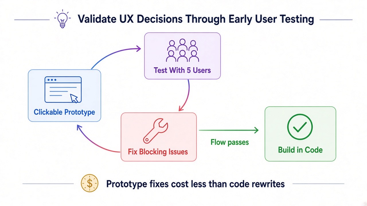
Early user testing shows whether real people can complete key tasks before engineering builds the full product. Clickable prototypes answer most questions about navigation, labels, and flow order. Fixing a prototype is usually far cheaper than rewriting shipped code.
Small studies suit startups with tight budgets. Usability research shows that testing with five users uncovers about 85% of the problems in a design. That estimate assumes similar participants, so products serving distinct groups need testers from each group.
Combine methods to answer different questions. Usability testing reveals where people struggle, while interviews explain goals and workarounds. This mix keeps user-centered design for startup products grounded in evidence. Blocking problems come first, and cosmetic issues can wait.
Simplify the First-Time User Experience
In startup UX, the first session often decides whether a new user returns. A strong user onboarding experience for startups removes everything that delays the first meaningful outcome. That outcome might be a published page, a synced account, or a shared report.
Most early friction comes from unclear next steps, empty screens, and too many choices. Each technique below targets one of these causes without adding new screens. The four work best together:
- Guided onboarding: let users complete real setup tasks instead of watching a tour.
- Contextual tips: explain a control only when users first reach it.
- Clear calls to action: give each screen one visually dominant next step.
- Progressive disclosure: hide advanced settings until users need them.
Measure success through time to first value and setup completion rate. If many users stall at one step, simplify that step before adding more guidance. Frictionless digital product experiences usually come from removing work, since extra tooltips rarely fix a confusing flow.
Prioritize UX Improvements Based on User Feedback
Early adopters generate more feedback than a small team can act on. Each source reveals a different kind of usability problem, so collect several and compare them. The table shows what common methods contribute and where they fall short.
| Feedback Method | What It Reveals | Main Limitation |
| In-app surveys | Satisfaction and friction at specific moments | Short answers often lack context |
| Support requests | Recurring confusion and broken workflows | Covers only users who ask for help |
| Session recordings | Where users hesitate, misclick, or abandon tasks | Shows behavior without explaining motives |
| User interviews | Goals, expectations, and reasons behind behavior | Small samples need confirmation from usage data |
Group incoming feedback by the workflow it affects, then score each issue by frequency and severity. An issue reported by a few users can still matter if it blocks payment or setup. Startup app usability improvements should target these high-impact problems before broader polish.
Build Flexible Interfaces That Can Scale With the Product
Startup UX must accommodate changing requirements as teams learn more about customer needs. Navigation designed for a small feature set can become confusing as the product expands. Scalable user experience design for fast-growing startups plans for that growth from the first navigation model.
Reusable UI components are the practical starting point. Build buttons, forms, and tables once and assemble new screens from these tested parts. Navigation should also leave room for new sections, such as a collapsible sidebar with nested groups.
A consistent pattern library turns these components into a scalable design system. Engineers ship features faster when patterns already exist, and designers spend less effort on one-off screens. Scalable UX design for growing startups also keeps the experience familiar as the user base expands.
The UX vs UI distinction helps startup teams separate structural product decisions from visual styling choices.
Adapt Product UX as the Startup Finds Product-Market Fit
UX priorities change as a startup moves from validation toward product-market fit. Early on, design work tests whether the core idea solves a real problem. Later, the focus shifts toward deeper workflows built for larger accounts.
Feature usage patterns show where to invest next. Features supporting successful customer workflows deserve refinement, while consistently unused features warrant further investigation. Cohort comparisons reveal which workflows separate users who stay from those who leave.
UX strategies for product-market fit keep the product aligned with evolving needs. Introduce new functionality through existing patterns, so experienced users do not have to relearn the interface. Revisit onboarding as well, since the ideal customer profile often changes during this stage.
Use UX Analytics to Identify Drop-Off Points
Startup UX analytics pinpoint where users abandon important workflows, at a scale interviews cannot reach. Define a funnel for each core task, then track how many users reach every step. Sharp funnel drop-offs identify steps worth investigating for usability, technical, or expectation-related problems.
| Indicator | What It Shows | Possible UX Response |
| Task completion | Share of users who finish a core workflow | Simplify or reorder the steps where users quit |
| Onboarding drop-offs | The setup step where new users stop | Shorten, defer, or explain that step |
| Feature adoption | How many active users try a feature | Improve its visibility or entry point |
| User retention | How many users return after set periods | Refine the workflows that retained users repeat |
Analytics describe what happens, while session recordings and interviews explain why. Pair each drop-off with qualitative evidence before redesigning the step. Without both, teams risk treating symptoms while the underlying cause remains untouched.
Book a Call
Maintain Consistency Across Product Interfaces
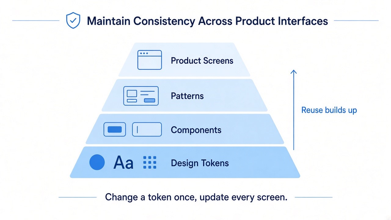
Consistency in startup UX lets users apply what they learn on one screen to every other screen. Predictable patterns reduce hesitation because people already know where actions live and how they behave. Inconsistency grows quickly when several people ship features without shared rules.
A documented design system holds quality steady as the product grows. Even a lightweight version in a design tool prevents duplicate components. Document four areas first:
- Navigation: menus and page structure follow one model across modules.
- Visual hierarchy: size, color, and spacing signal importance the same way.
- Terminology: each action and object keeps one name everywhere.
- Interaction patterns: forms, modals, and alerts behave identically.
Audit the system after each major release to remove duplicates and outdated patterns. Intuitive product interfaces depend on this upkeep, since small exceptions accumulate over time. Assign one owner for the system, even part-time, so decisions stay coherent.
How to Balance UX Design Costs and Product Development Priorities
Startups balance UX costs by funding the design work that reduces the biggest product risk at each stage. Research and prototyping come first because they prevent building the wrong features. Design systems and external expertise follow once the core workflow is validated and releases become regular.
UX budgets should reflect product complexity, research needs, and the cost of correcting mistakes after development. Compare providers by deliverables rather than headline hourly rates. A narrow MVP may need flow mapping and prototype testing before a complete design system. Clear investment triggers make UX design for startups easier to plan:
- UX research: before major build decisions, such as choosing the first workflows to develop.
- Prototyping: whenever a feature is costly to build or hard to reverse.
- Design system: once several people design or build screens in parallel.
Reserve additional design capacity for validated workflows that require expansion. External specialists become useful when internal teams lack research expertise or cannot support regular releases. Evaluate each investment against the product risk it reduces.
Conclusion
Startup UX succeeds when design decisions follow real user behavior from the first prototype onward. Clear flows, simple onboarding, and consistent patterns help new users reach value and return. Testing and analytics then show which of these areas needs attention next.
Limited budgets favor small, frequent investments over large redesigns. Fund research and prototypes early, then add shared components as the product and team grow. Products built with this startup UX design approach can add features without losing their original simplicity.