

- Fintech interfaces must distinguish available balances from pending transactions and restricted funds.
- Payment confirmation screens must disclose recipient details, applicable fees, and processing timelines.
- Fintech usability testing must cover failed authentication, interrupted transfers, and duplicate payment attempts.
- Financial dashboards should prioritize actionable account information over decorative performance visualizations.
- AI-powered financial recommendations require accuracy testing and clear explanations of prediction limitations.
Fintech product design is the process of creating financial applications that make complex transactions understandable, secure, and manageable. Effective product design for fintech combines user research with interface architecture and usability validation. These solutions transform complex financial processes into intuitive digital experiences while clarifying costs and consequences. Our guide explains practical methods for developing financial experiences that remain useful beyond their initial release.
What Is Fintech Product Design?
Fintech product design combines research, interface planning, and interaction testing to create usable digital financial services. Its scope includes banking applications, payment systems, lending platforms, and investment products. Each experience must support informed decisions while respecting security requirements and technical limitations.
Unlike purely visual work, fintech user experience design addresses the consequences of every interaction. An unclear balance can cause spending mistakes. Misleading payment feedback may leave customers uncertain whether money has moved.
Five principles should guide financial product development:
- Clarity: Explain financial information using familiar language and consistent labels.
- Control: Allow customers to review decisions and understand available alternatives.
- Reliability: Provide accurate statuses and predictable responses throughout important transactions.
- Accessibility: Support different abilities without creating unnecessary operational barriers.
- Transparency: Present relevant costs and restrictions before users commit.
Translate these principles into acceptance criteria for critical financial tasks. Test whether customers identify available funds and recognize completed transactions correctly. Include accessibility checks before approving essential payment flows.
How Does Fintech Product Design Differ From Traditional Product Design?
Financial products expose customers to consequences that ordinary digital interactions rarely involve. An incorrect delivery preference creates inconvenience, while an incorrect payment recipient can cause financial loss. Product design for fintech therefore requires stronger error prevention and clearer confirmation feedback.
| Design dimension | Fintech products | Other digital products |
| Primary concern | Financial accuracy and informed decisions | Convenience and task completion |
| Error consequences | Monetary loss or regulatory exposure | Often reversible inconvenience |
| Information requirements | Fees, balances, rates, and restrictions | Product features and preferences |
| Authentication | Risk-sensitive verification | Often lower-risk account access |
| User journeys | Multiple verification and processing states | Frequently shorter interaction paths |
| Success criteria | Completion, comprehension, and error prevention | Completion, engagement, and satisfaction |
The same principle applies to digital banking interface design. A balance should indicate whether funds are available or temporarily restricted. Showing one unexplained number can create false expectations about spending capacity.
Key Stages of the Fintech Product Design Process
The financial product design process should validate assumptions before teams invest heavily in development. Each stage of product design for fintech produces evidence supporting subsequent decisions. Research findings must remain accessible throughout implementation rather than disappearing after initial discovery.
A structured product design process helps teams connect research outcomes with concrete deliverables. Financial applications also require early input from security and compliance specialists. Their requirements can affect navigation and interaction patterns before visual design begins.
Discovery and User Research
Discovery should begin with specific financial tasks rather than proposed screens. Teams need to understand account types and transaction rules. Product owners must also identify regulatory requirements affecting each customer journey.
Fintech UX research should combine interviews with available behavioral evidence. Ask participants to describe recent financial decisions and confusing experiences. Compare those accounts with support requests and abandonment patterns.
Research findings should distinguish processing delays from unclear transaction feedback. Comparing system timestamps with customer complaints helps identify underlying causes. Document validated user scenarios and unresolved risks before deciding whether engineering or interface changes are necessary.
Information Architecture and Prototyping
Information architecture determines where customers find financial information and complete important actions. Organize navigation around recognizable goals rather than internal department names. Users should locate payment history without understanding the provider’s operational structure.
Wireframes establish the order of decisions and disclosures. Interactive prototypes then expose timing problems and confusing transitions. Test realistic amounts and processing states before approving visual details.
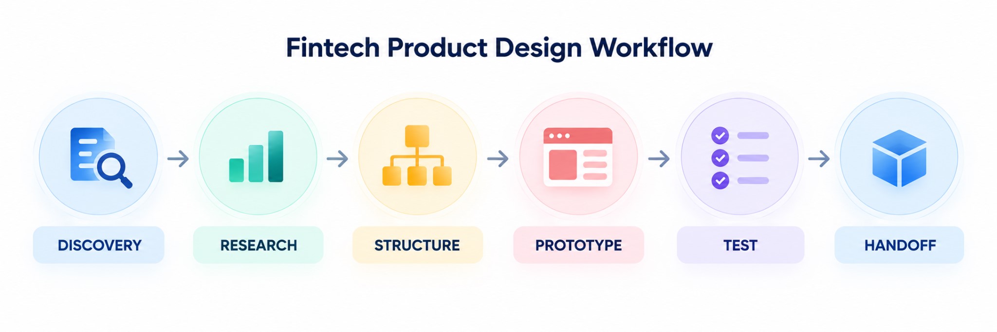
Usability Testing and Developer Handoff
Fintech usability testing should include successful transactions and recoverable mistakes. Participants might enter incorrect recipient details or encounter expired verification codes. Observe whether they recognize problems without researcher assistance.
Developer handoff requires more than polished screens. Specifications should describe loading states and error recovery behavior. Engineers also need rules for unavailable balances and interrupted transactions.
Define acceptance criteria before implementation begins. Failed transfers, for example, must display accurate statuses without suggesting successful settlement. Confirm implementation feasibility with engineers, then validate the completed interactions against approved specifications.
Best Practices for Effective Fintech Product Design
Effective financial interfaces reduce uncertainty without concealing important details. Their design should reflect actual customer behavior and transaction consequences. Prioritize interactions where misunderstanding could cause financial loss.
Map Financial User Journeys Before Designing Screens
Map the complete task before designing individual interfaces. A payment journey includes recipient selection and confirmation. It may also involve authentication, processing delays, and failure recovery.
A useful journey audit includes:
- Entry point: Identify why the customer starts the task.
- Decision point: Record information needed before proceeding.
- Friction point: Locate confusion or unnecessary effort.
- Recovery path: Define what happens after an interruption.
- Completion signal: Specify evidence that the task succeeded.
Consider a customer scheduling a recurring transfer. The interface should explain payment frequency and the first execution date. A review screen must also show how future payments can be changed.
Make Complex Financial Information Easier to Interpret
Financial data visualization should clarify decisions rather than decorate dashboards. Prioritize figures according to their practical importance. A savings interface might emphasize available funds before historical performance charts.
Use consistent labels for balances and transaction states. Separate estimated values from confirmed amounts. Explain unfamiliar terminology beside relevant figures to reduce confusion during financial decisions.
Financial disclosures should explain costs before customers make binding decisions. Loan comparisons must distinguish monthly installments from total repayment amounts. Present applicable rates alongside fees to reveal the full borrowing cost.
Design Around Real Financial Scenarios
User-centered financial product development requires realistic tasks with meaningful constraints. Test what customers actually need to accomplish. Avoid prototypes that assume perfect connectivity and uninterrupted attention.
A payment interface should accommodate incorrect recipient information and insufficient funds. Recurring payment controls must distinguish cancellation from temporary suspension. Loan comparison tools should account for different repayment periods.
Scenario testing should cover these situations:
- Complete a transfer using unfamiliar recipient details.
- Review a scheduled payment before its execution date.
- Compare borrowing costs across different repayment terms.
- Recover from interrupted authentication without duplicating transactions.
- Locate confirmation details after leaving the payment screen.
Each scenario needs a defined success condition. Measure whether participants understand the result and can explain their next action. Completion alone does not prove that customers made informed decisions.
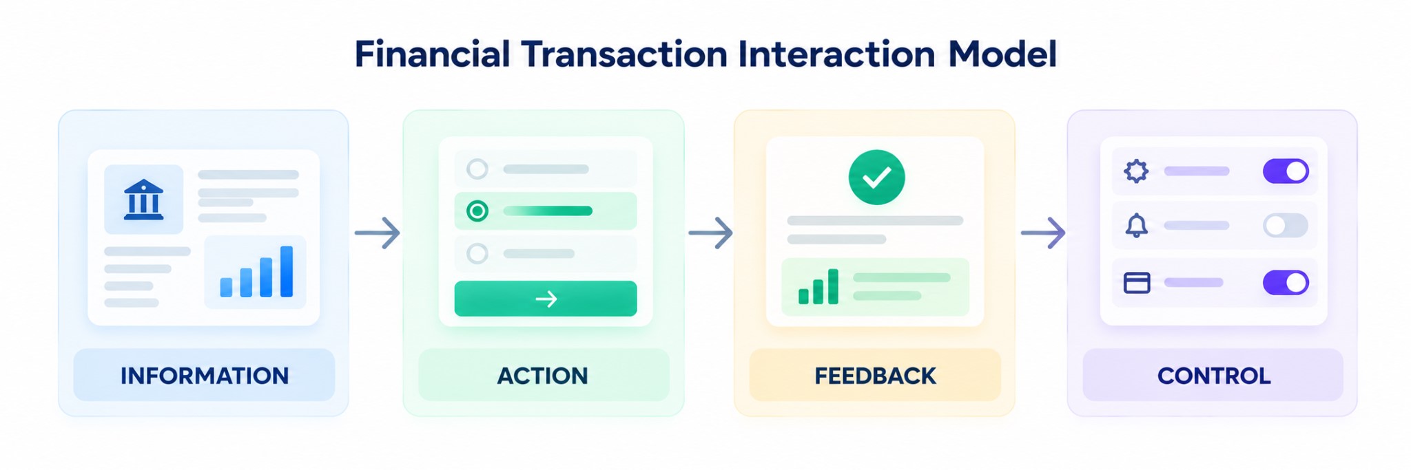
Give Every Financial Action Clear Feedback
Financial interfaces should distinguish submission from completion. A successful button press does not necessarily mean funds reached their destination. Status messages must reflect actual processing information.
Display scheduled payments separately from transactions awaiting bank processing. Show estimated completion times only when reliable information is available. Provide transaction references that customers can use when contacting support.
Make Security Measures Clear Without Disrupting User Flows
Secure financial user interactions require appropriate authentication without unnecessary confusion. Verification prompts should explain the immediate reason for additional checks. Their wording must distinguish legitimate security requirements from unexpected interruptions.
Use this checklist to validate security-sensitive financial journeys:
- Risk-based verification: Apply stronger authentication to sensitive changes and unusual transactions according to assessed risks.
- Session recovery: Restore permitted form data after reauthentication without automatically resubmitting financial instructions.
- Duplicate prevention: Block repeated payment requests until the system confirms the original transaction status.
- Sensitive data protection: Mask confidential details in notifications and authentication screens.
- Verification failures: Provide secure recovery options without revealing sensitive account information.
- Security testing: Test expired sessions, interrupted payments, and failed authentication before release.
Authentication requirements should reflect the sensitivity of each financial action. Additional checks must not obscure the transaction awaiting approval. Test whether customers understand what remains pending after verification succeeds.
Reduce Friction Without Hiding Important Details
Simplification should eliminate unnecessary effort rather than important decisions. Autofill can reduce repetitive entry when information remains accurate. Customers must still review consequential payment details before authorization.
Financial interfaces must distinguish essential disclosures from optional explanations. Clear financial disclosure requirements establish expectations for presenting transaction terms. Keep relevant charges visible before users authorize payments.
Before confirming a transfer, customers should be able to verify three essential details:
- Recipient verification: Display the recipient’s name and masked account details to help prevent transfers to unintended destinations.
- Total payment cost: Show the transfer amount alongside applicable fees and currency conversion charges before authorization.
- Processing expectations: Indicate the estimated arrival time and explain whether the payment can be canceled after submission.
Build Accessibility Into Every Interaction
Accessible interfaces support customers with different visual and cognitive abilities. Use readable typography and sufficient contrast. Every important control also needs a meaningful label.
Use this accessibility checklist before releasing financial workflows:
- Keyboard navigation: Complete transfers and account management tasks without a mouse, including confirmation dialogs.
- Screen reader compatibility: Verify that balances, transaction statuses, and validation errors are announced accurately.
- Accessible authentication: Provide supported verification alternatives when memory-dependent challenges or physical interactions create barriers.
- Error recovery: Identify incorrect fields through text and connect each message to its corresponding input.
- Transaction confirmation: Ensure customers can review payment amounts and recipients using assistive technologies.
- End-to-end testing: Complete essential financial journeys with keyboard navigation and screen readers before release.
Financial authentication should support users who cannot memorize passwords or manually transcribe verification codes. The accessible authentication requirements explain how alternative methods can reduce these barriers. Test supported login options with assistive technologies before release.
Validate Design Decisions With Behavioral Evidence
Financial application usability depends on behavioral evidence that visual reviews often miss. Combine task observations with funnel analysis and support complaints. Examine whether users misunderstand information or encounter technical failures.
A high abandonment rate does not automatically indicate poor interface design. Customers may leave because of eligibility restrictions or unavailable documents. Segment findings before choosing corrective actions.
Investigate these behavioral signals before prioritizing interface changes:
- Transfer abandonment: Observe confirmation-stage behavior to determine whether customers understand recipient details.
- Repeated form corrections: Identify problematic fields and examine whether validation messages explain required changes.
- Verification failures: Test recovery paths to distinguish authentication barriers from temporary technical problems.
- Dashboard inactivity: Use comprehension tasks to check whether customers can interpret important financial figures.
- Support contacts: Compare customer complaints with transaction states to identify unclear outcomes.
Prioritize findings according to severity and frequency. Financial consequences should also influence urgency. A rare misleading confirmation can deserve attention before a common cosmetic complaint.
Book a Call
Use AI to Personalize Interfaces Without Adding Complexity
AI-powered fintech product design can personalize dashboards around specific financial needs. Interfaces might highlight upcoming payments or unusual spending patterns. Recommendations should remain understandable and easy to dismiss.
Start with a defined problem, such as managing irregular income. Test whether projected cash-flow warnings improve financial planning before expanding personalization. Measure decision accuracy and feature adoption rather than assuming automation improves usability.
Teams exploring AI for product design should distinguish design assistance from customer-facing automation. Financial recommendations require validation for accuracy and potential harm. Explain prediction limitations and preserve user control over consequential decisions.
How to Build a Cohesive Fintech Product Design Strategy
A cohesive fintech product design strategy connects user needs with commercial priorities and operational requirements. Individual improvements should support consistent journeys rather than isolated screens. Product design for fintech requires prioritization criteria that account for transaction frequency and potential monetary harm.
A practical prioritization framework considers four dimensions:
| Priority factor | Assessment question | Example |
| User impact | Does the issue prevent important tasks? | Customers cannot confirm transfer status |
| Financial risk | Could misunderstanding cause monetary harm? | Charges remain unclear before payment |
| Business impact | Does friction affect meaningful adoption? | Eligible applicants abandon verification |
| Delivery effort | Can the improvement be implemented safely? | Existing components support the change |
Product teams should agree on ownership before changing interface patterns. Designers define interaction behavior and content requirements. Engineering specialists assess implementation constraints while compliance teams review applicable obligations.
A shared component library helps maintain consistency across financial journeys. However, components should encode behavior rather than appearance alone. Payment confirmations need consistent terminology and predictable status handling.
Establish separate baselines for payment completion and verification recovery. Compare outcomes across customer segments before approving interface changes. Investigate declining transaction comprehension even when overall conversion improves.
Useful measures include:
- Task completion: Percentage of users finishing essential financial actions.
- Error recovery: Successful resolution after failed or interrupted attempts.
- Comprehension: Ability to explain transaction costs and outcomes.
- Adoption: Continued use of relevant financial capabilities.
- Satisfaction: Feedback collected after meaningful customer tasks.
Design reviews should consider these measures together. Faster completion cannot justify higher financial error rates. Likewise, increased feature adoption provides limited value when customers misunderstand important consequences.
What Makes Fintech Product Design Effective?
Effective fintech product design makes financial information understandable and important actions predictable. Customers should recognize available options without interpreting internal system terminology. Every interaction must provide enough context for informed decisions.
Accessibility strengthens both discovery and completion. Security prompts protect sensitive operations while explaining necessary interruptions. Consistent interface patterns reduce the effort required to learn unfamiliar financial features.
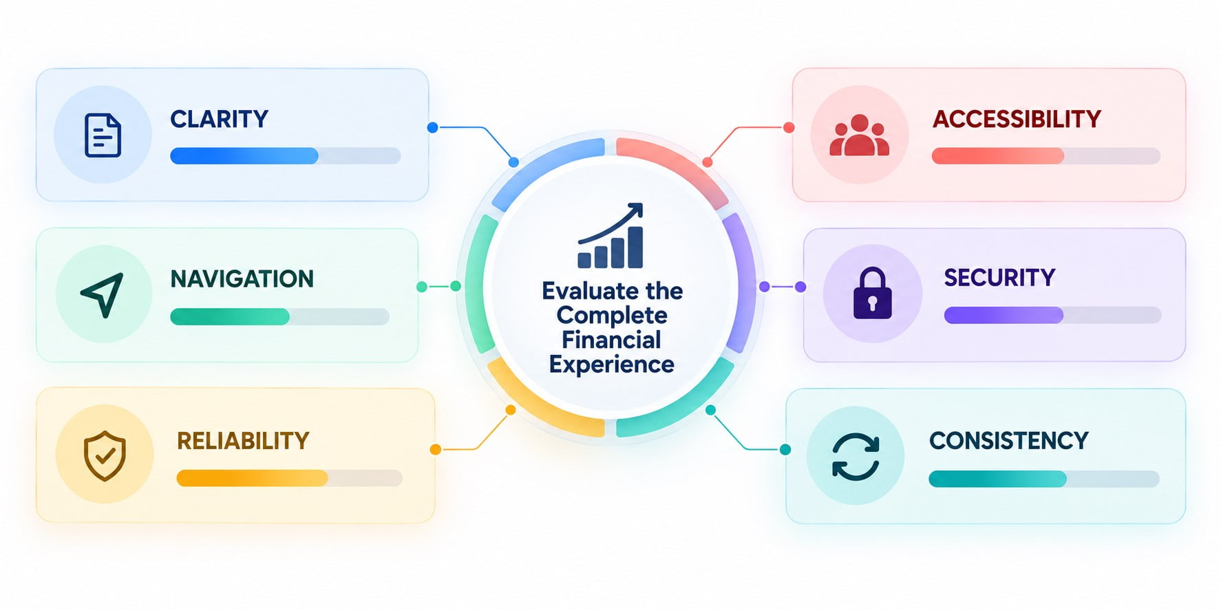
A practical evaluation should examine six connected qualities:
| Quality | Evaluation method | Failure signal |
| Clarity | Ask users to explain displayed figures | Incorrect interpretation |
| Navigation | Observe essential task discovery | Repeated unsuccessful searching |
| Reliability | Test transaction states | Misleading completion messages |
| Accessibility | Test keyboard and assistive technology | Blocked essential interactions |
| Security communication | Review authentication scenarios | Unexplained verification requests |
| Consistency | Compare related journeys | Conflicting terminology or controls |
Evaluating complete customer journeys reveals problems that isolated screen reviews often miss. Even a clear dashboard cannot compensate for confusing payment flows. Testing should therefore examine how customers move between financial tasks and respond to unexpected interruptions.
Insights from these evaluations can guide improvements to UX/UI design for fintech. Designers can address identified weaknesses by refining transaction flows and interaction patterns. Follow-up testing should establish whether those changes improve task completion and reduce recurring errors.
Conclusion
Better financial products emerge from clear information and validated customer journeys. Effective teams design for real transactions rather than idealized demonstrations. They also treat accessibility and security as essential interaction requirements.
Successful development depends on measurable decisions throughout the product lifecycle. Research identifies meaningful problems, while testing validates proposed solutions. Ongoing testing helps prevent new financial features from disrupting established payment and account management journeys.