


UpHealth is a US supplement brand for women. We built it end to end: logo, labels and packaging for the full range, campaign art direction and a custom Shopify store.
What is UpHealth?
UpHealth makes supplements for women and sells them as one daily ritual. Its voice is quiet and clean, closer to skincare than to sports nutrition. In 2026 Duck.Design did both the design and the development.
Services Provided:


The store
Challenge
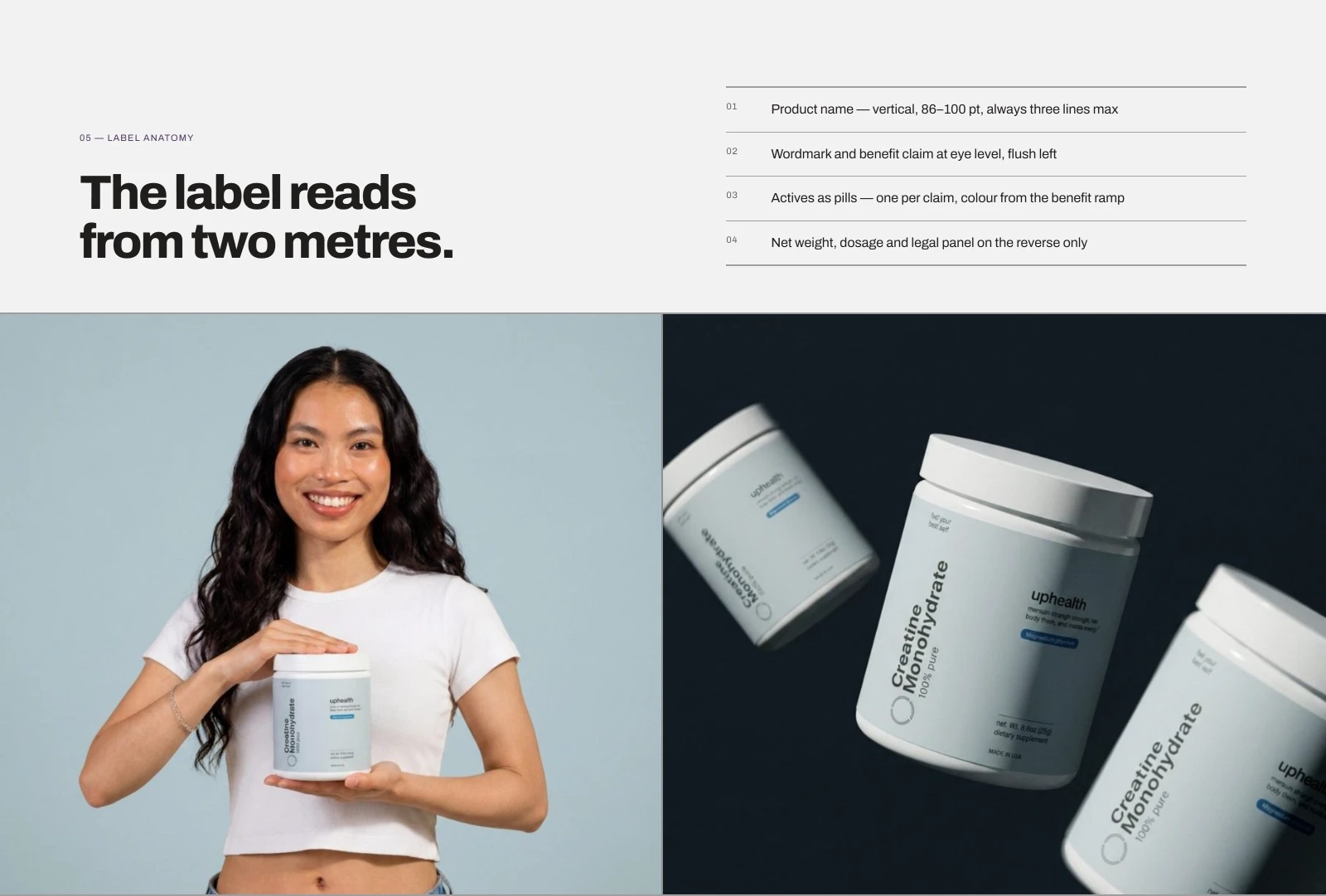
Supplement shelves are full of neon tubs and loud, gym-first typography. UpHealth’s customer is different: a woman who works, trains, reads labels and wants the tub on her kitchen counter to look like it belongs there. The brand needed one system that would hold across the whole range and carry over to the store.
Project Goals
- Give UpHealth a brand that sells supplements like skincare, not like sports nutrition
- Design one label system for the full range: creatine, whey, collagen, BCAA, energy powders and daily essentials
- Carry the same restraint into campaign imagery and the store
- Design and build a Shopify store that routes shoppers to the right formula and that the client’s team can edit without a developer
What We Did
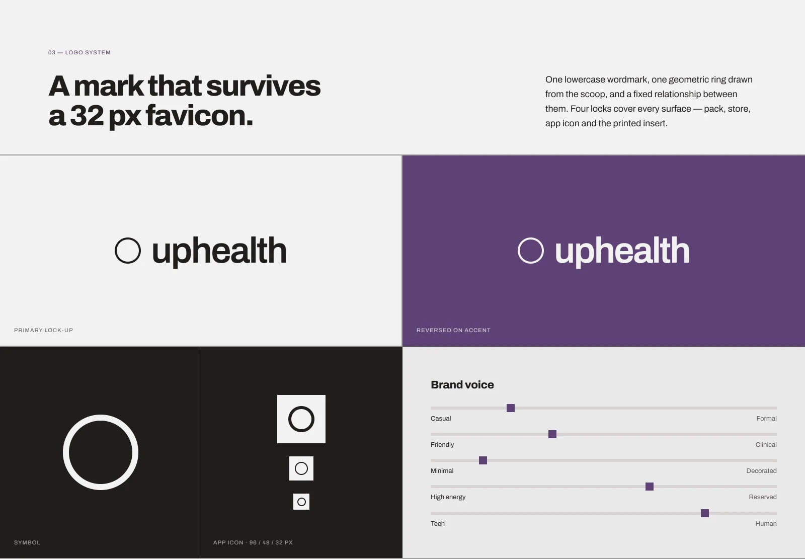
We built the brand from the counter backwards. The logo is a lowercase wordmark with a geometric ring drawn from the scoop, and it stays legible from the tub down to a 32 px favicon. One type family, Archivo, in three weights, carries the whole brand.
Labels, Packaging & Campaign
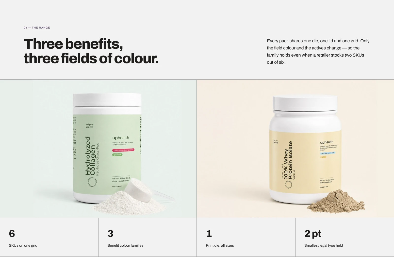
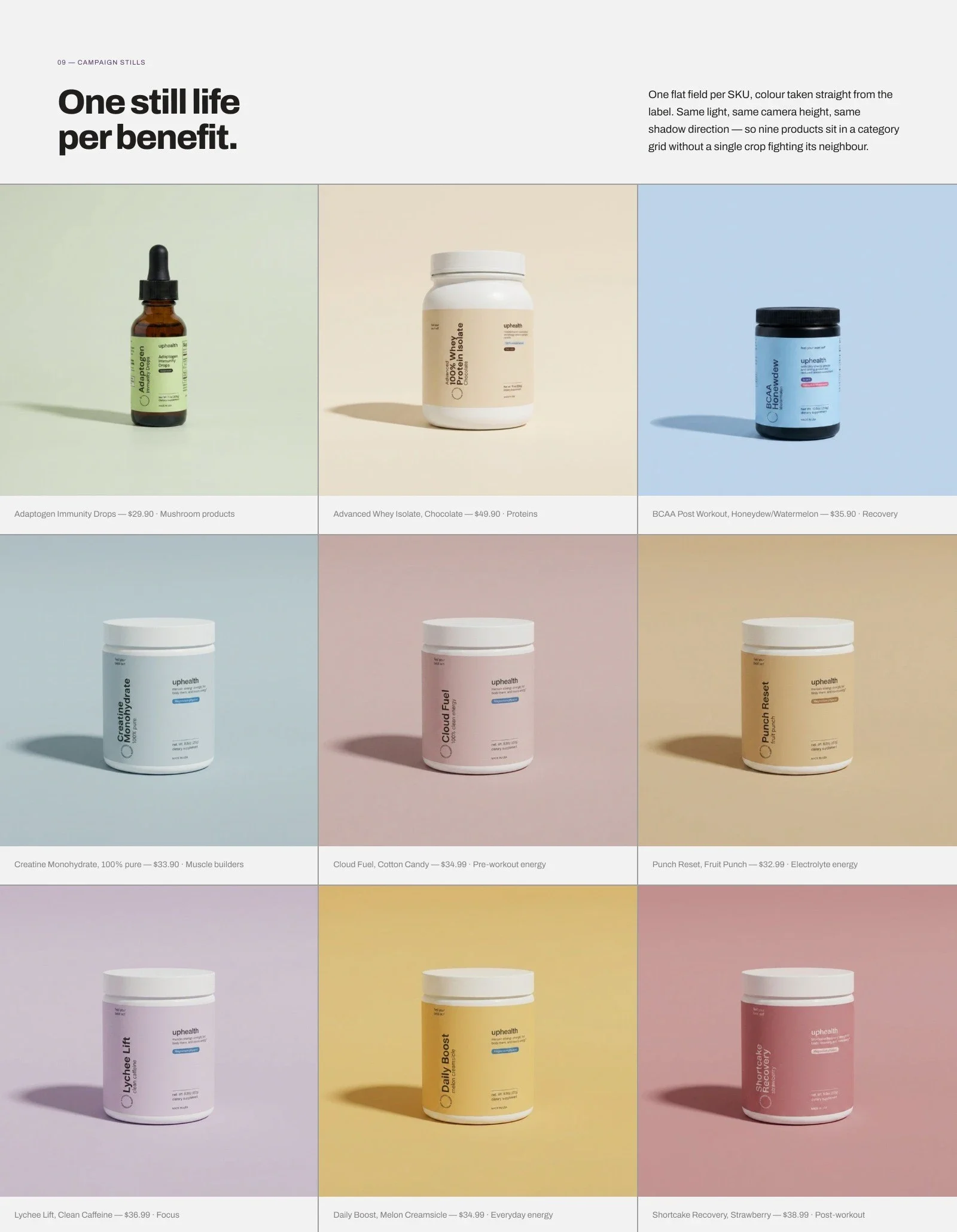
Every pack shares one die, one lid and one grid. Only the field colour and the actives change. The four field colours are Hydration Blue, Beauty Sage, Protein Cream and Action Plum, and a new flavour is a new colour and two lines of type. The campaign follows the same rule: studio light, one product and a flat colour field taken from its label.
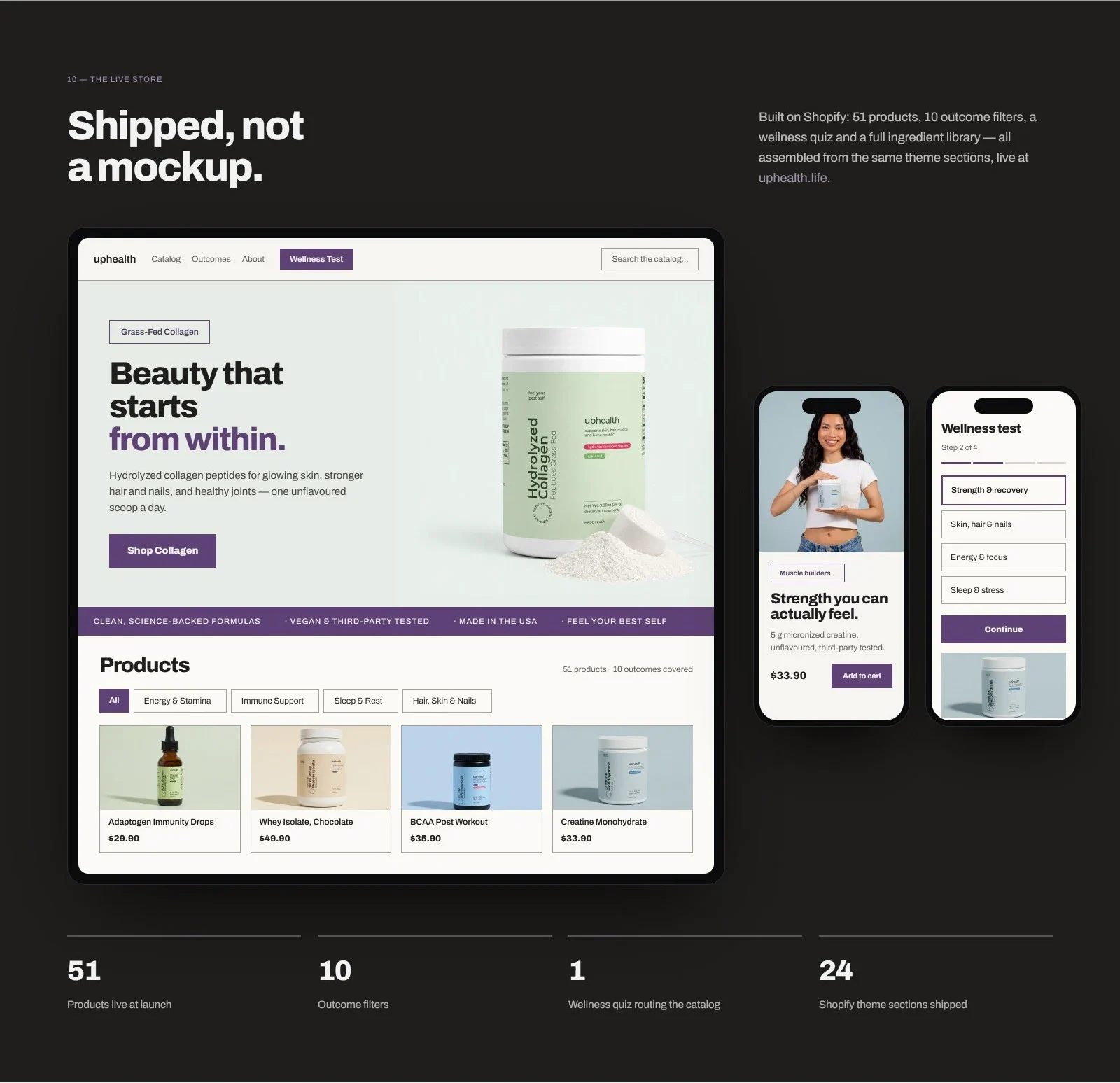
Shopify Store
The UI kit follows the packaging grid and has 42 components. Its colour, spacing, type and state tokens are set up as Figma variables and as Shopify theme settings. The store runs on a custom Shopify Online Store 2.0 theme, so the client’s team can reorder, duplicate and publish sections without a developer. It has 51 products, 10 filters by health goal, a wellness quiz, subscriptions (skip, swap or pause) and loyalty points.
Conclusion
The live store is at uphealth.life. Planning a Shopify store of your own? See our Shopify web design services.
More E-commerce & Retail case studies
 E-commerce & Retail
Beko
Beko is the UK division of a global home-appliance leader. Over two years we became its external creative department and rebuilt every digital touchpoint. Study case
 E-commerce & Retail
Lush Stonez
How We Transformed Lush Stonez: A Journey in Branding and UX/UI Design Study case
Your one-stop-shop for
good design
design at scale without increasing headcount