What starts as a color preference often ends up shaping the entire product experience. Light and dark modes affect more than how your interface looks. In fact, they influence usability, brand perception, and even user retention.
Color and visual aesthetics shape 94% of first impressions, according to the Behaviour & Information Technology Journal. And on OLED screens, night mode has been shown to reduce power usage by up to 60%, making it a practical as well as visual decision.
This article explores the strategic side of theme selection: where it fits into UX decisions, how it plays out in UI design, and what to consider when applying it to your own platform. We’ll break down the trade-offs, look at how different modes impact accessibility, emotion, and performance, and help you figure out what fits your product best.
Your theme not only enhances the interface’s appearance but also determines its functionality.
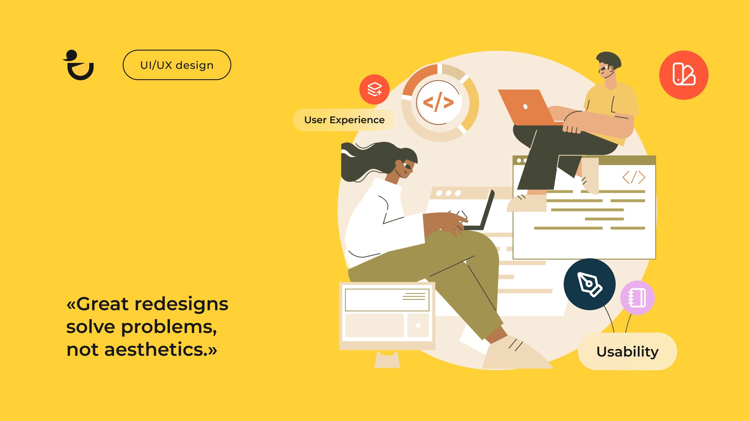
Dark or Light? The Importance of Picking the Right Theme

You could be forgiven for thinking it’s a small decision. Just a background color. Maybe a style choice.
Themes tend to shape more than you’d expect. They influence how your product feels at first glance, how easy it is to get into, and whether it supports strong user engagement over time. They even leave a mark on what users remember after they’ve logged off.
Some products lean into brand design, using tone and palette to express values. Others focus on clarity and movement, where conversion-centered design is the priority. In either case, the theme needs to reinforce that intent, not work against it.
There’s also the practical side. A light mode that looks clean in the office might feel glaring at night. A night mode that nails contrast can still feel disorienting in daylight. And these shifts don’t just affect comfort—they influence attention, scroll behavior, and task completion rates.
Think, too, about how the theme fits with your broader marketing design goals. The colors and contrast you choose become part of your visual identity. They’ll show up in screenshots, presentations, pitch decks—anywhere your UI is seen beyond the product itself. Essentially, choosing a theme extends beyond what appears on the surface. It affects how people use, learn about, and engage with your product.
So before you default to what feels familiar, ask the harder question: Does this theme reflect how people actually use your product?
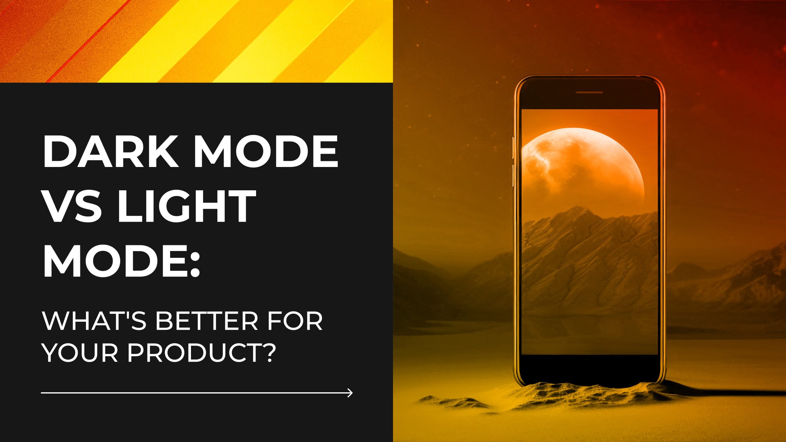
Light Mode vs Dark Mode: Key Differences and Pros & Cons

When it comes to dark vs light mode, the choice might seem like a cosmetic tweak. In practice, it shapes how users experience, interpret, and navigate your product.
Below is a clear look at how each mode performs—so you can pick a direction that works with your product goals, not against them. Let’s take a look at light mode vs dark mode and their pros and cons.
Light Mode Pros
✅ Easy to scan and skim in daylight
Great for public use or sunlit workspaces. The interface stays visible and legible even when ambient light is high.
✅ Familiar and intuitive for most users
Since most digital platforms default to light mode, users often feel instantly comfortable navigating it—especially those less familiar with modern UI trends.
✅ Effective for text-heavy layouts
Long articles, reports, and learning materials benefit from dark text on a bright background, which helps reduce eye strain during extended reading sessions.
✅ Supports a polished, content-first design
Light mode works well with clean layouts and whitespace, naturally drawing attention to core messaging and CTAs—key elements in any conversion-centered design.
✅ Pairs well with traditional brand design
Many corporate, medical, and educational brands use light interfaces to signal transparency, safety, or professionalism. It fits especially well with neutral color palettes.
Light Mode Cons
❌ Can feel harsh in low light
When used at night or in dim settings, light backgrounds can lead to screen glare and user discomfort.
❌ Higher brightness levels increase battery drain on mobile devices
This becomes more noticeable for users with heavy screen time or those using devices without adaptive brightness features.
❌ Without visual depth, it risks looking flat or dated
Unless thoughtfully layered, light interfaces can lack modern dimension or visual engagement—especially on content-light pages.
Get Started
Dark Mode Pros
✅ Comfortable in dim environments
Ideal for night use, as it reduces eye strain caused by bright screens. Many users report it feels easier to focus when everything else around them is low light.
✅ Improves battery life on OLED screens
On devices with OLED displays, dark mode saves energy by turning off black pixels—making it a practical choice for mobile-first design.

✅ Highlights key visuals and media
Visual design elements and content like images, videos, and infographics pop more against dark backgrounds, which gives designers more control over emphasis and focal points.
✅ Popular among modern tools and creative apps
Design platforms, coding environments, and streaming interfaces often lean dark to create immersive, distraction-free experiences.
✅ Supports layered, motion-rich interaction design
Dark backgrounds can help animations and transitions stand out. They can also make it easier to add feedback and flow without cluttering the screen.
Dark Mode Cons
❌ Harder to read in bright environments
Night mode can be challenging, particularly on older devices where brightness settings may not be sufficient.
❌Readability suffers when contrast is off
It’s simple to overlook buttons, labels, or other information when the text disappears into the backdrop, which can make things seem more difficult to use than it needs to be.
❌ Needs extra care to stay accessible
If the contrast isn’t tested properly or assistive tools aren’t supported, night mode can make things harder for people who already rely on visual clarity to navigate.
Some compromises are inevitable in any design process. Those decisions become more logical when you consider your product’s actual usage by customers; instead of speculating, you’re adapting to actual patterns across devices, times of day, and user demands.
Clarity, fluidity, and consistency are all enhanced when your theme fits those patterns.
Up next, we’ll look at how day and night modes affect different parts of design—from UX and accessibility to battery use and how flexible your interface is over time.
How Each Mode Affects Web / App Design
The impact of theme choice shows up differently depending on the platform. For instance, there are distinct demands on designers while working on mobile applications as opposed to, say, web dashboards or landing pages. This process incorporates visual hierarchy, color psychology, contrast ratios, accessibility testing, and tweaks at the component level. A solution that is effective in one context may not be suitable for another.
Regardless of which theme you choose, the goal should be a consistent, intuitive, and accessible website design that works across lighting conditions, devices, and user needs. Here’s how dark and light modes compare across the most critical design areas:
| Criteria | Dark Mode | Light Mode |
| User Experience (App) | Creates an immersive feel that supports deep focus. Ideal for creative tools, entertainment, or late-night use. | Easy to adopt and familiar. Fits well with productivity apps, form-heavy flows, and task-based screens. |
| User Experience (Website) | Can feel bold and modern, but needs careful spacing and contrast to avoid visual fatigue. | Well-suited for editorial layouts, eCommerce, and content-driven platforms—especially those that rely on long reads or scrolling. |
| Accessibility | Requires extra care with contrast ratios and color pairing. Mistakes can quickly create barriers. | Often easier to make accessible, especially for users with low vision or cognitive load sensitivity. |
| Battery Use (App) | Saves power on OLED displays when blacks are truly black. Beneficial for high-usage mobile apps. | Drains battery faster on mobile devices, especially under high brightness or heavy white pixel use. |
| Brand Perception | Tends to convey a premium, high-tech feel. Common in design-forward platforms and modern SaaS products. | Reflects clarity, professionalism, and simplicity. Feels approachable and trustworthy for a wide range of audiences. |
| Readability | Works well in short bursts but can strain the eyes over time if contrast isn’t dialed in. | Generally better for reading-intensive interfaces and scanning large bodies of text. |
| Design Complexity | Demands more precision in visual hierarchy and color use. Mistakes show faster and feel heavier. | Easier to prototype and scale across devices and screen sizes, with more predictable patterns to lean on. |
| Customization Options | Great for layered visuals and interactive experiences, though consistency across states and screens takes work. | Versatile for most industries and user types. Offers more flexible baselines for iterative updates and accessible interface design. |
Psychological and Emotional Effects of Dark and Light Themes
Theme choice also creates a mental one. People form impressions quickly, often before they read a single word or interact with a single feature. In fact, research from Google found that users form design opinions within just 50 milliseconds of seeing a website. It’s the emotional handshake between your product and your user.
Light Themes: Familiar, Structured, Clear
Light interfaces tend to suggest clarity, openness, and ease of use. The kind of environment where tasks get done and information feels under control. These themes work well for:
- Professional and enterprise tools
- Financial services and SaaS dashboards
- Government, healthcare, and educational platforms
- Products designed for high legibility or daylight use
They provide an air of neutrality that draws attention away from the container and onto the content. A sense of reliability is further enhanced by their conformity to conventional design standards, such as white backgrounds, black lettering, and enough space. Many platforms that prioritise their users’ needs take use of this to facilitate onboarding and establish trust.
Light themes, however, aren’t always the best choice for interactive or expressive user interfaces. Using too much brightness might detract from the tone of your product if it is about narrative, graphics, or entertainment.
Dark Themes: Focused, Intentional, Immersive
Dark interfaces take the spotlight off the UI and let the content lead. Used well, they create depth and concentration. This is why you’ll often find them on:
- Streaming services
- Creative tools and editing software
- Developer platforms
- Music apps and productivity tools built for night use
They also suit visual media—dark backdrops make images, animations, and color accents stand out. For teams working on interaction design, this can be a strength. It gives shape to motion, cues to click states, and space for interface elements to breathe.
Psychologically, dark themes suggest exclusivity, control, and sophistication. They feel deliberate. You see this in tech-forward products and entertainment platforms where branding leans bold or cinematic.
Still, dark theme can miss the mark. Users in sectors like finance and law, where trust and openness are paramount, may find it confusing. Some information becomes more difficult to read without proper consideration of contrast ratios, which is particularly problematic for older devices or individuals with limited eyesight.
Emotional Fit: Aligning Mood With Use
Theme selection lives somewhere between utility and mood. It’s a practical decision that carries emotional weight. A productivity app built for busy teams might benefit from a crisp, neutral design. A mindfulness app, on the other hand, might need warmth, space, and softness. And a music discovery tool may thrive on darker tones that suggest immersion and energy.
Where users are also plays a role. For example, a commuter scanning news in daylight needs legibility. A designer tweaking details at 11pm wants focus, not glare. These use patterns influence what feels “right” in a theme—and what creates friction.
That’s why the best decisions start with real context. Not with what looks stylish, but what supports how your users behave. What device they’re on. What time they’re logging in. What emotion or mindset your product design needs to meet.
Color sets expectations before a button is pressed. When it works, users feel at home right away—even if they can’t say why.
Talk With Us
Which Mode Fits Your Product Best? Let Us Help!
Picking between a dark theme vs light theme usually comes down to who’s using your product, where they’re using it, and what feels easiest to navigate. At Duck.Design, we work alongside teams to figure out what actually makes sense for their product. Whether you’re planning a content site, updating a SaaS dashboard, or redesigning your mobile UI, we adapt the process to fit the real context.
Our UI/UX design services follow a user-centered design approach focused on practical outcomes, including real-world dark vs light theme decisions. That includes:
- Research and wireframing to define what users actually need—not what looks trendy
- Building responsive, flexible interface aesthetics for both light themes and dark settings
- Running accessibility audits and color contrast testing to ensure clarity across the full visual spectrum
- Designing for interface customization, giving users the option to shift between themes based on lighting, time of day, or preference
- Creating interaction flows that support smooth transitions, dynamic elements, and high-contrast feedback
- Optimizing for energy saving by designing with screen type and brightness defaults in mind
Our work draws from a wide toolkit: visual systems that preserve brand design, modular components that adapt across screen sizes, and thoughtful use of color palette to express hierarchy without relying on color alone.
What makes this process work is structure. Our website design services bring consistency across digital properties. Our app UI/UX design services prioritize user interface performance on mobile. And our broader UI/UX design services tie it all together—brand, product, platform, and user needs—into a system that scales.
We operate on flexible, monthly plans that fit around your team’s capacity and growth stage:
- $999/month for graphic design
- $1699/month for combined UI/UX and motion design
- $1999/month for no-code builds and development-ready assets
Each plan includes access to a dedicated design team. No project queues. No nickel-and-diming. Just smart, reliable design that aligns with your product’s goals. Get in touch to learn more!