


Web3 UX design refers to the practice of making blockchain products easier to use. It helps people understand how to create a wallet, sign a transaction, or pay network fees without feeling lost or exposed to unnecessary risk.
User experience in web3 matters because blockchain mistakes are often final. A bad click can mean lost funds, failed transactions, or confusion that users cannot easily undo. Good Web3 UX makes each step clear, predictable, and safer.
Adoption is not the main problem anymore. Global cryptocurrency ownership reached 741 million people in 2025, a 12.4% increase in one year (Crypto). The bigger challenge is keeping those users active, and that depends heavily on the user experience.
The goal is simple: help people use crypto products with confidence, without forcing them to understand the cryptography behind them.
The Role of UX Design in Web3 Product Success
Good UX is what turns a curious first-timer into a regular user. The code in most blockchain apps already works. The trouble starts at the human moment: a seed phrase pops up, a fee appears with no context, or a transfer fails in silence.
A clean Web3 user experience carries people past that moment and into a habit. Lose them there, and no amount of marketing wins them back.
Four things ride on the quality of that experience:
- Adoption climbs when a newcomer can finish the first action instead of quitting halfway
- Engagement grows when routine tasks take seconds, not a maze of steps
- Trust builds when the screen says, in plain words, what a signature approves
- Retention holds when one wrong tap no longer feels like it could empty a wallet
Blockchain puts the risk on the user. Nobody can reverse a bad transfer, and there’s no reset for a lost key. That’s why blockchain UX carries more weight here than in almost any other kind of software. That is why UX is important: it ties the quality of the experience to revenue.
Essential UX Principles for Modern Web3 Platforms
Strong Web3 UX design rests on five principles that make a product approachable without hiding how it works. Each one tackles a spot where blockchain tends to confuse or scare people. Used together, they form a user-centered design approach for crypto.
The table below pairs each principle with its job and its real-world form:
| Principle | Why it matters in Web3 | What it looks like in practice |
|---|---|---|
| Simplicity | Newcomers meet unfamiliar ideas at every turn, so mental effort decides whether they finish. | Hide jargon, pick safe defaults, and show advanced options only on request. |
| Transparency | Actions can’t be undone, so users must see what they approve. | Plain-language summaries of each fee, permission, and transaction before signing. |
| Intuitive navigation | When actions hide, people hunt, and hunting causes a drop-off. | A clear site architecture where the wallet, balances, and main actions sit where users expect. |
| Security awareness | Scams strike at the signing step, so the screen has to guide caution. | Inline warnings, verified-source badges, and signature requests people can read. |
| Frictionless onboarding | The first five minutes decide whether a user stays. | Social login, a sponsored first transaction, and setup spread over time. |
These principles share one goal: respect the user’s attention and protect their money at the same time. They borrow from plain product thinking, which is why knowing the line between UX vs UI helps teams separate polish from real usability. Crypto website usability improves fastest when teams treat all five as rules, not extras.
Web3 UX Best Practices for Better User Engagement
What follows is a set of proven practices for lifting adoption, engagement, and retention. Each one explains what to build, why it matters on a blockchain, and how it makes the product simpler. Think of it as a playbook for crypto UX design that fits inside your current UI/UX design process.
The table below maps the most common friction points to the fix that resolves each one.
| Friction point | UX fix | Why it works |
|---|---|---|
| Seed-phrase setup blocks the first session | Social login plus account abstraction | Removes the scariest step before any value is delivered |
| Unexplained gas fees stall a transaction | Fiat equivalents and total-cost previews | Replaces guesswork with an informed decision |
| Cryptic signing requests invite scams | Plain-language permission summaries | Lets users see exactly what they approve |
| Silent pending transactions feel broken | Real-time status and confirmation messages | Turns an anxious wait into a reassuring one |
| Lost keys cause permanent loss | Social recovery options | Converts a top fear into a reason to stay |
Simplify Wallet Onboarding for New Users
Wallet onboarding is the biggest wall in Web3, so tearing it down pays off the most. Three tools now make signup feel close to a normal app: social login, account abstraction, and simpler wallet connections.
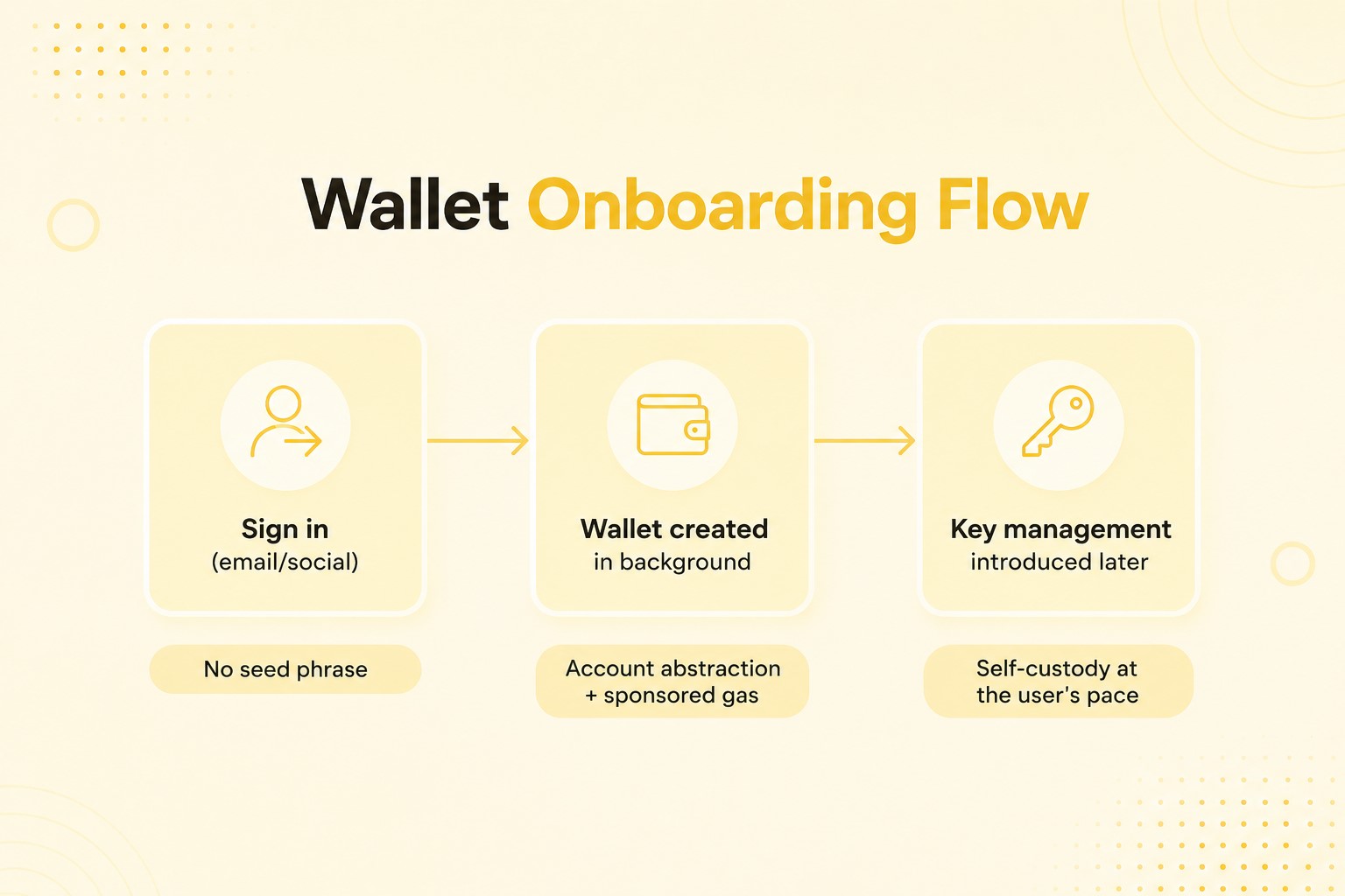
Account abstraction does the heavy lifting. The ERC-4337 standard already powers more than 26 million smart accounts and over 170 million user operations (Ethereum), and the EIP-7702 upgrade from May 2025 brings those perks to older wallets. In plain terms, a new user can transact without ever seeing a seed phrase or buying a token just to cover gas.
A smooth flow usually runs in three steps:
- Let people sign in with an email or social account they already use.
- Create the wallet quietly in the background and cover the first transaction.
- Bring up key management and self-custody later, once they’re hooked.
This staged approach removes the wall that stops most newcomers cold. It also turns frictionless decentralized applications from a buzzword into something you can measure.
Use Contextual Education Throughout the User Journey
Teach people right when they need it, not all at once on a setup screen. Tooltips, short walkthroughs, and inline notes let users pick up complex blockchain mechanics while they act.
Call it just-in-time learning. A tooltip that explains gas the second a fee shows up sticks far better than a glossary nobody opens.
Plot these moments across the customer journey so each new idea lands where it first matters. The learning curve shrinks, and you never break the task in front of the user.
Make Transaction Costs and Fees Easy to Understand
Show people the transaction costs, in terms they know, before they commit. An unexplained gas fee is one of the top reasons users bail in the middle of an action.
Crypto-native users put up with it. A newcomer sees a long hex string and a shifting fee, then closes the tab.
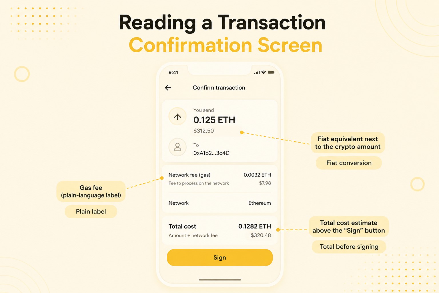
Three details clear up the doubt:
- Show the gas fee with a plain label.
- Put the fiat value next to the crypto amount.
- Give a total estimate before the user signs.
When fees are readable, users decide instead of guessing. This matters even more as activity shifts to cheaper networks, where a few cents shouldn’t look like a scary string of decimals. Clear pricing is a quiet form of conversion-focused design.
Build Trust Through Transparent Security Measures
Security UX should make people feel safe without making the product feel hostile. The signing step is where trust is won or lost, because that’s exactly where attackers aim.
The threat is real and measurable. Most of the scams work by getting someone to sign a malicious request that looks routine. The user thinks they are confirming a login. They are really handing over their tokens.
Clearer signing screens are already paying off. That 83% drop in phishing losses lined up with readable warnings and plain transaction prompts becoming standard across major wallets.
Helpful trust signals are simple. Permission summaries spell out what an app can touch. Verification indicators confirm a real source. Security warnings flag odd requests. The trick is to warn only when risk is real, and stay quiet when it isn’t.
Provide Clear Transaction Status Updates
Tell users what’s happening to their transaction at every stage. Confirmations take time, and silence during that wait is a top source of panic and support tickets. Picture sending rent and staring at a blank screen for thirty seconds.
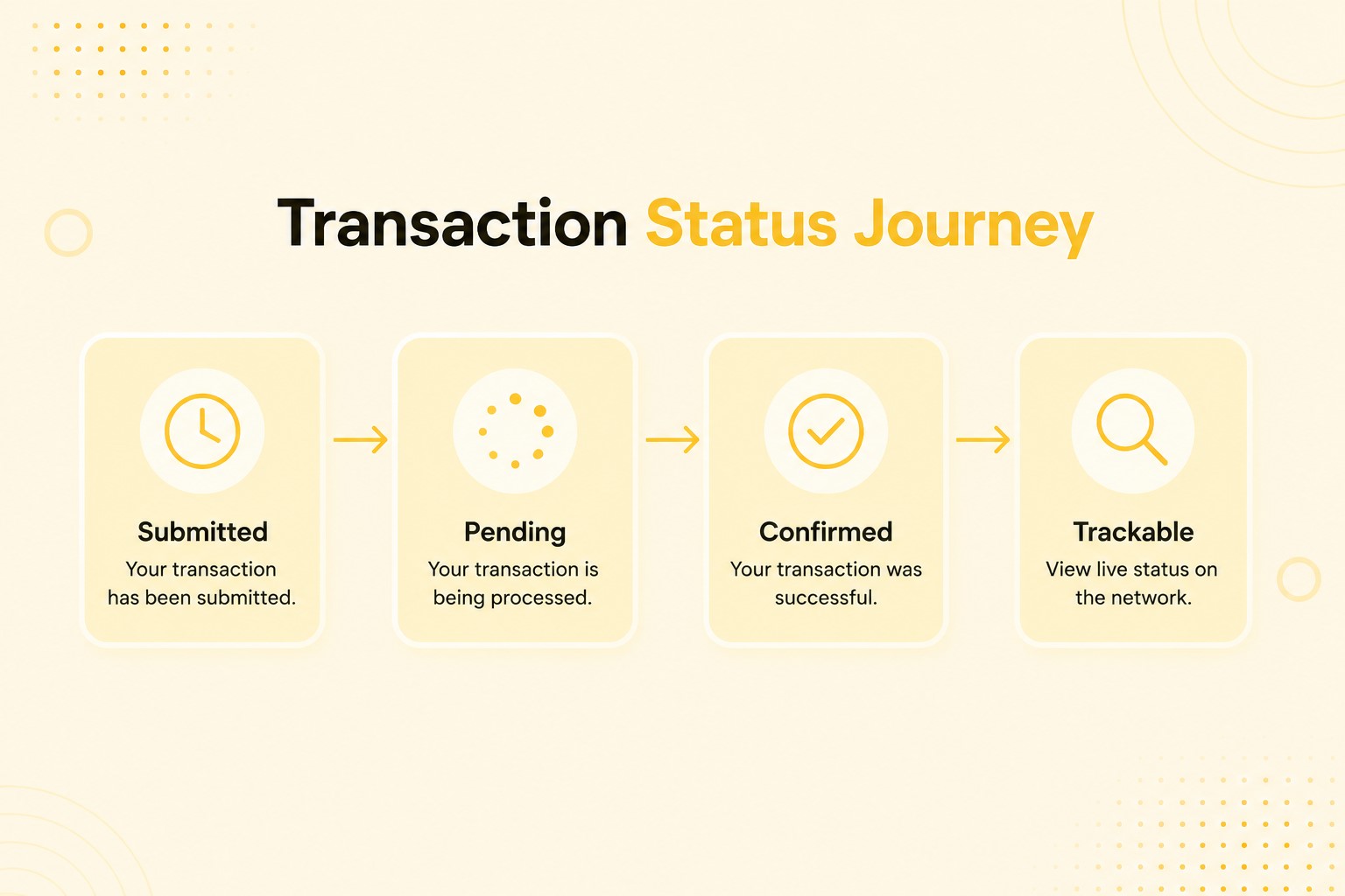
Three UX elements keep people calm:
- A progress indicator shows the transaction is moving
- A confirmation message lands when it settles
- Live tracking lets users check the status anytime
A pending transfer with no feedback feels broken, even when the network is fine. Visible status turns a blind wait into a reassuring one.
Help Users Prevent Costly Mistakes Before They Happen
Catch errors before the user signs, because most chains have no undo. Prevention is the most valuable thing a Web3 interface design can offer.
Three guardrails do most of the work:
- Validation checks that flag a bad address or an impossible amount.
- Network warnings that catch the wrong chain.
- Previews that show the likely outcome before confirmation.
A short preview, showing how much leaves the wallet and what comes back, stops a lot of avoidable losses. These checks also build nerve, since people learn the product has their back. A look at user behavior analysis at each failure point tells you which guardrail to fix first.
Optimize Web3 Experiences for Mobile Users
Build mobile-first, because most new users show up on a phone. Mobile is the main door to crypto in the fast-growing regions, so a desktop-only mindset leaves the biggest crowd outside.
In many of those markets, a phone is the only computer a person owns.
Mobile work spans a few fronts:
- Layouts should reflow cleanly on small screens
- The product should pair well with mobile wallet apps
- Tap targets should be big enough that nobody fat-fingers a payment
- Transaction flows should lose any step they don’t need
A signing flow that demands tiny, precise taps invites costly slips. Smooth mobile website navigation is the baseline now, not a later treat.
Book a Call
Prioritize Fast Access to Core Actions
Keep the things people do most within easy reach. Connecting a wallet, sending assets, staking, and swapping should never hide behind menus.
The goal is quick task completion and easy product discovery for the features that pay off.
Audit the screen, count the taps each core action needs, then cut the spare ones. Every step you drop is a real performance improvement in completion rate. When the main actions sit one tap away, people come back more, because the product respects their time.
Keep navigation predictable so users always know where the core actions are. Layouts that shift around force people to relearn the app on every visit, and that drives them away.
Strong UX design in Web3 treats navigation as plumbing. Park the wallet, balances, and main actions in fixed spots. Use the same labels everywhere so “Swap” always means the same thing and always sits in the same place.
Intuitive navigation reduces the mental cost of each visit and frees attention for the choices that drive revenue. A steady structure also lets repeat users move faster, which feeds retention. Treat the menu as a promise to the user, not a place to experiment.
Map the Complete User Journey
Design the whole path someone takes, not just single screens. A transaction can work on its own and still fail if the steps around it stall the user. The gap between two good screens is often where the worst friction hides.
User journey mapping shows the friction between screens: the dead ends, the second-guessing, the quiet exits. Trace a newcomer from landing to a first successful transaction, and mark every step that needs a note or carries risk.
Screen-by-screen reviews miss these gaps, because people feel a product as one flow, not a stack of features. Better blockchain UX comes from smoothing the handoffs between wallet, app, and confirmation. Map it once, fix the worst parts, then map it again after each big release.
Offer Account Recovery That Users Can Trust
Give people a safe way back in when they lose access. Lost keys are one of the biggest reasons users leave for good, since a single slip can wipe everything.
New recovery options change that math. Social recovery lets trusted contacts or backup devices restore access without a seed phrase, and account abstraction makes it work at scale.
Set up recovery early, framed as protection, and don’t nag people through it. Once someone knows a lost phone won’t erase their funds, they lean into the product instead of holding back. Good recovery turns one of crypto’s worst fears into a reason to stay.
Conclusion
Better blockchain user experience starts with one shift: put the user, not the tech, at the center. The blockchain user experience optimization wins are rarely flashy. They’re clearer fees, readable signatures, staged onboarding, and honest status updates.
The data agrees. Ownership has passed the half-billion mark. Account abstraction has dropped the seed-phrase barrier for tens of millions of people. Better signing screens have already cut phishing losses sharply.
The teams that win the next wave will make hard actions feel simple, safe, and fast. Web3 UX design is now the line between a product people keep and one they leave.