




Key Findings
- Ecommerce graphic design should answer product questions that physical shopping normally resolves.
- Ecommerce product visuals should prioritize useful evidence over decorative imagery.
- Mobile Ecommerce graphics require dedicated hierarchy rather than scaled desktop creative.
- Ecommerce promotional graphics convert complex offers into clear visual shopping decisions.
- Ecommerce design systems keep product and campaign visuals consistent as creative demand grows.
Customers cannot touch a product, inspect its materials, or judge its scale before buying online. Ecommerce graphic design must replace that missing physical experience through clear product presentation and useful visual evidence. This guide therefore focuses on practical graphic design for Ecommerce rather than decoration. Effective Ecommerce visual design should clarify products, reduce uncertainty, and support consistent shopping decisions.
What Is Ecommerce Graphic Design?
Ecommerce graphic design is the creation of visual assets specifically for selling products through digital storefronts. Unlike general graphic design, it must balance brand identity with product presentation, usability, and measurable commercial actions. Every visual should help shoppers understand a product, navigate an offer, or make a more confident decision.
Its scope includes product images, product page graphics, website banners, and promotional graphics. Social visuals, email graphics, digital ads, infographics, packaging and inserts extend the system across other touchpoints. Different types of graphic design therefore support different products, audiences, and sales funnels.
Why Is Graphic Design Important for Ecommerce?
Graphic design for Ecommerce matters because shoppers must evaluate products through a screen. Visuals shape product understanding, brand recognition, and purchasing confidence. Effective online shop design reduces unanswered questions instead of relying on aesthetics alone.
A useful product page should help shoppers verify:
- Appearance: Does the product look the same across different views?
- Details: Can shoppers inspect materials, finishes, or important features?
- Scale: Can they understand the product’s actual size or proportions?
- Context: Can they see how the product looks or works in real use?
- Credibility: Do customer photos or other evidence support the presentation?
Visual design also matters later in the journey. Clear purchase information can reduce uncertainty that contributes to cart abandonment. Consistent visual treatment supports recognition and repeat purchases across marketing touchpoints.
What Visuals Does an Ecommerce Store Need?
An Ecommerce store needs visuals covering discovery, evaluation, promotion, conversion, and post-purchase experience. The precise mix depends on its business model, product type, audience, and sales funnel. Each asset should therefore have a defined shopping purpose.
| Visual Asset | Main Purpose |
| Product Photography | Show appearance, quality, scale, details, and variants |
| Product Graphics | Explain features, dimensions, materials, or benefits |
| Website Banners | Direct attention toward categories, launches, or offers |
| Category Graphics | Help shoppers recognize and navigate product groups |
| Social Media Graphics | Build recognition and present products in channel-native formats |
| Display Ads | Communicate one product promise quickly |
| Email Graphics | Support launches, recommendations, and promotions |
| Infographics | Explain comparisons, processes, or complex features |
| Packaging Design | Extend Ecommerce branding into the physical experience |
10 Ecommerce Graphic Design Principles
The most effective principles connect visual decisions with actual shopping tasks. Before starting production, define what customers must notice, understand, verify, and do. A repeatable graphic design process keeps those decisions consistent when campaigns and catalogs expand.
1. Keep Product Visuals Clear and Consistent
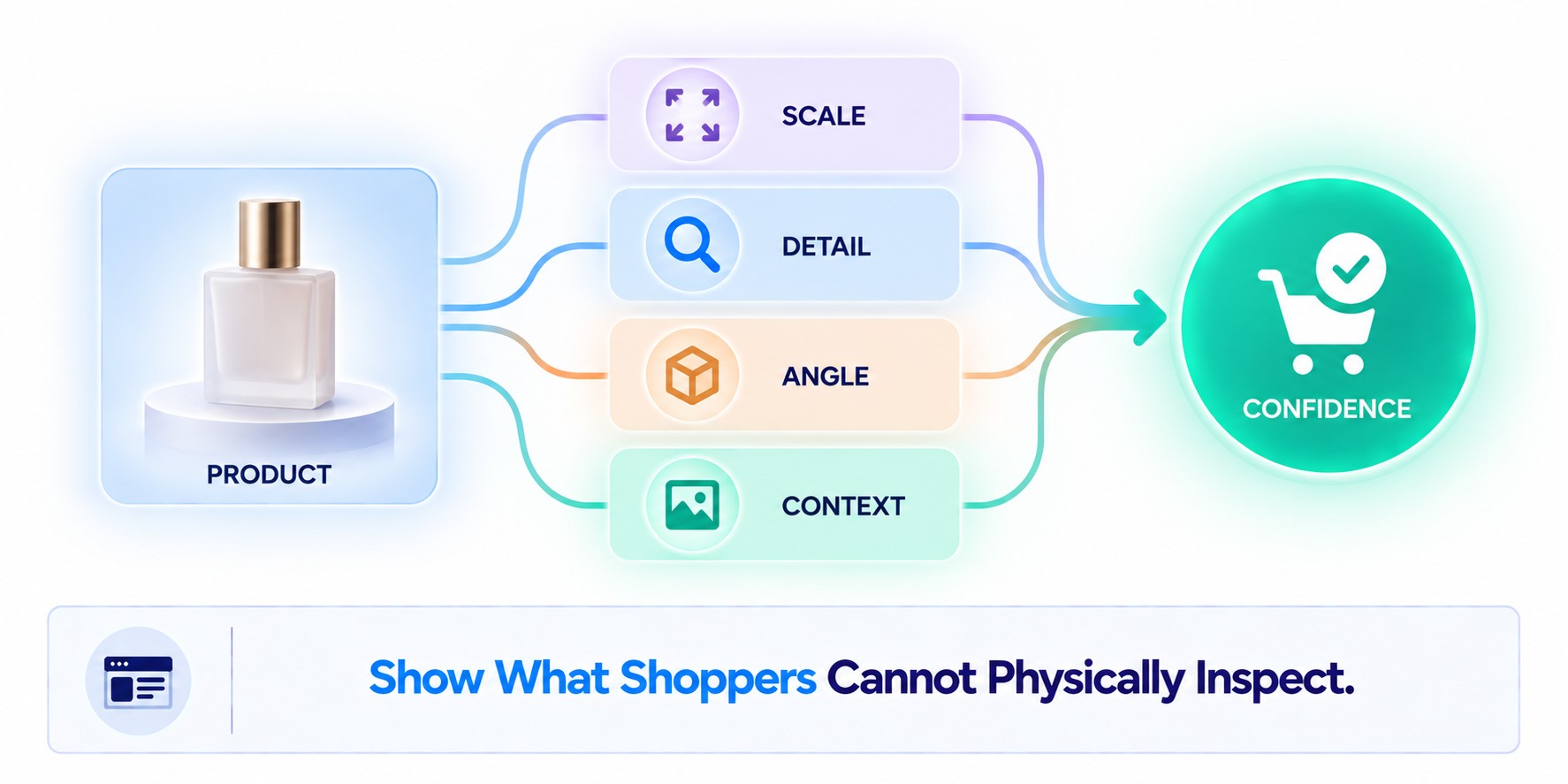
Product visuals should let shoppers compare items without mentally adjusting for inconsistent photography. Standardize backgrounds, camera angles, cropping, and proportions across equivalent catalog views. A category grid becomes harder to scan when similar products appear at unrelated scales.
Consistency should not eliminate useful variation. Keep primary images aligned in quality and treatment, then use secondary views for detail and context. Every chair might share one catalog angle, while galleries reveal upholstery texture and room placement.
2. Make Product Benefits Easy to See
Product graphic design should translate specifications into consequences shoppers understand quickly. Use them when product appearance alone cannot communicate important information. The format should match the question shoppers need answered.
Use graphics when they answer questions such as:
- How large is it? Show dimensions beside the relevant product edges.
- What does it hold? Show capacity using familiar objects or realistic contents.
- How does it work? Annotate controls or functional components directly.
- Why does the feature matter? Connect one visible feature with one practical benefit.
Graphics should supplement rather than duplicate detailed product copy. Baymard Institute found that 56% of tested users explored product images first. Important visual explanations should therefore remain accessible during image-led evaluation.
3. Follow a Consistent Brand Identity
Brand consistency should make different Ecommerce graphics recognizable without forcing them into one template. Define colors, typography, imagery treatment, spacing, graphic elements, and tone before scaling production. Those rules should remain recognizable across Ecommerce product pages and marketing channels.
| Touchpoint | Visual treatment | What stays consistent |
| Product page | Clinical close-ups | Typography and color logic |
| Social media | Lifestyle photography | Image treatment and brand tone |
| Product-led modules | Layout hierarchy and typography |
Different graphic design styles can still preserve recognition when they follow the same core brand rules. The product and audience should determine the treatment, while core identity rules maintain recognition.
4. Design for Mobile Shopping
Mobile Ecommerce website design should protect the information shoppers need before purchasing. Product imagery, price, variants, and purchase controls must remain easy to find on smaller screens. Promotional creative should never push decision-critical product information unnecessarily far down the page.
Use mobile-first thinking before adapting graphics to responsive layouts. Check image dimensions, text legibility, product crops, and critical proof at actual mobile sizes. Keep supporting images discoverable without pushing critical product information below unnecessary mobile content.
5. Use Visual Hierarchy to Guide Attention
Ecommerce hierarchy should expose information in shopping order. Product identity and the primary benefit should lead, followed by supporting proof and the purchase action. Discounts, badges, and secondary messages should not compete with that path.
Decision order:
- Recognize the product or category.
- Understand the primary offer or benefit.
- Verify supporting information when needed.
- Act through one dominant next step.
On product pages, hierarchy should change as shoppers move from recognition to evaluation. Ratings and key specifications can support comparison without competing with price or purchase controls. Product page design should make decision-critical information prominent when shoppers need it.
6. Use High-Quality Product Photography
Product photography should reduce uncertainty that text cannot resolve efficiently. Use primary images for identification, detail shots for materials, and multiple angles for shape. Lifestyle product photography should clarify function, scale, or realistic use.
Scale deserves particular attention because isolated images provide few reference points. Baymard Institute found that 42% of participants tried judging product size through imagery. Show products in a meaningful context when surroundings help customers understand their actual proportions.
7. Make Promotional Graphics Easy to Understand
Promotional graphics should communicate one dominant offer quickly. An Ecommerce banner needs a recognizable product, clear offer, and one primary CTA. Secondary information should earn its space.
The same principle applies to Ecommerce advertising design. A seasonal footwear promotion might show representative products, one offer, and a direct “Shop Collection” CTA. Keep discount conditions readable, remove competing promotions, and avoid badges that distract from the primary offer.
8. Design for Conversion, Not Just Aesthetics
Conversion-focused online store design removes visual obstacles between product evaluation and purchase. If shoppers cannot judge scale, add an in-context product image instead of another decorative shot. If a key specification affects the decision, show it beside the relevant product feature.
Small visual changes can target different conversion barriers:
- Product images: replace repetitive angles with scale, detail, or product-in-use evidence.
- CTA: replace competing buttons with one action matching the shopper’s next step.
- Trust signals: move ratings, guarantees, or customer evidence beside the uncertainty they resolve.
- Product information: turn decision-critical dimensions or features into scannable visual explanations.
Measure each change against the behavior it should influence. Better product evidence can reduce evaluation uncertainty, while clearer CTAs can support progression toward purchase. Well-placed trust signals and product information can resolve objections before they interrupt the conversion path.
9. Use Social Proof and Trust Signals
Nielsen Norman Group identifies product information and customer reviews as important elements of Ecommerce trust. Reviews, testimonials, customer photos, and certifications answer different forms of uncertainty. Their value therefore depends on both relevance and placement.
| Shopper uncertainty | Useful trust signal | Best placement |
| Does it work as claimed? | Customer reviews or UGC | Near product benefits |
| Is the claim credible? | Certification or verified evidence | Beside the relevant claim |
| Can I return it? | Returns guarantee | Near purchase controls |
| Will it fit my needs? | Customer photos or fit reviews | Near sizing information |
| What happens after purchase? | Delivery information | Before checkout |
Place trust evidence beside the claim or decision it supports. This keeps proof available when shoppers encounter the relevant uncertainty. Generic badges provide less context when separated from the underlying risk.
10. Test and Improve Your Visuals
Visual testing should answer a specific question. Test one visual hypothesis at a time. Compare contextual imagery, simplified promotions, or trust evidence against the relevant shopping behavior. Changing several variables simultaneously makes the result harder to interpret.
Combine A/B testing with analytics, heatmaps, and conversion data. Evaluate behavior after the interaction rather than rewarding clicks alone. Record successful patterns inside the design system so future production can reuse validated decisions.
Book a Call
How to Design Product Images That Sell
Product images should answer questions shoppers cannot resolve without handling the product. Build galleries around appearance, scale, function, and important details. Every view should contribute information rather than fill an image slot.
Use Multiple Product Views
Different angles should reveal information unavailable in the primary image. Footwear may require several functional views, while furniture benefits from perspectives showing shape and construction. Each additional image should reduce a specific uncertainty.
Before: a product gallery shows six nearly identical studio angles but never communicates scale.
After: keep essential angles and replace repetition with a detail shot and in-context view. Each image then answers a different purchase question.
Show Products in Context
Context should explain size, fit, use, or environment rather than create atmosphere alone. A desk beside a chair communicates scale, while clothing on a person reveals proportions unavailable in folded photography. The useful context depends on what shoppers cannot infer from the isolated product.
Choose context according to the missing information:
- Furniture: show scale against familiar room elements.
- Fashion: show fit on a person with useful viewing angles.
- Accessories: show dimensions relative to everyday objects.
- Tools: show grip, operating position, or working environment.
Product visualization should provide evidence rather than atmosphere alone. Keep contextual imagery when realism answers a purchase question. Remove it when clearer product evidence would be more useful.
Highlight Important Features
Annotations help shoppers notice features that ordinary photography may hide. Callouts can reveal compartments, dimensions, compatibility, or meaningful differences between models. Choose the treatment according to the information problem.
| Feature problem | Better visual treatment | Example |
| Hard to notice | Short callout | Hidden bag compartment |
| Difficult to size | Dimension overlay | Cookware diameter |
| Models seem similar | Comparison graphic | Capacity differences |
| Function is unfamiliar | Usage sequence | Folding mechanism |
Keep labels physically close to the feature they explain. Longer explanations belong in product copy rather than inside imagery. Product image design should accelerate recognition, not recreate a specification sheet.
Maintain Consistent Image Quality
Set catalog rules for resolution, cropping, aspect ratios, backgrounds, and primary-image scale. Consistent standards keep category pages from appearing assembled from unrelated sources. They also simplify visual merchandising as inventory grows.
Define separate rules for primary, detail, lifestyle, and annotated images. Consistency should apply within each function rather than forcing every asset into one treatment. This keeps large catalogs systematic without making them repetitive.
How to Design Ecommerce Website Banners
Ecommerce website banners should orient shoppers toward a relevant product, category, or promotion without interrupting navigation. Give each banner one primary message, establish visual hierarchy, and connect its promise with the destination page. Good UX design supports the user experience when banners lead shoppers toward the product, category, or offer they expect.
Create a Clear Visual Hierarchy
Let banner hierarchy follow the campaign objective. A launch banner can lead with the new product, while a sale banner may lead with the offer. Product context and one relevant CTA should support whichever message comes first.
Check the banner at actual display size before approval. The product or offer should remain understandable before shoppers read supporting copy. If several elements compete first, reduce their prominence rather than adding stronger styling.
Use Strong but Relevant Calls to Action
A CTA should describe the next useful action. Its wording should tell shoppers what happens after the click. Keep competing actions away from the primary path.
CTA check:
- Names the next shopping action.
- Matches the banner promise.
- Leads to the expected destination.
Specific CTA wording reduces uncertainty after the click. “Shop New Arrivals” communicates more intent than an ambiguous “Learn More.” Competing actions should remain secondary or disappear.
Match Banners to Landing Pages
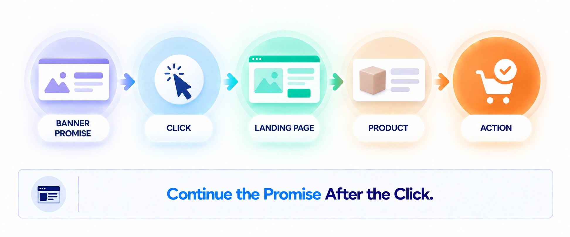
The landing page should continue the expectation created by the banner. If the banner promotes a specific collection, the click should not lead to a generic homepage. Effective landing page design preserves the product category, visual language, and offer after the transition.
| Banner promises | Landing page should preserve |
| Specific collection | The same collection |
| Promotional offer | The same terms |
| Product benefit | Supporting product evidence |
| Visual theme | Recognizable imagery and hierarchy |
Message match should remain obvious immediately after the click. Shoppers should recognize the selected product, offer, and visual context. Unexpected changes force them to verify whether they reached the intended destination.
Avoid Overloading the Design
Before: a sale banner combines several products, two discounts, multiple badges, and competing CTAs. Shoppers must separate the main offer from secondary promotions before deciding where to click. Shipping copy and decorative elements create additional competition without helping them evaluate the deal.
After: keep one representative product and rebuild the message as Product → Key Benefit → Offer → CTA. Move secondary conditions outside the primary visual path, while keeping essential offer terms readable. The revised banner gives shoppers one product context, one reason to care, and one obvious next action.
Ecommerce Graphic Design for Social Media and Ads
Ecommerce visual content should preserve recognizable identity while adapting to each channel’s viewing behavior. Platform adaptation involves composition, pacing, information density, and product emphasis. Ecommerce content design can share one visual system across organic and paid channels while serving different jobs.
| Channel | Effective Visuals |
| Product carousels, lifestyle images, customer content, short demonstrations | |
| Product-led promotions, collections, customer proof, benefit-focused creative | |
| Vertical product inspiration, collections, how-to visuals, contextual imagery | |
| TikTok | Short product demonstrations, creator-style visuals, product-in-use sequences |
| Google Display | Simple product focus, concise offer, recognizable branding |
| Email marketing graphics for product launches, recommendations, and promotions |
How to Create an Ecommerce Graphic Design System
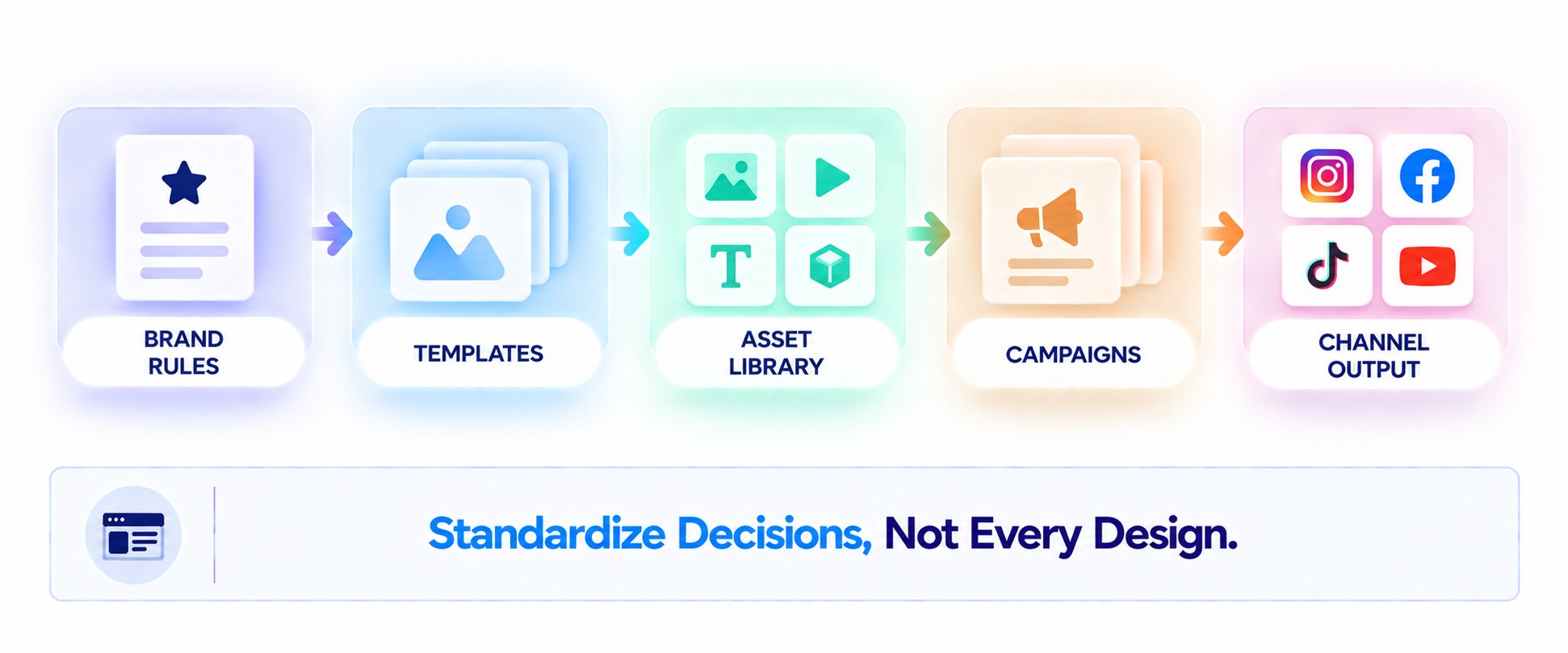
An Ecommerce design system turns recurring decisions into reusable rules. Standardize identity, layouts, asset storage, and campaign variations. The goal is faster production without making every creative identical.
Define Your Brand Guidelines
Ecommerce guidelines should cover more than logos and brand colors. They should resolve recurring production decisions before campaigns begin. Clear rules reduce unnecessary interpretation during execution.
Document at least:
- Product-image backgrounds and cropping rules.
- Promotional typography and hierarchy.
- Approved imagery treatments.
- Spacing and layout principles.
- Rules for discounts, badges, and CTAs.
These boundaries keep outputs recognizable as production scales. They should guide recurring decisions without prescribing one layout for every asset. Teams still need flexibility for different products and campaign objectives.
Create Reusable Templates
Templates work best for genuinely recurring formats. Standardize banners, social posts, email graphics, product callouts, and promotions. Preserve enough flexibility for different products and messages.
Reusable templates also help external graphic design services produce recurring assets without reinterpreting brand rules. The brand system should remain the source of truth for every contributor. This prevents added capacity from fragmenting visual identity.
Build a Digital Asset Library
Digital asset management keeps approved files accessible and outdated versions out of production. Use predictable naming for product imagery, templates, campaign files, and exports. Organize assets so teams can identify the current master quickly.
| Asset type | Control needed | Owner responsibility |
| Logos | Approved versions | Retire outdated files |
| Product imagery | Naming and variants | Maintain current masters |
| Templates | Version control | Approve structural changes |
| Campaign files | Status and dates | Archive expired creative |
Clear ownership keeps the library reliable over time. Assign responsibility for approving masters and retiring outdated versions. Teams should not need a designer to identify the current file.
Create Different Templates for Different Campaigns
Campaign templates need different information priorities. Launches may emphasize novelty and explanation, while discounts prioritize offer clarity. Evergreen campaigns usually give more space to benefits and proof.
Keep the underlying visual identity stable across those formats. Change hierarchy according to campaign purpose rather than redesigning the brand each time. This creates useful variation without weakening recognition.
Ecommerce Graphic Design Trends to Watch
Ecommerce trends matter when they solve a specific shopping or production problem. AI-assisted workflows can accelerate campaign variations, but teams still need fixed brand and product rules. Personalized Ecommerce visuals can adapt featured products or messages to different shopping contexts instead of showing everyone identical creative.
Other trends become valuable when they replace information customers normally obtain by handling a product:
- User-generated content: shows real-world fit, scale, or everyday use.
- Interactive visuals: let shoppers inspect features or configurations before purchasing.
- 3D product visualization: clarifies shape, dimensions, and spatial relationships.
- Short-form video: demonstrates movement, assembly, or product operation.
- Motion graphics: explains changing states or unfamiliar functions quickly.
- Immersive experiences: simulate product exploration when static imagery cannot.
Teams evaluating broader graphic design trends should therefore start with the Ecommerce problem, not the format. Faster production matters for high-volume campaigns, while richer visualization matters for products that are difficult to evaluate online. A trend deserves investment when it removes a specific information gap or production constraint.
Conclusion
Effective Ecommerce visuals should help customers understand products, evaluate evidence, and shop with less uncertainty. Graphic design for Ecommerce also needs consistent Ecommerce branding and a clear commercial purpose. Repeatable systems make successful visual decisions easier to scale across products and campaigns.