
In 2025, around 64% of all global web traffic comes from mobile devices, according to Soax. Since more people are scrolling on their phones, the way we design websites matters. A good site needs to look great, load quickly, and actually have real-world business impact. That’s where the difference between adaptive and responsive design comes into sharp focus.
If you’ve ever seen a website that looks great on desktop but feels sluggish on mobile, or one that loads fast but looks awkward on certain screens, the answer boils down to the design approach behind it.
This article walks you through exactly what each approach means. You’ll find a detailed side-by-side comparison and receive actionable guidance on choosing the right path for your site. Plus, you’ll see how we at Duck.Design implement mobile-friendly design principles in real projects.
What Is Adaptive Design?
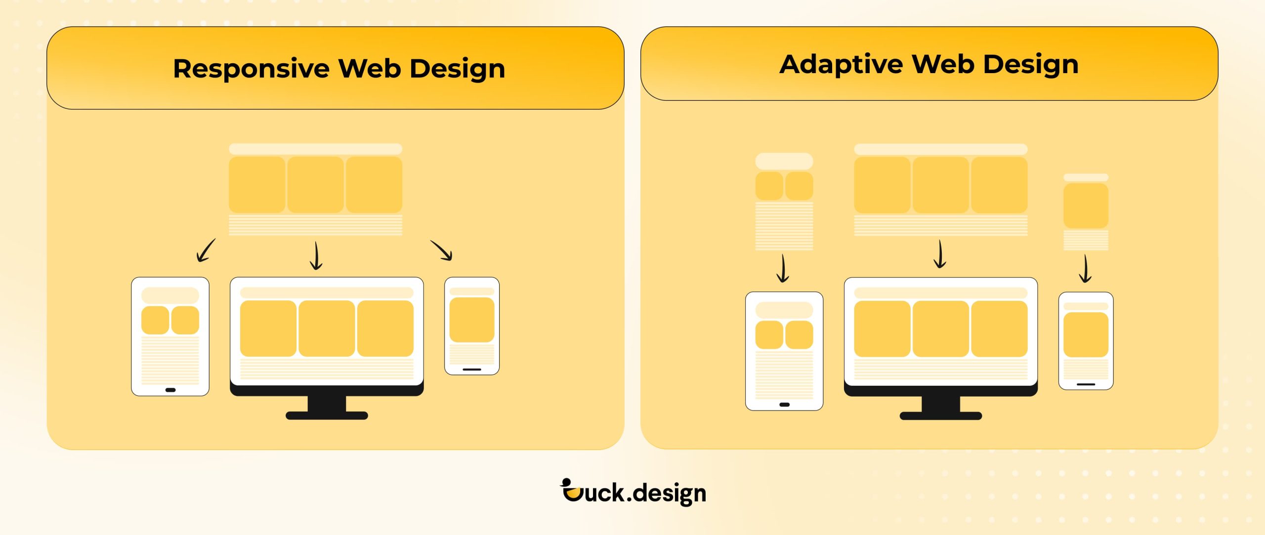
At its core, adaptive design is a strategy where a website or app has several fixed-layout versions, each made for specific device widths or screen sizes. Like the name suggests, this type of interaction design system adapts to the device someone is using to view the site. Instead of using one fluid layout that stretches or compresses across all devices, adaptive web design detects a visitor’s screen dimensions (or device type) and serves the version most suited for that form factor.
The essence of adaptive design
It starts with pre-designed layouts for common breakpoints (for example: 320px, 480px, 760px, 960px, 1200px) rather than one layout trying to adjust to every device. When someone visits the website, the server or client logic checks their device or screen size (or uses the user-agent string) and loads the layout that fits best.
Each version can be optimized individually (for layout, image sizes, navigation, and even features), so the experience feels designed specifically for that device. Since you’re working with known widths, you get more control over how the site looks across different screens.
In practice, adaptive web design shines when:
- A brand has an existing large site and wants to deliver a high-quality mobile experience without totally rebuilding everything.
- You have distinct device usage patterns. Maybe mobile users are more likely to browse quickly, whereas desktop users explore in-depth. With this system, you get to offer different content or presentations accordingly.
- You want performance optimization. Since each version loads only what’s needed for that device, you can trim asset sizes and tailor features.
- You’re building apps or sites with heavy variation in device type, and you want full control of layout.
Real-life examples
According to DeviceAtlas, IKEA uses an adaptive version of its desktop layout for its mobile site. The menus change, the layouts shift, and the whole experience adjusts based on whatever device you’re on.
Here’s what the website looks like on a laptop:

On a phone, the design fits small-screen browsing:

Each version is optimized to accommodate the device that visitors are using. This means they don’t have to deal with weird spacing or navigation that only works well on larger screens.
What Is Responsive Design?
Responsive design is all about using one layout that can adapt to whatever screen size or device the visitor is using. Rather than creating several fixed layouts, it relies on fluid grids, flexible images, and CSS media queries. This lets the content re-flow, resize, or reshape itself dynamically.
The essence of responsive design
With responsive design, you’re only dealing with one code base and one website. Using a set of breakpoints (defined in CSS), the layout automatically adapts as the screen gets bigger or smaller. It allows layouts to stretch, shrink, or reorder elements to fit the available space. Basically, imagine the website as water flowing into a container. It stretches and fills up according to the shape of what holds it.
Responsive web design is widely used across websites and apps where brands want one site that works seamlessly everywhere, rather than building and maintaining separate “mobile” and “desktop” versions. Here’s where responsive web design would work best:
- A brand launches a new website and wants it to look solid on any device people use. They also don’t want extra URLs to manage or deal with duplicate content.
- An online store wants its product pages, checkout flows, and navigation to shift smoothly from a wide desktop layout (with sidebar filters, large images) to a simple, thumb-friendly mobile layout. They want all this to be handled under the same domain.
- A SaaS company builds a flexible user interface for desktop, tablet, and mobile using a single code base. This keeps features consistent and streamlines updates.
Real-life cases
Brands like Dropbox have adopted responsive web design by serving unified layouts that rearrange for mobile vs desktop rather than separate site versions.
Here’s a screenshot of their website on a laptop:

And here’s how their site looks on mobile:

Keeping a consistent look across devices helps brands stay aligned and recognizable everywhere.
Book a Call
Key Comparison Between Responsive vs Adaptive Design
Both design systems come with their own pros and cons, and the right choice really depends on what your brand needs.
| Feature | Adaptive Design | Responsive Design |
| Layout approach | Uses several fixed layouts built for specific screen widths/devices | Uses fluid grids and CSS media queries so one layout flexes to fit any screen |
| Level of control over the website layout | High control; each version can be fine-tuned or even pixel-perfect for that device | Medium control; everything runs on one codebase that adjusts on the fly |
| Performance optimization | Better potential because only the assets, elements, and layouts needed for the specific device are loaded | More challenging to optimize because the single codebase might require extra assets to load |
| Maintenance and scalability | Higher maintenance; multiple layouts mean more work when updating content or features | Easier to maintain; there’s only one codebase to deal with and fewer versions to update |
| Future-proofing for viewing and use on new devices | Less future-proof; new screen types may require additional layouts and dimensions | More future-proof; fluid design and singular codebase can adapt more seamlessly to newer environments |
| Best use cases |
|
|
Pros and Cons of Adaptive Design
✅Pros:
- You can customize each device version exactly how you want. This means you can adjust layouts, navigation, and assets separately.
- Potential for higher performance on targeted devices because you only load what’s needed for that version.
- Useful when retrofitting a large existing desktop site and you want a solid mobile version without rebuilding everything from scratch.
❌Cons:
- You’ll need to design and maintain several versions of your site. This adds extra design, development, and QA work.
- May struggle with “in-between” screen sizes, meaning devices that don’t match your fixed breakpoints may get sub-optimal layouts
- As new device form-factors emerge, additional layouts may be needed, making them less future-proof
- Complexity of SEO and duplicate content can increase if not carefully handled
Pros and Cons of Responsive Design
✅Pros:
- Sticking to one layout and one codebase keeps things simpler in the long run. It makes maintenance easier and updates or future changes become more manageable.
- Better suited for unknown or evolving device sizes because it adapts fluidly rather than relying on fixed breakpoints.
- Aligns well with mobile-first and modern performance and SEO practices. This is a plus because Google recommends mobile-friendly, flexible sites.
❌Cons:
- Because of less granular control, the layout may not look “perfect” for every screen size.
- Potential performance issues because with one codebase handling everything, there’s a risk of loading unnecessary assets for some devices.
- May require a more thoughtful strategy in UX and design to ensure fluidity and readability across many breakpoints.
When to Use Adaptive or Responsive Web Design? Choosing the Right Approach
Both design systems aim to give users a smooth experience on any device. They just use different means. Choosing between adaptive vs responsive design really depends on your goals, the resources you have, and how people browse your site.
Use adaptive web design if:
- You’re retrofitting an existing desktop site. If you already have a desktop-centric approach, adaptive web design helps you create a lighter, more streamlined version for mobile and tablet users.
- You cater to clearly defined devices or audiences. Say around 70% of your visitors are iPhone users, and the rest use desktops. With adaptive web design, you can build layouts that match those exact breakpoints instead of worrying about every device on the market. Just be sure to look at your analytics so you know exactly where your traffic is coming from.
- Performance is your top priority. Adaptive sites load only what each device needs, which is why they’re a strong choice for eCommerce brands. Faster mobile loading directly affects sales. Deloitte Digital found that even tiny improvements in load time can bump up conversions and help users move through checkout faster.
Imagine a luxury retailer whose mobile shoppers mostly browse collections, while desktop users complete purchases after comparing details. The retailer could use adaptive web design to deliver a fast, image-driven mobile version focused on “Add to Wishlist” and a richer desktop version with videos, zoom features, and full lookbooks.
However, you can also use responsive web design for a different set of objectives. It’s ideal if:
- Your traffic comes from all sorts of devices. Responsive web design keeps your site looking good everywhere, from foldable phones to ultra-wide monitors. It also future-proofs your layout on devices that don’t even exist yet when you launch a website.
- SEO and accessibility are crucial. Google recommends responsive sites because everything lives under one URL. That makes it easier to index your pages and can help your SEO perform better. It also keeps accessibility more consistent across the whole site, which matters for WCAG guidelines.
- You want easier long-term maintenance. Since everything runs on one codebase, developers only need to update one version of the site. Consequently, making updates becomes quicker and cheaper.
- You’re trying to grow your site. A unified site means consistent messaging, analytics, and A/B testing, which you need for accurately tracking behavior and effectively improving a website.
Take a SaaS company, for example. Its visitors are coming in from different countries and using all sorts of devices. Responsive design makes sure everything stays steady: sign-ups, demos, and pricing pages.
| Goal | Best Approach | Why |
| Redesigning a desktop-heavy website | Adaptive Design | Enables a faster transition to mobile without rebuilding everything |
| Launching a new brand or product site | Responsive Design | Easier to scale and maintain |
| Focusing on SEO, accessibility, and long-term growth | Responsive Design | Single URL, improved indexing, consistent UX |
| Serving specific device audiences | Adaptive Design | Targeted layouts enhance usability and performance |
Still not sure whether to choose responsive vs adaptive web design? If your website needs carefully crafted layouts for certain devices, adaptive is usually the better fit. If you prefer one flexible solution that’s easy to update, responsive web design is the way to go.
And if you want both, Duck.Design can help. Our design teams can blend the two strategies to create a conversion-centered design that works smoothly, no matter what screen someone’s using.
Book a Call
See How Our Designs Stay Perfect on Every Screen
The best way to understand the difference between adaptive vs responsive web design is to see how it comes alive in real projects. At Duck.Design, we don’t just talk about flexible layouts like it’s a buzzword. We build websites that adapt, respond, and perform flawlessly, no matter where they’re viewed.
Case Study #1: Anything SPF

✅Goal: Create a mobile-first eCommerce experience that prioritizes speed, clarity, and conversion.
The Anything SPF team wanted a store that loaded quickly on mobile but still looked premium on desktop. So we built the entire site using responsive web design principles (using media queries, flexible imagery, and fluid grids instead of fixed grids), so it would automatically adjust to different viewport sizes and screen resolutions for a user-centered design.
🚀Outcome:
A smooth, consistent experience everywhere. The custom design led to a 70% jump in brand recognition and 89% user satisfaction.
Case Study #2: Lush Stonez

✅Goal: Build a visually immersive yet technically efficient site for a jewelry brand that could capture the tactile luxury of their products. We chose responsive web design for its scalability and SEO benefits.
🚀Outcome:
Lush Stonez saw a 25% boost in sales in just the first quarter. Users were checking out 30% more pages per visit, and 9 out of 10 users said the site was way easier to navigate.
Want Your Digital Product to Deliver a Seamless Experience on All Devices?
Need a design team that can handle it all (from web and app UI/UX to full-brand systems)? Duck.Design has you covered. With our subscription model, you get one flat monthly rate and as many design requests as you want. No surprise charges, no hiring headaches, no juggling multiple vendors.
We put our energy where it counts: performance, usability, cross-device compatibility, and business impact. Whether you want more website conversions, a smoother user experience, or a brand that feels current, we build with UI design principles and conversion-focused design patterns in mind.
Ready for a digital presence that looks sharp and scales with your business? Reach out to Duck.Design today.