Ever looked at a design and thought, “That’s such a clean design”?
Or… “What is this hot mess?”
Yeah, same. We’ve all been there.
Graphic design is everywhere — from your go-to websites and Instagram ads to street billboards and the cereal box you barely glanced at this morning.
But here’s the big question:
What makes good design actually good… and bad graphic design, well, bad?
Spoiler alert: It’s not just about making stuff look pretty.
Good design works.
It guides you. It makes sense. It feels right.
Bad graphic design? It’s like hitting a dead-end in a maze — confusing, frustrating, and you bounce fast.
The right combo of colors, fonts, spacing, and layout can make something look sleek and professional.
Mess that up? Suddenly, it’s giving 2003 MySpace vibes — cluttered, clunky, and low-key stressful.
Think about logos.
A solid one sticks in your brain and makes a brand feel legit.
A bad one? Looks cheap, sends mixed messages, and makes you not trust the brand at all.
So whether you’re creating a website, designing custom graphics, or just tweaking your visuals, knowing how to spot (and fix) bad design is a game-changer.
In this article, we’ll break it down:
✅ Real-world design examples
✅ What works (and why)
✅ What flops (and how to fix it)
By the end? You’ll have an eye for what clicks with your audience and what flops.
Let’s go. 🚀
Key Factors That Separate Good and Bad Graphic Design
Not all designs hit the same.
Some grab your attention in seconds, guide your eyes like a pro, and just feel right. Others? They leave you squinting, scrolling, or straight-up bouncing.
So what actually separates a good design from a bad one?
Let’s break it down — side by side — and look at the key factors that separate a good and a bad design:
Good vs. Bad Graphic Design: A Detailed Comparison
| Factor | Good Graphic Design | Bad Graphic Design |
| Clarity & Readability | The text is clear, clean, and easy to read. Contrast, spacing, and font size? All on point. | The text is tiny and cramped or blends into the background. You’re left guessing. |
| Visual Hierarchy | Key graphic elements pop and guide your eye where it needs to go. | Everything’s fighting for attention. No flow, no structure. Just chaos. |
| Color Scheme | Colors complement each other, add energy, and support the message. | Colors clash, look washed out, or feel all over the place. |
| Font Selection | Fonts are readable, polished, and match the brand vibe. | Too many fonts, weird styles, and no consistency — it’s a mess. |
| Spacing & Layout | Clean, organized layout that feels effortless to navigate. | It’s too cluttered or awkwardly empty. There is no balance in design. |
| Branding Consistency | The design feels on-brand. Fonts, colors, and tone are consistent. | Feels random or disconnected from the brand. |
| Imagery & Graphics | Crisp, high-quality visuals that actually support the message. | Blurry, pixelated, or just irrelevant images that should not be there. |
| Contrast & Alignment | Strong contrast makes things stand out. The elements are lined up just right. | Poor contrast makes stuff hard to read. Your audience won’t connect with your message. |
| User Experience (UX) | Everything flows. Navigation feels natural and seamless. | Users get lost, confused, or frustrated. Not a good sign for the website rankings. |
| Call-to-Action (CTA) | CTAs are bold, clear, and impossible to miss. | Weak CTAs that blend in or make users ask, “What now?” |
| Modern Design vs. Outdated Design | Follows current graphic design trends while maintaining timeless appeal. | Stuck in the past. Dated fonts, styles, and effects. |
| Emotional Impact | The design connects. It feels intentional and resonates. | Leaves people cold. No vibe, no spark. |
| Purpose & Functionality | It’s built for the goal—whether that’s selling, branding, or engaging. | No clear message. No direction. Just noise. |
Why does this matter?
Here’s the truth:
94% of first impressions come down to design.
And a bad one? It can make 88% of people decide not to come back.
So yeah, design isn’t just decoration. Understanding these differences between good and bad graphic design is a deal-breaker.
Understanding what separates the good from the bad helps you create designs that don’t just look great but work great, too.
Whether you’re building a website, crafting a social media post, or designing a logo, these factors will help you avoid common mistakes and create professional, user-centered designs that leave a lasting impression.
✅ Pro tip: Looking into ai for graphic design? Discover practical ways to speed up workflows and enhance creative output.
Let this be your cheat sheet to cleaner, bolder, more effective designs that leave a real impact.
Now, let’s look at some good vs bad graphic design examples.
Good vs. Bad Graphic Design: Comparison Examples
If you understand the difference between good and bad graphic design, you can easily create a visual that works for your business.
Essentially, your design must:
- Build trust
- Connect with the target audience
- Communicate your message clearly
Here are some good and bad graphic design examples to demonstrate what we mean.
1. Logo Design
❌ Bad Example: The 2010 Gap Redesign
![]()
In 2010, Gap, a popular fashion brand, decided to redesign its logo. They wanted to modernize their logo. So, they replaced their iconic blue-box design with a design featuring a plain Helvetica font and a small, gradient blue square. That’s it!
The redesign lacked originality and the connection to the brand’s heritage – something that its customers cherished. People hated the new logo, and they made their displeasure known.
What happened then?
Gap reverted to its original logo within just one week.
✅ Good Example: Duck.Design x Voto
![]()
Duck Design partnered with Voto to create a modern and innovative logo – something important to Voto’s core values.
What did we do? We selected a color palette that oozes innovation. For typefaces, we chose modern fonts that were clean and readable across all devices.
The final result is what you can see in the image above. A perfect example of good graphics.
The logo design helped Voto create a brand identity that stood out in a competitive market. And like a domino effect, they saw a significant boost in brand recognition and user engagement.
2. Website Design
❌ Bad Example: Yale School of Art Website
![]()
The Yale School of Art’s website has often been criticized for its overwhelming and disorganized design. It is a really bad graphic design example.
With too many fonts, colors, and competing visual elements, the site creates a chaotic experience that makes it difficult for users to find what they’re looking for — a clear case of design getting in the way of communication.
✅ Good Example: Duck.Design x Swipetask
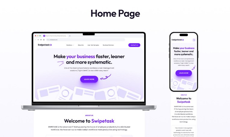
In contrast, our work with Swipetask — a workforce management solutions provider — showcases what a well-planned graphic design process can achieve.
We developed 7+ responsive web pages tailored for performance, usability, and clarity. Our team created a UX kit with 20+ reusable blocks, selected a refined typeface combination (Outfit for headlines, Poppins for body text), and used a 5-color palette aligned with the brand’s value proposition.
The result was a user-friendly, aesthetically cohesive website that improved loading times, enhanced navigation, and contributed to higher conversion rates.
3. Advertising Materials
❌ Bad Example: Poorly Designed Event Poster

It’s common to come across local event posters packed with clashing colors, too many fonts, and no visual hierarchy.
The message gets lost in the noise, leading to poor visibility and low turnout — not because the event lacked value, but because the design didn’t communicate it effectively.
✅ Good Example: Duck.Design x Southern Surgery

Our advertising campaign for Southern Surgery tells a very different story.
With a carefully selected color palette, consistent typography, and a clear, focused value proposition, the design elevated the campaign’s professionalism and significantly increased both inquiries and sales.
It is a good example of graphic design that shows when visuals are aligned with strategy, they move the needle.
4. Social Media Graphics
❌ Bad Example: Generic, Low-Quality Posts

Poor social media design — think pixelated images, cluttered text, and mismatched colors — doesn’t just fail to attract attention.
It can actively damage your brand’s credibility. In today’s highly visual digital space, those details matter more than ever.
✅ Good Example: Duck.Design x ICARE
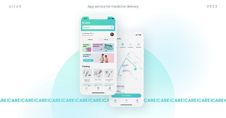
When Duck.Design partnered with ICARE, and the goal was to build a unified, professional visual identity for their social media channels. We delivered clean, high-resolution graphics with a consistent design language.
The impact was measurable: ICARE grew its social following by 10,000 users in just three months and saw a 20% increase in successful order placements. A thoughtful, well-executed design system turned into tangible business results.
What should you learn from these examples?
The main lesson here is that a strategic design must not be only about aesthetics. It should have a clear message, be easy to navigate, and follow consistent design elements.
If you want to enhance your customer experience, drive engagement, build trust, and support business growth, a good graphic design is important; frankly, it’s non-negotiable.
Read Also: Graphic Artist vs. Graphic Designer: Insights to Help You Make the Right Choice
The examples we shared above demonstrate how subtle but right design choices can turn an ordinary visual into powerful branding materials.
If you design your visuals with these foundational guidelines, your work won’t just look good; it’ll make you money on autopilot.
You’ve seen the difference between well-planned and bad graphic designs. Now, let us show you how we can create the best designs for you.
With Duck Design, you get pixel-perfect graphics that amplify your message and grow your brand.
The Long-Term Benefits of Investing in Quality Graphic Design
If you think that good graphic design is just “making things look pretty,” then you are so wrong. It’s about shaping your brand’s recall value.
Your designs must imprint your brand in customers’ minds today so they remember it tomorrow. Trust is built only when your design consistently reflects your brand’s image, values, and tone.
Over the years, that trust turns into loyalty, and loyalty turns into growth.
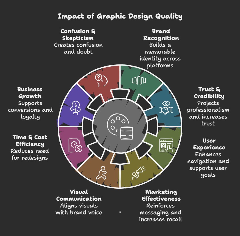
Here’s how quality design pays off in the long run:
✅ Builds a Strong Recall Value for your Brand
Studies say people remember how something made them feel, and UX plays a massive role in making your audience feel towards your brand. Even a clean and simple graphic design can make your brand stay on the top of the mind.
A report by Lucidpress proves that consistent branding across all platforms can boost your revenue by 23%. Do you know why this happens? Whenever a customer sees your designs on any platform, they immediately recognize your design.
For example, McDonald’s “M” with the iconic red background.
✅ Boosts Credibility and Professionalism
Think about it—would you trust a company’s image with pixelated logos, poor font choices, and chaotic layouts? Probably not.
Poor design leads to mistrust, especially online, where visitors make snap judgments in seconds.
After all, 94% of first impressions are design-related, which means people often judge your entire business by your graphics.
✅ Improves User Experience
One of the biggest signals of a good graphic design is how easy it is to navigate and understand. Your customer must be able to grasp your message and brand values instantly.
Things like consistent font selection, thoughtful contrast, and clean alignment improve visual communication, helping users find what they’re looking for faster.
✅ Supports Long-Term Marketing Goals
You might try different types of graphic design as your marketing goals evolve, but one thing always stays common: high-quality graphics.
Whether you are gearing up for a new product launch or creating graphics for a social media campaign, investing in quality graphic design could never go wrong.
First, you need to finalize your graphic design foundations. This will act as your guideline for all your future designs. This way, you won’t be starting from scratch every time, and your audience will start recognizing and trusting your brand.
✅ Saves Time and Money Down the Road
Using cookie-cutter templates or repurposing old designs might seem like an affordable option at first, but in the long run, it will cost you a lot more than you can imagine.
- Rebranding due to poor visual impact
- Spending hours tweaking an amateur design
- Losing customers due to an unprofessional and hard-to-navigate design
All of this is expensive and a complete waste of time and resources. Investing in professional graphic design from the start helps avoid those setbacks.
Want to avoid mistakes in web design? Learn 12 basic web design principles for effective websites
👎 What a Bad Graphic Design Can Cost You
Marketing with low-quality visuals is a bad example of graphic design.
A confusing homepage that lacks direction or a low-resolution, pixelated logo can do more harm to your business than you can imagine.
It confuses users. It makes your brand look unprofessional. And more often than not, it drags down your conversion rates.
Worse? If you leave it unchecked, it can slowly eat away at your credibility—until your brand feels forgettable… or worse, untrustworthy.
That’s why design needs to do more than just look nice.
Your visuals should have a clear message. They should reflect who you are, what you stand for, and why someone should choose you over the next option in their feed.
And let’s be real—nailing that isn’t always easy, especially if graphic design isn’t your thing.
But that’s exactly where a great design partner comes in.
When you team up with a custom graphic design company, you’re not just getting pretty visuals—you’re getting proven design expertise, strategy, clarity, and direction.
You get a creative partner who knows how to bring your ideas to life in a way that feels true to your brand. This helps you make a real impact.
So you’re not stuck second-guessing every font or fiddling with Canva at midnight.
You’re focused on growing your business with visuals that actually work for you.
Main Indicators You Need a Graphic Design Refresh
Not a designer? That’s absolutely fine.
You can tell when a design feels off even without a design degree. Most marketers and businesses can sense when their branding is not resonating with their audience through metrics like low conversions, high bounce rates, and few to no repeat buyers.
The problem arises when businesses keep using confusing and outdated designs even when they know it’s harming their business.
But how can you tell when it’s time for a design refresh?
Here are some red flags to look out for👇
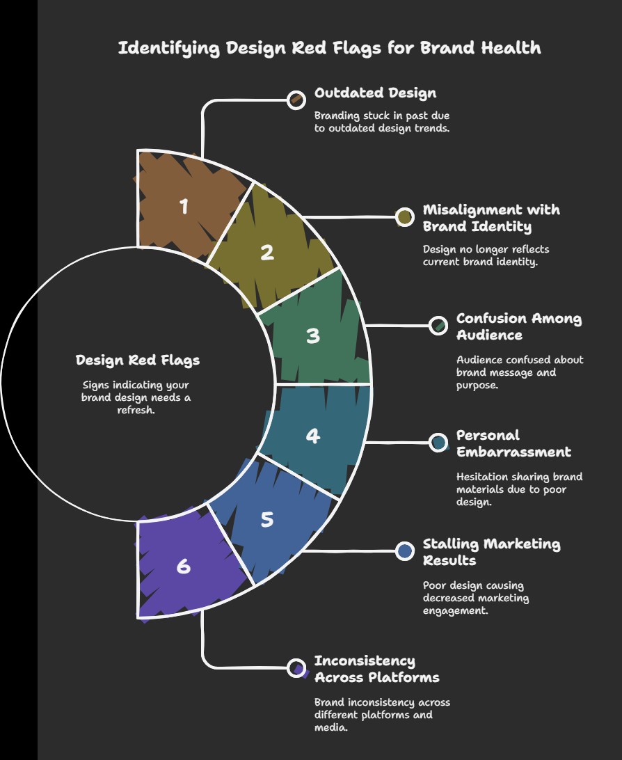
🚩 1. Your Design Looks Outdated
Your brand assets become outdated if you do not tweak them every once in a while. Your design must always look modern and fresh.
Maybe you’re still using pixelated stock photos from the last decade, or you are using outdated fonts like Comic Sans, or maybe your brand value has changed, but your color palette hasn’t.
Such bad designs can send the wrong message and make your brand feel irrelevant.
🚩 2. It No Longer Matches Your Brand
Your business has evolved. Has your design?
If your visuals don’t reflect who you are now—your tone, values, or audience—it creates confusion. Your brand identity should grow with you.
🚩 3. People Don’t Get It
Getting questions like “What do you do?” or “Is this your actual site?”
Bad graphic design – cluttered layouts, unoptimized contrast, too many fonts – can lead to poor visual communication. Such bad designs make it hard for your users to grasp your message easily and quickly.
🚩 4. You’re Not Proud to Share It
If you hesitate to show someone your website or business card, trust your gut.
Confidence in your branding matters—and if you’re cringing when you hand it out, it’s time for an upgrade.
🚩 5. Your Marketing Results Are Dropping
Clicks down? Engagement flatlining?
Your design might be part of the problem. Amateur visuals can lower trust and hurt conversion, even if everything else is on point.
🚩 6. Your Brand Looks Inconsistent
Logo colors changing across platforms? Layouts all over the place?
Inconsistent design weakens your brand. A strong visual identity should look and feel the same wherever people see you.
❗Why It Matters
- An outdated design can hurt conversions.
- It makes customers doubt your credibility.
- And it can cost you business—without you even realizing it.
The worst part? You might not even realize it’s happening until the damage is done.
🛠️ Time for a Refresh?
If you find any of the above signs in your designs, it means your design is in need of a touch-up.
You do not have to entirely re-design your brand assets. Oftentimes, you can just choose a different color palette, tweak the layout, or even select new typefaces, and your audience will start perceiving your brand differently.
Duck.Design: Delivering High-Quality Graphic Design Solutions at Affordable Prices
At Duck Design, we know that strong visuals are the backbone of a strong brand.
Our goal is simple: deliver high-quality graphic design services to help you connect with your audience and make your brand look its best—without blowing your budget
Design Services That Fit Your Needs
Duck Design offers flexible, subscription-based design packages tailored for businesses of all sizes.
We excel in a variety of high-quality graphic design styles. Whether you need daily design support like social media graphics, blog visuals, and packaging or full-scale creative services like branding, UX/UI, motion graphics, and app design, we’ve got you covered.
We are an unlimited graphic design service, which means each plan includes unlimited design requests and revisions, ensuring your brand always looks polished and professional.
Need even more? Our top-tier package includes web development, SEO, and copywriting—giving you everything from visuals to fully functional websites, all without hiring a dev team.
Want to see what fits your needs best? Check out our full pricing and service breakdown here: Duck Design Pricing.
Let’s Level Up Your Brand
If your visuals aren’t keeping up with your business, we’re here to help. Duck Design makes it easy to get professional, on-brand design—without the hassle.
Book a free demo call with us, and let’s build a brand that stands out and performs.