It can’t be denied that we’re surrounded by screens day in and day out. But did you know that print advertising still plays a big role in modern marketing?
Digital marketing may dominate, but print holds real value. Think of billboards or magazine ads—they leave a lasting impression. In fact, 56% of consumers trust print over digital.
So why do ads in print media continue to work well? And more importantly, how can you make it work for your business?
In this article, we’ll explore print advertising and its different types. You’ll also see examples of successful print campaigns to inspire your next move. Ready to improve your print ad strategy? Let’s take a look.
What Is Print Advertising?
Print advertising is a type of advertising design that covers promotional materials using physical formats like newspapers and billboards. Unlike digital ads, print ads are tangible. You can hold them or see them out in the “real” world. Because of this, they create a more direct and personal connection with audiences.
Typical elements of a print media ad include a clear headline, strong visuals, and a call to action (CTA). The copy should be simple with a compelling CTA. Equally important are the colors, fonts, and layout to capture attention. The rule of thumb for a good print ad? It needs to deliver its message at a glance.
Here’s a quick guide about elements of print ads:
✔️Pros of Print Media Ads
- Physical presence: Print ads are hard to ignore since they’re right in front of you.
- Targeted audience: You can place them in specific publications that reach niche groups.
- Higher trust: 56% of consumers have more confidence in print ads than digital.
❌Cons of Print Media Ads
- Limited tracking: It’s tough to measure how effective a print ad is compared to digital ads.
- Higher costs: Printing and distribution expenses can add up, especially for large campaigns.
- Short lifespan: Once people see a print ad, it’s easy for it to be forgotten unless kept.
The Impact of Print Ads on Modern Marketing
Print media ads are still a relevant form of marketing, even in a digital-first world like we have today.
- Print media ads are easier for the brain to process. They need 21% less cognitive effort than digital ads.
- About 78% of people remember seeing print media ads. Meanwhile, only 30% recall digital ads, proving print’s strength.
- Around 82% of consumers say they trust print media ads when making purchases. Only 61% trust digital ads.
- People who receive print materials spend 28% more than those who don’t.
- Roughly 80% of consumers take action from direct mail print ads, compared to 45% with digital.
In short, print media ads aren’t just a holdover from the past. It builds stronger connections. It boosts brand recall. It can even make digital campaigns more effective. All this and more make print media ads a key part of any advertising strategy if you want to improve long-term brand loyalty and ROI.
Key Types of Print Advertising
Print media ads come in different forms, allowing businesses to connect with specific audiences in a tangible way. Whether you’re aiming to reach local communities and passersby or target customers directly, print offers flexible options that engage readers.
Below is a table of key print advertising types, their uses, and the benefits they offer.
| Type | Description | Advantages of Use |
| Newspapers | Ads featured in daily or weekly papers, often targeting local or regional markets |
|
| Magazines | High-quality ads placed in niche or mass-market magazines with targeted readers |
|
| Billboards | Large ads placed in high-traffic areas like highways and city centers |
|
| Direct Mail | Personalized ads sent straight to consumers’ mailboxes |
|
| Flyers & Brochures | Handouts or mailers providing detailed info about products or services |
|
| Posters | Ads displayed in public spaces like stores or community boards |
|
| Catalogs | Printed advertisement materials featuring a collection of products, usually mailed to customers |
|
| Event Program Materials | Ads placed in booklets handed out at events like concerts or sports games |
|
Book a Demo
How to Create Impactful Print Advertisements
An impactful print ad campaign does more than just fill space—it catches your audience’s eye, sends a clear message, and sticks with them.
Let’s look at the strategies behind creating an effective print advertisement.
Consider Size and Placement When Designing Your Advertisement

Your print media placement and size matter greatly. Larger ads naturally attract more attention, but size alone won’t guarantee results. A good print distribution strategy considers where your ad will be viewed—magazines, newspapers, or outdoor spaces—and tailors the size and layout accordingly to create the right impact.
For instance, placing a newspaper ad in the top half of the front page increases the likelihood of readers noticing it. For billboard ads, they need to be large, but with simple designs and bold visuals. They must be able to grab the attention of drivers at high speeds. And a minimalistic billboard design will ensure the message is quickly understood.
Outdoor ads, such as bus stop ads or building wraps, rely on eye-catching visuals. These ads need the right balance between size and content. A medium to large ad at eye level ensures ad effectiveness. On the other hand, smaller ads can work in focused environments. A well-placed flyer on a community board will perform just as well as a large ad.
Psychological reading patterns also play a role. Readers typically follow a Z pattern, scanning from the top left. Placing key elements like headlines in these zones increases engagement.
Choose the Right Colors and Fonts
Colors and fonts influence how people view your visual advertising. It’s important that they match your message and evoke the right feelings.
Here’s a list of the most common colors used in print advertising.
- Red. Creates excitement and urgency. Often chosen by retail and sales brands wanting to spur immediate action. Brands like Coca-Cola, Netflix, and Target use red to capture audience attention quickly.
- Blue. Represents trust and reliability. Used frequently by financial and healthcare brands. Companies like IBM and Bank of America use blue to give off a sense of stability and professionalism.
- Green. Reflects health and growth. Chosen mostly by eco-friendly and wellness brands. Whole Foods and Starbucks lean on green to highlight their connection to nature and sustainability.
- Yellow. Evokes energy and positivity, commonly used by brands targeting children or creativity. McDonald’s and IKEA use yellow to create a cheerful and welcoming image.
- Orange. Signifies enthusiasm and fun. Used mainly by youth-focused and creative brands. Nickelodeon and Fanta use it to keep their image playful and lively.
- Purple. Associated with imagination, fantasy, and luxury. Used by brands like Cadbury and Hallmark because they want to show creativity and sophistication.
- Pink. Represents love, femininity, and compassion. Brands like Victoria’s Secret and Barbie use pink to appeal to their mostly female target demographic.
- Brown. Symbolizes reliability and nature, making it great for natural and rugged brands. Timberland uses brown to reflect simplicity and warmth.
- Black. Conveys power, sophistication, and elegance. Brands like Vans, Miu Miu, and Forbes use black to make a bold, luxurious statement.
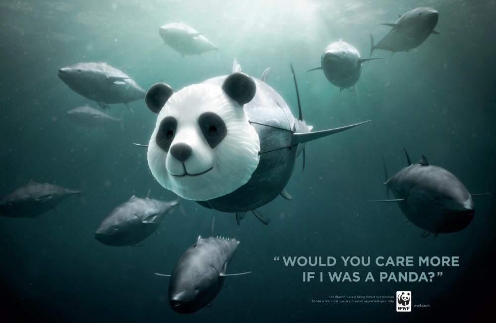
- White. Stands for purity and simplicity, often used in sleek, modern designs. Brands like WWF, MAC Cosmetics, and DC Shoes use white to evoke a clean, elegant look.
- Gray. Represents neutrality and balance, often used in minimalistic or professional designs. Brands like Apple, Toyota, Nissan, and Swarovski use gray to create a sleek, timeless appearance.
Fonts matter just as much. Serif fonts suggest tradition and reliability, making them perfect for formal contexts. This is why newspapers and legal ads use Times New Roman. Meanwhile, sans-serif fonts, like Arial, feel modern and clean, which is why tech brands frequently use them.
When choosing fonts, always prioritize readability. Headlines need large, bold fonts to grab attention. Body text should be readable and simple, flowing smoothly without overwhelming the reader. Also, avoid using too many font styles in one ad. Mixing too many fonts creates confusion. A thoughtful combination of colors and fonts will create a more cohesive, impactful design.
Maintain a Clean Layout
A clean, organized layout format can make your printed advertisement more effective. Cluttered designs overwhelm readers and make it harder for them to engage with your print media. Proper spacing improves readability. It also holds the audience’s attention longer.
White space, or negative space, is among the most powerful tools in a designer’s arsenal. It allows the main elements of an ad to stand out and do their magic. Apple’s print media ads are a great example of a balanced ad layout and effective use of white space, allowing their products to shine without distractions.
You can also use the Golden Ratio or the rule of thirds to create a more balanced layout. This approach improves the flow of information and guides the viewer’s eye toward where you want it to go. The result is a more dynamic and engaging ad that doesn’t feel overcrowded.
The Gestalt principle is another common technique used in ad design. It emphasizes how people perceive elements. By instinct, humans tend to see whole structures rather than individual parts. They naturally group objects together in their minds to create a sense of order. Designers can apply this to highlight the most important elements of the ad.
Whatever design principles you use, avoid cramming too much information into one space. Readers process ads faster when there’s room to breathe.
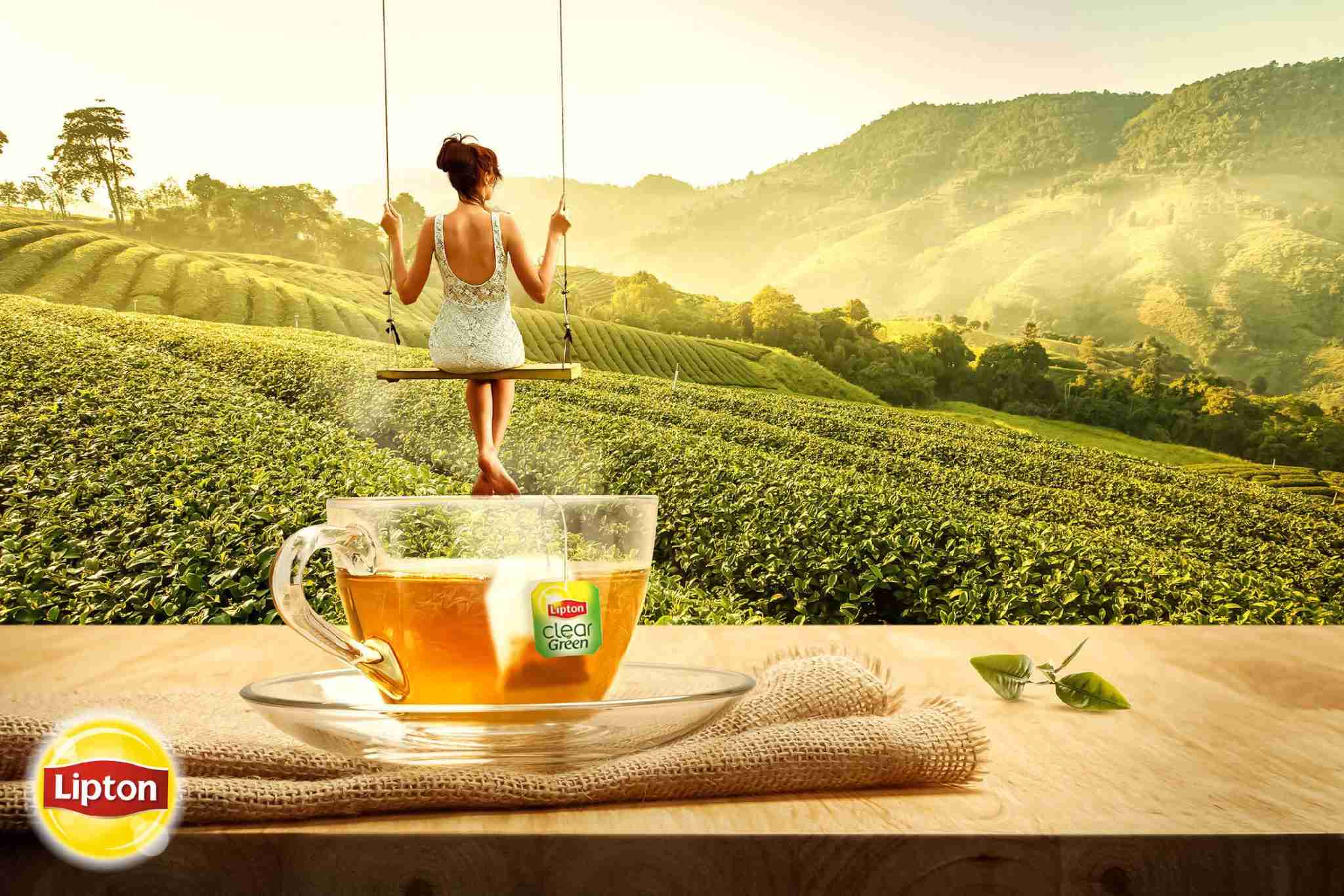
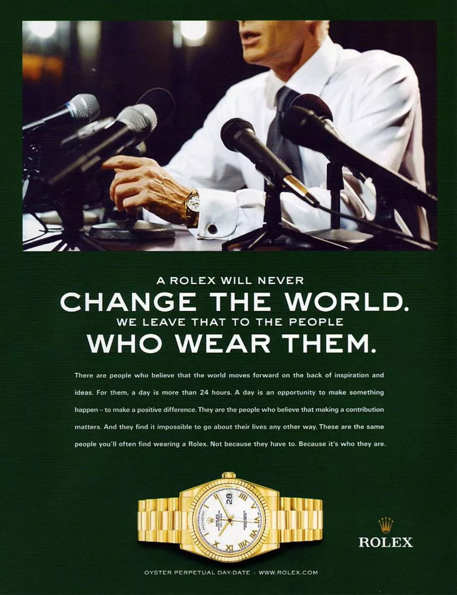
Ensure Your Images Are Sharp and Clear
Clear and sharp images are essential for creating professional and effective print media ads. Blurry visuals hurt your brand’s credibility. Meanwhile, clean, crisp images grab attention and convey quality. Just look at brands like Rolex, who are known for their timeless ads. Their print visuals reinforce their premium image and appeal.
If you want the same results, aim for a resolution of at least 300 DPI (dots per inch). This should be perfect for most printed formats like brochures, magazines, and flyers. It provides enough detail for small, close-up prints, so the image turns out sharp and clean.
For larger formats like billboards, you can use a lower DPI of around 150-200. Since billboards are viewed from a distance, they don’t need higher resolutions.
Pay attention to image file types as well. Vector files work best for logos or illustrations. They stay sharp at any size. For photos, stick to high-resolution raster images. Always test your images before printing to make sure they stay sharp, even at larger sizes.
Craft a Strong Headline
Your headline sets the stage for the rest of your ad. It’s the first thing people notice. And considering how 80% of people don’t read beyond the headline these days, it needs to grab attention—fast.
This means your headline has to evoke curiosity and communicate your message in mere seconds. A strong headline gets readers to keep reading.
Additionally, great headlines work because they speak directly to the reader. They solve a problem or elicit an emotion.
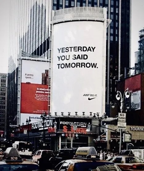
One famous example is Nike’s “Just Do It.” It works because it resonates with people’s inherent desire to overcome challenges, perfect for a sports brand.
Domino’s also nailed their unique selling proposition with “30 minutes or free.” It promises speed and reliability—something you’ll want in a fast food chain.
These examples succeed because they address what the audience cares about. So when writing your print promotion’s headline, focus on your readers’ problems. Above anything else, keep it simple and easy to understand. Clear, direct language works best. Don’t complicate the message; focus on what will capture your audience’s attention right away.
Ensure the CTA Is Prominently Placed
The CTA is the heart of your ad’s effectiveness. It can make the difference between your audience simply noticing your ad and taking the next step. Whether it’s to buy, visit, or schedule a consultation, it’s the CTA that directs them.
In a print advertisement, CTA placement is everything. So put the CTA where it naturally grabs attention.
- For billboards: A billboard’s CTA must be short and highly visible, as drivers only have a few seconds to read it. The bottom-right corner is a prime spot. As mentioned previously, people naturally scan ads in a Z pattern, so it’s where their eye often lands.
- For newspapers and magazines: Adding white space around the CTA helps it stand out. It makes it more noticeable without overwhelming the viewer. Bold and simple CTAs, such as “Shop Now,” give the audience a clear action to take.
A good print ad CTA also combines action-focused language with a benefit. Words like “call,” “visit,” or “shop” encourage immediate action. For instance, retail brands often use “Shop now to save 50%.” The action is clear, and the benefit is obvious. They tell the reader directly what to do, leaving no doubt about the next step.
Urgency can increase effectiveness. Phrases like “limited-time offer” create FOMO, or fear of missing out. In marketing, this is called the scarcity tactic. People feel the need to act quickly before it’s too late. Retail ads, particularly, often rely on this tactic to boost responses.
Let’s Discuss
Craft Emotionally Evocative Design Messages
Emotionally driven ads connect deeply with the audience. People often buy based on how they feel, not how they think. In fact, research shows that 95% of decisions are made subconsciously—driven by emotions rather than reason. This makes emotion a powerful tool in your print advertisement.
Start by knowing your audience’s emotional triggers. This helps craft a message that resonates with them. For instance, showcasing human faces and emotional moments is known to draw people in. This connection triggers the brain’s greater amygdala, which enhances emotional memory.
Storytelling also strengthens emotional connections. Ads that tell a relatable story leave a lasting impression, regardless if it’s nostalgic, inspiring, or comforting. Consider how brands like Coca-Cola and McDonald’s often use warm, familial themes to connect with their audience. In the example below, Pedigree also appeals to its audience’s feelings by showcasing images of life with dogs versus without them. This juxtaposition of the two images tugs at the audience’s heartstrings and encourages them to adopt.

Emotional ads don’t need to be complex. Remember, people relate more to stories than to product descriptions. They might not recall the specifics of your product or service, but they’ll certainly recall how you made them feel.
So focus on what your audience cares about. Then align your message with your brand’s values. This way, you can turn your ad into more than just a message, but rather an experience that stays with them.
Test Multiple Variations of Your Print Ads
Testing different versions of your print media ads is key to finding out what works best for your audience. Without testing, you’re guessing at what will capture attention and drive action.
A/B testing is a great way to start. This method compares different versions of the same ad. It involves creating two ads with slight changes, like different headlines or image placements. Showing these versions to different focus groups allows you to gather feedback on what grabs attention or drives action. It helps pinpoint the strongest elements of the ad, allowing you to make data-driven decisions.
Pre-testing is also valuable, especially before a large-scale print run. It definitely helps avoid costly mistakes in large-scale campaigns. Also, you can refine the ad’s effectiveness without wasting resources on an idea that may not work.
The key is to keep testing. You might see a small improvement with one change, but more testing can lead to bigger gains. Aim to continuously improve your print advertisements using the data you gathered. Testing multiple variations isn’t just smart—it’s necessary to create ads that truly engage your audience and create real results.
Make Sure Your Design Reflects the Brand Image
Your print advertisement should always reflect your brand’s identity. Consistent branding materials build recognition and trust with your audience. Whether it’s a flyer or a billboard, visuals should align with your brand’s values. This helps your brand stay memorable and recognizable.
The easiest way to do this is to have a brand kit. It should include your logo, colors, fonts, and other design elements you often use. These should remain consistent across all materials. For example, Adidas has its iconic three-stripe logo and black-and-white theme. Anyone who has ever seen it will recognize it immediately.
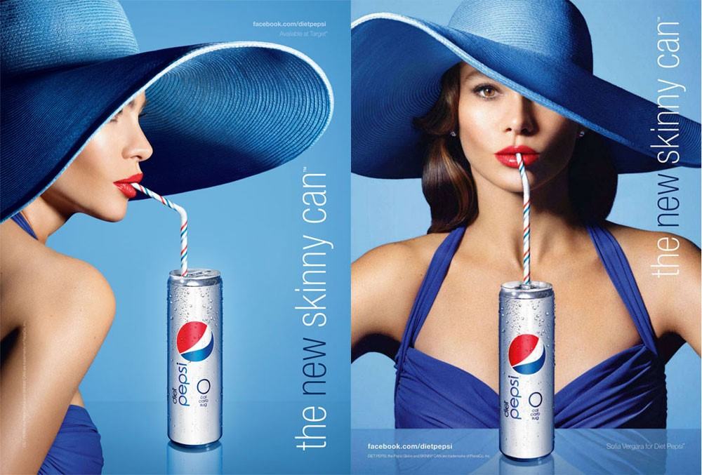
Another example is Pepsi. The red, white, and blue colors, paired with playful imagery, reflect Pepsi’s fun brand. Each print ad reinforces this identity, making Pepsi instantly recognizable to its audience.
Similarly, Louis Vuitton knows how to stick to its luxury branding. The brand’s monogram and color palette featuring rich tones of brown and gold aren’t only recognizable—they’ve become practically synonymous with exclusivity and high fashion.
Your ad’s tone should also match your brand. Adidas projects strength and action, Pepsi radiates fun and energy, and Louis Vuitton conveys elegance and exclusivity. Your design and message should always align with your brand’s core values.
At the end of the day, consistency builds recognition and deepens connections. This makes your brand more trustworthy and memorable. Keep this in mind for every ad you create.
Examples of Catchy Print Ads
Here are a few more examples of print media ads that captured their viewers’ attention. Each serves as a powerful example of marketing design, with effective visual strategies to communicate their message clearly and instantly.
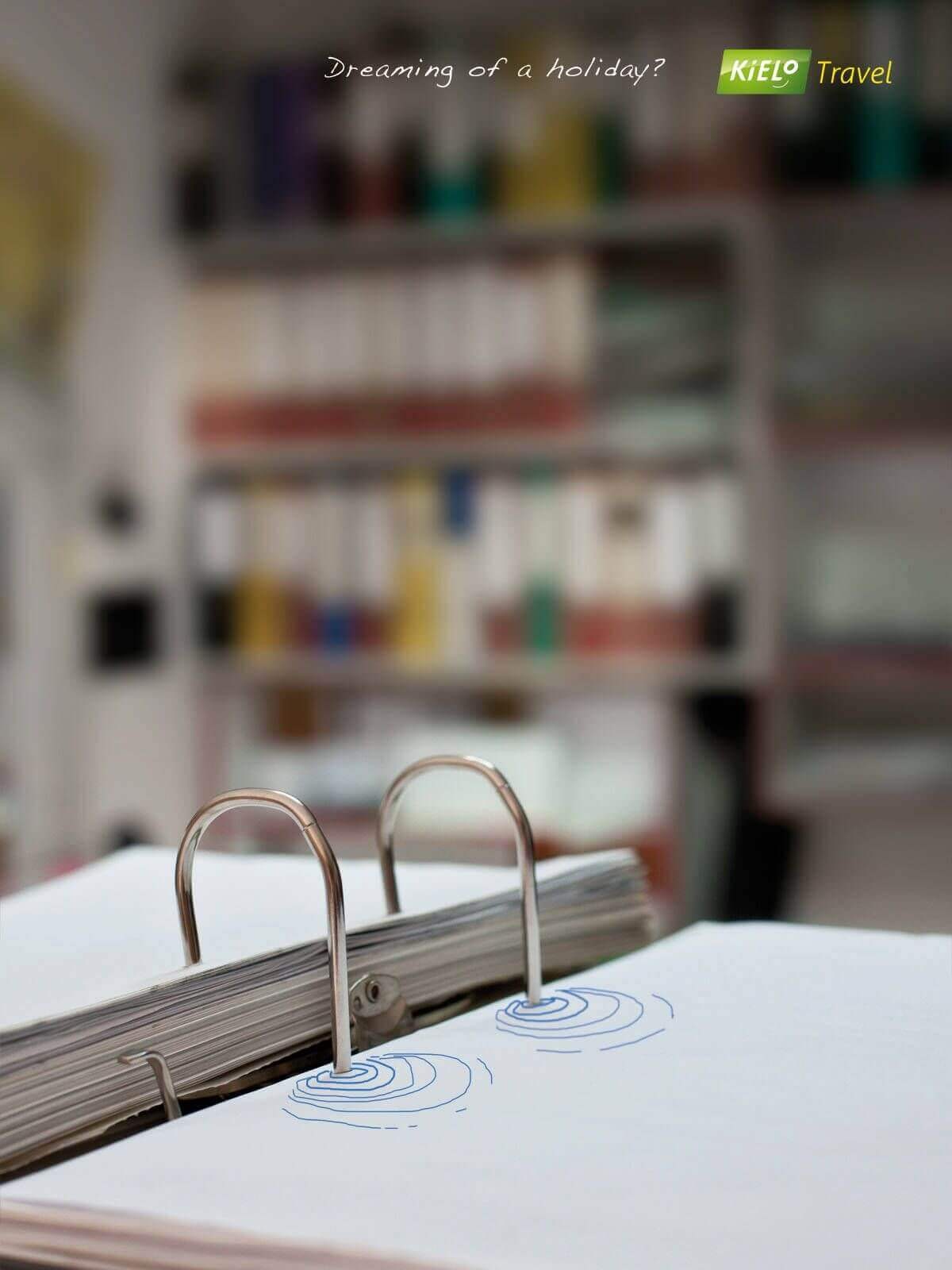
Kielo Travel’s ad turned a binder notebook into a swimming pool.
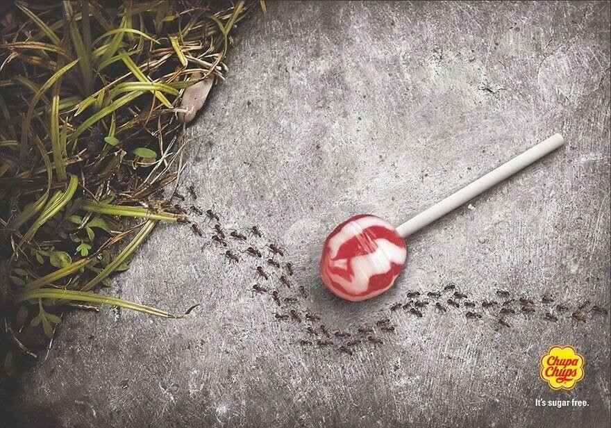
Chupa Chups’ ad showed ants avoiding its sugar-free lollipop.
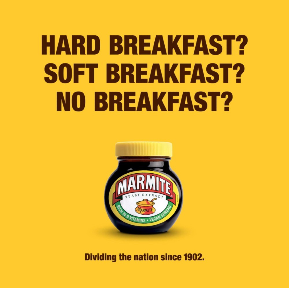
Marmite’s ad covered different “types” of breakfast that people have.
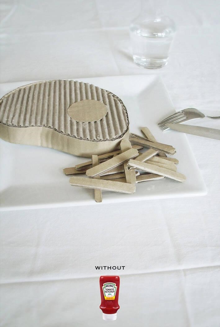
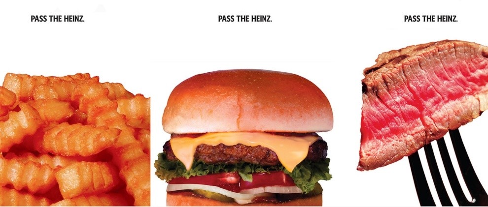
Heinz’s playful ad featured cardboard steak and fries, hinting at how meals taste like “cardboard” without Heinz ketchup.
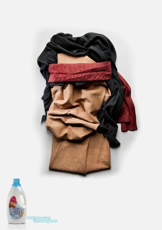
Sta-Soft’s ad displayed a cloth caricature of Sylvester Stallone and featured the tagline “Softens even the toughest.”