People decide how they feel about a brand in seconds. 55% of a brand’s first impression is based on visuals, and a single signature color can increase brand recognition by up to 80%. That is why professional design matters more than most companies think. One weak visual choice can quietly damage trust. One strong system can do the opposite.
In this guide, we explain what corporate design is, why consistency builds trust, and how a clear visual system keeps brands strong across websites, apps, and marketing. We will also show what separates brands that look stable and intentional from those that look random and forgettable.
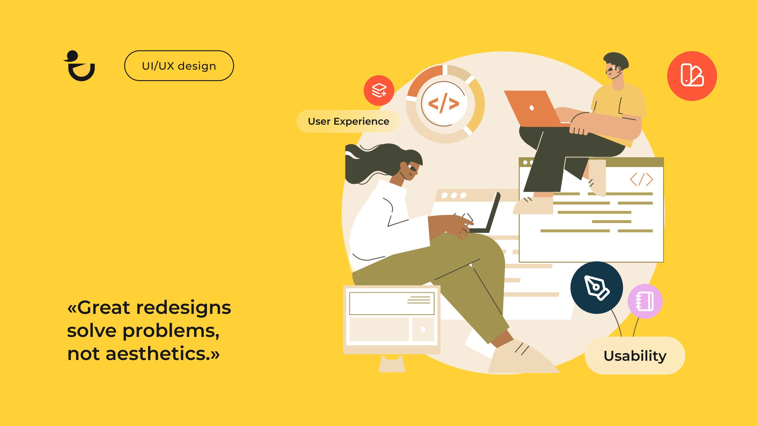
What Is Corporate Design?
The corporate design definition is simple. It is the set of visual rules that control how a company presents itself in public. It helps companies to look clear, stable, and recognizable everywhere.
It’s a core part of the corporate identity, shaping the corporate image and guiding how the brand appears on a business website, in apps, in ads, on social media, and in print. When done right, this design protects brand consistency and builds trust.
This system connects branding, visual identity, and visual communication into one clear structure. It helps people understand the company fast. It also shapes brand perception and shows the company’s brand personality.

In digital space, corporate web design applies these rules to layouts, menus, buttons, and content. In apps, the same system controls screens and icons. In marketing, it shapes banners, posts, brochures, and pitch decks. This creates a comprehensive corporate identity built on strategic design, unified across all customer touchpoints.
A strong business needs a clear corporate design strategy. It connects business goals with a consistent brand identity. Modern design services use one integrated design approach for digital channels.
Not sure how to scale this consistency beyond visuals alone? Strategic B2B branding
How a Consistent Corporate Design Across All Channels Strengthens Brand Trust
People trust what feels stable. When your design stays the same everywhere, the brand becomes easier to recognize and harder to forget. The mind locks onto repeated patterns. Colors, typography, layout, and tone act like signals. When these signals stay constant, users stop questioning who they are dealing with.
A unified look creates reliability. If a website uses one visual style and the app uses another, the company looks unorganized. When every channel follows the same visual identity, the corporate image feels controlled. This reduces friction and raises confidence in the company.
Recognition builds fast. Repeated exposure to the same structure shapes brand perception. Users do less mental work. They know what to expect. That stability supports long-term loyalty because people stay with brands that feel predictable.
Core effects of consistent design:
- Faster recognition because users see the same visual logic everywhere
- Stronger sense of reliability because nothing looks out of place
- Clearer brand communication because the style matches the message
- More comfort during navigation on digital products
- Higher trust built through repeated stable experiences
- Revenue increase by up to 33%
Consistency also keeps the brand personality intact. The same colors, shapes, and tone show up across the business website, product screens, ads, emails, and social posts. This creates a single memory for the user instead of scattered impressions.
Trust impact across key areas:
| Area | What It Does |
| Style and layout | Creates a clean first impression. Helps users understand the brand fast and feel order instead of chaos. |
| Color and type | Set the emotional tone. Stable colors and readable fonts signal control and reliability. |
| UI structure | Makes digital products easy to use. Clear structure reduces hesitation and confusion. |
| Visual messaging | Guides attention and supports the brand message. Helps people understand and recognize a brand faster. |
| Repetition | Builds memory through familiarity. What people see often, they start to trust. |
Clean, steady design across all channels removes doubt. Users stop thinking about inconsistencies and start focusing on the value of the product.
Book a Call
Proven Practices for Building a Strong Corporate Design
A strong corporate design system is built through repeatable rules, not taste. Each practice below directly shapes the corporate identity, the visual identity, and how people judge the brand within seconds. Together, they form a stable design strategy that protects long-term brand consistency, perception, and corporate image.

Define Core Brand Values
Every decision in corporate design must come from real brand values. These values define how the company looks, sounds, and behaves. They guide tone, level of formality, color mood, and layout tension. Without them, corporate branding becomes random.
Strong values lead to a stable brand personality and help create memorable corporate visuals that differentiate the company from its competitors. This is the emotional foundation of the full corporate identity.
Align Brand Strategy With Brand Communication
Your visual system must match your positioning. If your strategy promises clarity, your visual communication must be structured. If your strategy promises warmth, your design must feel human. This alignment keeps branding and brand communication moving in the same direction.
When strategy and visuals work together, the company builds a unified brand image across all customer touchpoints, from ads to product interfaces.
Create a Cohesive Color and Typography System
Colors and type shape instant recognition. The strategic use of colors and typography controls emotion, clarity, and memory. A limited palette and a fixed type hierarchy stop visual chaos before it starts.
This is why 39% of Fortune 500 companies use blue as their main logo color, while black appears in 34% of top global brands and 25% of the Fortune 500. Red is used by 16%. Most brands also combine text and symbols, with 61% of Fortune 500 logos using this format for stronger recognition.
Font choices matter just as much. Over 70% of the world’s top 250 companies use sans-serif fonts in their logos, while only 22% use serif. This shows that choosing the best fonts for business is practical, not decorative. Correct typography strengthens corporate web design, corporate graphic design, and every part of the visual identity system.
Prioritize Accessibility and Usability in Web and App Design
If users struggle to read, click, or understand, corporate design fails. Accessibility is not optional. It directly affects trust, comfort, and credibility. Clear contrast, predictable layouts, readable type, and visual hierarchy shape user confidence.
This approach follows user-centered design, where real user behavior defines visual decisions. It also improves how users experience the business website, dashboards, and mobile products.
Design a Flexible and Adaptable Visual System for Websites and Apps
A rigid system breaks when the product grows. A strong corporate design system uses scalable components, clear spacing logic, and modular layout rules. This allows teams to extend features without damaging the corporate identity.
This flexibility makes it easier to improve a website without visual resets. The brand identity remains stable even as products evolve.
Create Cohesive Custom Features That Strengthen Corporate Design Everywhere
Icons, illustration styles, charts, infographics, and background patterns give structure to corporate graphics. These elements allow recognition even when the logo is absent.
This level of corporate graphic design creates a repeatable corporate style that works across slides, reports, social media, dashboards, and marketing assets. It also sharpens brand perception through visual memory.
Standardize Design Processes Across Teams
Without shared rules, teams create multiple versions of the same design. Standardized design processes control file structures, versioning, approvals, layout rules, and naming systems.
This protects brand consistency across marketing, product, and sales materials. It also strengthens design standards across the full organization.
Regularly Audit and Update Brand Materials
Design systems decay without checks. Regular audits remove outdated layouts, mismatched graphics, and broken rules. Updates keep the corporate design aligned with current strategy, user needs, and platform changes.
This prevents silent damage to the corporate image and keeps the corporate design strategy functional long-term.
Tie Visual Decisions to Real Business Behavior
Design must support action, not decoration. When layouts, color emphasis, hierarchy, and messaging support real user behavior, the system becomes measurable. This reflects conversion-centered design, where visuals directly support goals.
This also connects strongly with brand experience design, where every touchpoint supports the user journey as a whole.
Summary Table
| Practice | Why It matters for corporate identity |
| Define core brand values | Sets emotional and strategic direction for the full corporate identity |
| Align strategy with brand communication | Prevents mixed signals and stabilizes brand perception |
| Cohesive color & typography system | Builds fast recognition and strengthens the visual identity |
| Accessibility & usability | Increases trust and comfort in digital products |
| Flexible visual system | Keeps brand identity stable during product growth |
| Custom visual features | Builds distinct corporate graphics and recognition |
| Standardized processes | Protects brand consistency across teams |
| Regular audits & updates | Prevents long-term visual decay |
| Behavior-driven design | Turns corporate design into a performance tool |
Practical Examples of Corporate Design That Drive Real Results
Below are real corporate design examples from Duck.Design. Each case shows how a clear strategy, strong visual identity, and tight brand consistency changed how the brand was seen, used, and trusted.
These are not theory cases. These are real projects where we shaped the corporate image, improved brand perception, and built a stable, unified brand image across all customer touchpoints.
1. Invibes Website Redesign

This project is a full transformation, not just a visual refresh. We rebuilt the visual identity, corporate image, and corporate web design for Invibes to reflect their innovation in native advertising and GenAI. As a corporate website design agency, we focused on trust, clarity, and performance. The goal was to turn a cluttered, outdated site into a system that supports growth, credibility, and strong brand perception.
🧑💻Key problems we solved through corporate design:
- 68% of users felt the old site was cluttered and hard to focus on
- 55% struggled with navigation and unclear CTAs
- Only 28% scrolled past the first screen
- 57% said the design reduced trust
- 46% could not find critical investor data in two clicks
We rebuilt the corporate identity using a clear design strategy based on clarity, dynamism, and trust. The new visual identity uses a futuristic orange-on-dark color system, custom corporate graphics, and IBM Plex Sans typography.
We created AI-based visuals refined by our designers to ensure consistency across all touchpoints. This also included full brand identity design, custom UI patterns, and a clear trust-building content structure with client logos and ESG messaging.
✅Business results after the redesign:
- +41% increase in average session duration
- +37% improvement in key conversions versus competitors
- Stronger brand consistency and clearer brand communication
- A stable, unified brand image
2. Anything SPF Brand Transformation

Anything SPF project was a full rebuild for a consumer skincare brand. We transformed the corporate identity, visual identity, packaging, and corporate web design to reflect inclusivity, daily care, and confidence. Our goal was to create a bright, friendly corporate image that feels premium but stays accessible. The result is a clear and unified brand image, from product packaging to the digital store.
🧑💻What we built through corporate design:
- A new inclusive brand identity with warm colors and soft gradients
- Retro-inspired corporate graphic design with modern structure
- Custom packaging that blends skincare minimalism with playful emotion
- A mobile-first shopping experience built on strong usability
- Clear visual communication focused on education and confidence
- A consistent corporate style across product, web, and marketing
We based the strategy on clarity, warmth, and everyday use. The interface was shaped by real user behavior and accessibility logic to support smooth browsing and fast checkout. This strengthened brand perception, improved trust, and differentiated the company in a crowded skincare market.
✅Business results after launch:
- +60% increase in brand recognition within the target audience
- +55% growth in website user interactions
- +30% increase in monthly active users
- +50% growth in user reviews within three months
- 89% overall user satisfaction rate
Book a Call
3. Lush Stonez E-Commerce Transformation

We did a full design for a luxury e-commerce brand, Lush Stonez, in the jewelry space. We developed the full corporate identity, visual identity, corporate web design, and product presentation system to reflect natural beauty, craftsmanship, and premium quality. The goal was to create a refined corporate image that feels elegant but still warm and human. The result is a stable unified brand image, from brand story to checkout.
🧑💻What we built through corporate design:
- A luxury-focused brand identity using chocolate tones and gold accents
- A modern serif typography system for premium visual communication
- A responsive, mobile-first corporate web design for smooth browsing
- Dynamic product grids to support discovery and urgency
- Trust-focused testimonials and structured FAQ for decision support
- A consistent corporate style across content, product pages, and marketing
Our strategy was shaped by sales behavior and buying intent. The full interface followed conversion-centered design, where layout structure, product emphasis, urgency triggers, and trust signals all support purchasing decisions. This improved brand perception, increased checkout confidence, and gave the company a competitive advantage in a crowded luxury market.
✅Business results after launch:
- +25% increase in online sales within the first quarter
- 90% of users rated the interface as intuitive and easy to use
- +30% growth in page views per visit
- Strong improvement in trust and product engagement