




Ecommerce website design is the process of shaping an online store around the way people decide to buy. It brings together layout, navigation, product presentation, and Ecommerce graphic design to build trust and make the path to purchase clearer.
Good web design supports higher sales by making discovery easier and checkout simpler. This guide explains which design practices help an online store turn more visits into purchases.
The Main Difference Between Ecommerce and Traditional Web Design
Traditional websites mainly help visitors understand a company. Ecommerce websites have a more direct commercial job because they must help people choose a product and complete the order. That difference changes how the site should be planned from the first wireframe.
A corporate site can succeed when a visitor reads the offer and sends an inquiry. A store has to support the customer journey across more decision points before payment happens. Ecommerce web design therefore works less like a digital brochure and more like a buying system.
The shopper also carries more risk than a visitor reading a service page. They need to know whether the product fits, whether the store is credible, and whether the purchase feels safe. Good user-centered design lowers that effort by making the interface match real buyer behavior.
| Design Area | Traditional Website Goal | Ecommerce Website Goal |
| Navigation | Explain the business | Help shoppers find the right product |
| Page hierarchy | Build brand understanding | Move users toward purchase |
| Main CTA | Request a quote | Add to cart or buy now |
| Trust signals | Support credibility | Reduce purchase risk |
| Performance metric | Leads | Revenue and retention |
A traditional site can tolerate a slower learning path because research is often part of the visitor’s intent. An online store has less room for doubt because buying momentum can fade quickly. This is why website design for Ecommerce must treat clarity as a revenue function.
How Does Website Design Influence Online Store Performance?
Website design influences online store performance by shaping how quickly users understand the offer. Once the offer feels clear, the interface has to make action feel safe. The strongest stores improve performance by making the shopping experience easier to continue.
Navigation affects the first measurable layer of performance. When categories reflect shopper intent, visitors spend less time interpreting the store and more time considering products. Strong website design practices make product pathways feel natural without making the experience generic.
Page speed affects patience before persuasion has a chance to work. Google’s Milliseconds Make Millions research found that a 0.1-second mobile speed improvement increased retail conversions by 8% on average. For Ecommerce website design, speed is part of the buying experience rather than a technical detail hidden behind it.
| Performance Area | Design Impact | What to Watch |
| Product discovery | Helps shoppers reach relevant products sooner | Confusing categories |
| Purchase confidence | Makes the store feel safer to buy from | Hidden policies |
| Checkout completion | Keeps payment effort low | Forced account creation |
| Order value | Surfaces relevant add-ons at the right moment | Random recommendations |
| Repeat purchase | Makes post-purchase support easy to find | Poor order visibility |
Mobile usability shapes traffic quality because many shoppers browse in short sessions. Statista’s mobile commerce data estimates that mobile commerce revenue will reach about $2.5 trillion in 2025. That makes responsive Ecommerce web design essential for stores that cannot afford to lose buyers on small screens.
Trust signals influence purchase decisions when the brand is unfamiliar. Reviews help because they replace part of the confidence a shopper would normally get in a physical store. Transparent policies work in the same direction because they make the business feel accountable.
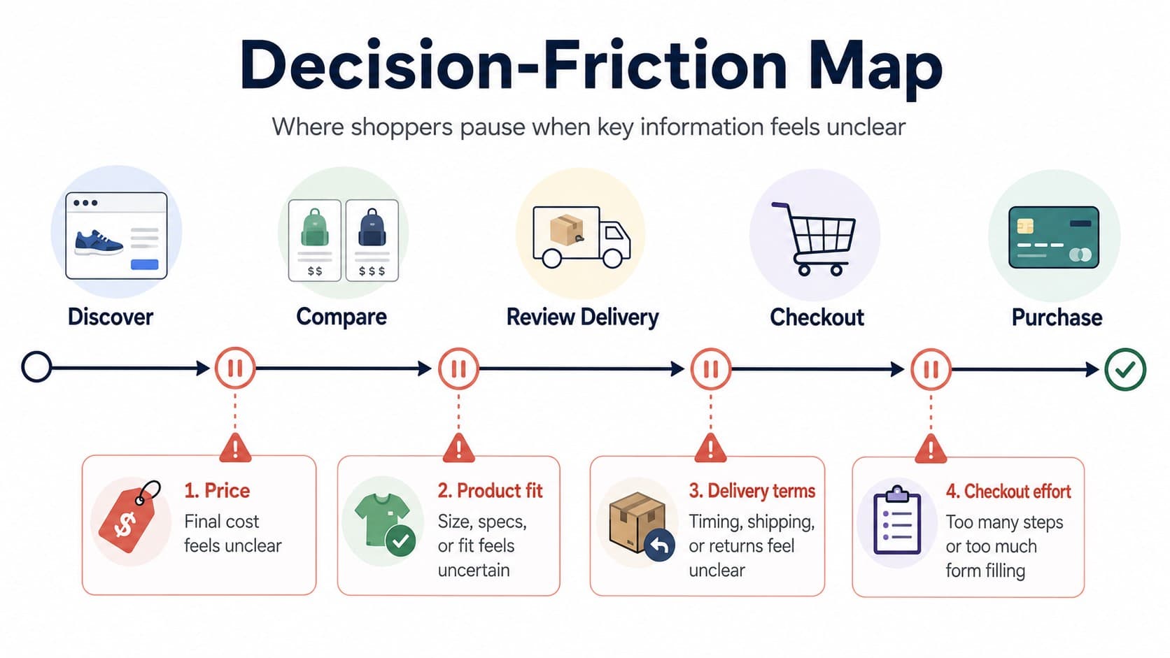
Customer retention starts before the first order is complete. Clear delivery information makes the buyer feel more in control after payment. That confidence supports customer loyalty and repeat purchases.
Design also affects bounce rate before users reach a product page. If the homepage does not explain the store’s value quickly, visitors start scanning for exits. Website design optimization works best when each page is measured by the decision it supports.
Store design doesn’t increase sales just because it looks better. Sales increase when each page eliminates a reason for doubt. The most impactful changes occur where trust meets a clear next step.
Best Practices for Designing High-Converting Ecommerce Websites
The best practices for high-converting stores focus on reducing uncertainty before it becomes abandonment. Visual polish helps, but it cannot rescue a product page that leaves basic doubts unresolved. Strong Ecommerce web design gives each page a clear role in the buying journey.
A useful way to judge design quality is to ask what problem each element solves. The website design process should connect those choices to business goals before visual production begins. That makes each practice easier to prioritize.
| Practice | What It Solves | Business Effect |
| Trust signals | Reduces hesitation before payment | Higher purchase confidence |
| Mobile-first UX | Makes small-screen shopping easier | Stronger mobile conversion |
| Guest checkout | Removes account pressure | Lower checkout abandonment |
| Faster product pages | Protects buying momentum | Lower bounce risk |
| Clear CTAs | Makes the next step visible | More add-to-cart actions |
| Flexible payments | Reduces final-stage friction | Better checkout completion |
The most reliable fixes appear where hesitation is easiest to observe. Start where buyers slow down, then refine the rest of the flow. This keeps optimization practical.
Build Trust with Reviews, Security Signals, and Transparent Policies
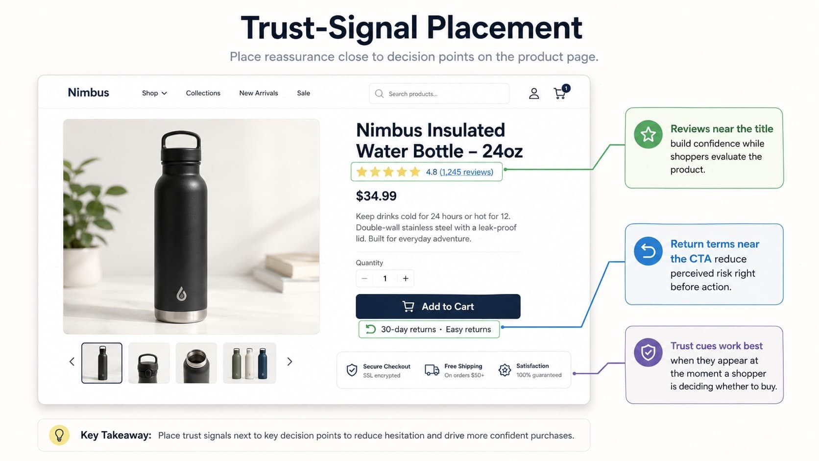
Customers hesitate when an unfamiliar store asks for payment before trust has been earned. Trust signals reduce that risk by showing that real buyers had successful experiences. In Ecommerce web design, those signals should appear close to the moments where doubt usually appears.
Reviews should do more than display a star average. Helpful review modules show context, such as sizing feedback or delivery experience. That context makes the review feel useful rather than decorative.
Security cues should support confidence without crowding the page. A short privacy note near checkout can do more than a badge buried in the footer. Return terms should also appear before payment because hidden conditions feel like a late surprise.
Transparent policies are part of branding because they show how the store handles responsibility. Clear delivery limits often feel more credible than vague convenience claims. Ecommerce branding connects those trust cues to long-term recognition.
Adopt a Mobile-First Design Approach to Maximize Conversions
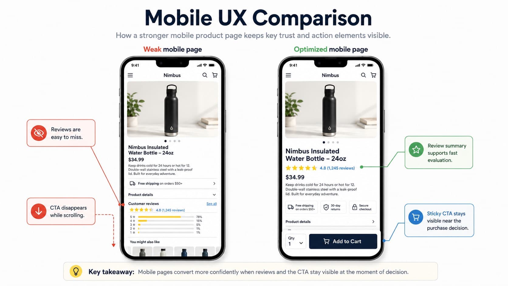
Mobile shoppers behave differently because their attention is easier to interrupt. A mobile-first store must make the next step visible without forcing users to pinch or hunt for controls. Ecommerce website design should start with the smallest high-value screen before it expands to desktop.
Mobile menus should reveal popular paths quickly. Search needs strong visibility because many buyers already know what they want. Easy entry points make the store feel faster.
Sticky CTAs are useful because product pages often run long on phones. They keep the buying action available while shoppers review images or read feedback. That pattern supports intuitive shopping because users always know what they can do next.
Simplify Checkout by Minimizing Steps and Enabling Guest Purchase
Checkout design should help a ready buyer finish without forcing a new commitment. Every extra field adds effort at the exact moment when the shopper is closest to paying. Baymard’s checkout UX research highlights guest checkout as a key practice because many shoppers resist creating an account just to buy.
Guest purchase should be easy to see. The store can invite account creation after payment, when order tracking gives customers a reason to register. This protects first-time conversion while still supporting retention.
Progress indicators help shoppers understand how much effort remains. Address autofill reduces typing and prevents avoidable errors. A focused checkout page keeps attention on payment instead of sending users back into browsing mode.
| Checkout Friction | Why It Hurts Conversion | Better Design Choice |
| Forced account creation | Adds commitment before trust is earned | Offer guest checkout first |
| Hidden delivery cost | Creates late-stage doubt | Show costs before payment |
| Too many fields | Increases effort and errors | Ask only for essential data |
| Weak error handling | Makes users feel stuck | Explain exactly how to fix input |
| Distracting page links | Pulls attention from payment | Use a focused checkout layout |
Enhance Product Pages with High-Quality Visuals and Clear Benefits
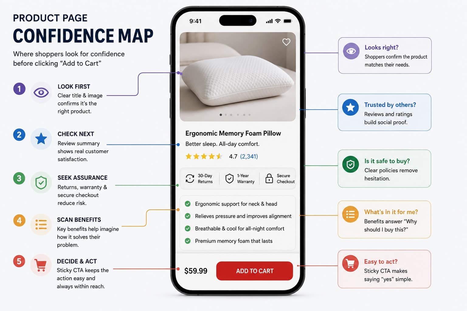
Product pages must replace the in-store experience as much as possible. Shoppers cannot touch the material or judge scale directly, so the page must build confidence through evidence. Strong visuals help close that gap before the buyer starts second-guessing the order.
Clear benefits matter because features do not automatically explain value. “Water-resistant shell” is a feature, while “stays dry during a 20-minute commute” explains the real use. Strong Ecommerce web design turns product information into purchase confidence by making value concrete.
Feature-led copy often sounds complete to the business and incomplete to the buyer. A technical specification may describe the product, but it does not show why the detail matters in daily use. Benefit-led copy translates that detail into a practical reason to buy by showing how the product improves the shopper’s day.
Optimize Page Load Speed to Reduce Drop-Off
Speed affects revenue because delay interrupts intent. A shopper who waits for filters or payment fields may not blame the store, but the buying momentum weakens. Website performance is therefore a design constraint as much as an engineering metric.
To reduce speed-related drop-off:
- Compress heavy product images before launch
- Remove scripts that do not support conversion
- Test category pages on mobile networks
- Track speed by journey step
Heavy media often creates the first problem, but it is rarely the only one. Extra scripts can slow down product pages at the exact moment when shoppers need quick feedback. Store design improves faster when teams measure speed where buying decisions actually happen.
Book a Call
Implement Prominent CTAs and Streamline the Add-to-Cart Experience
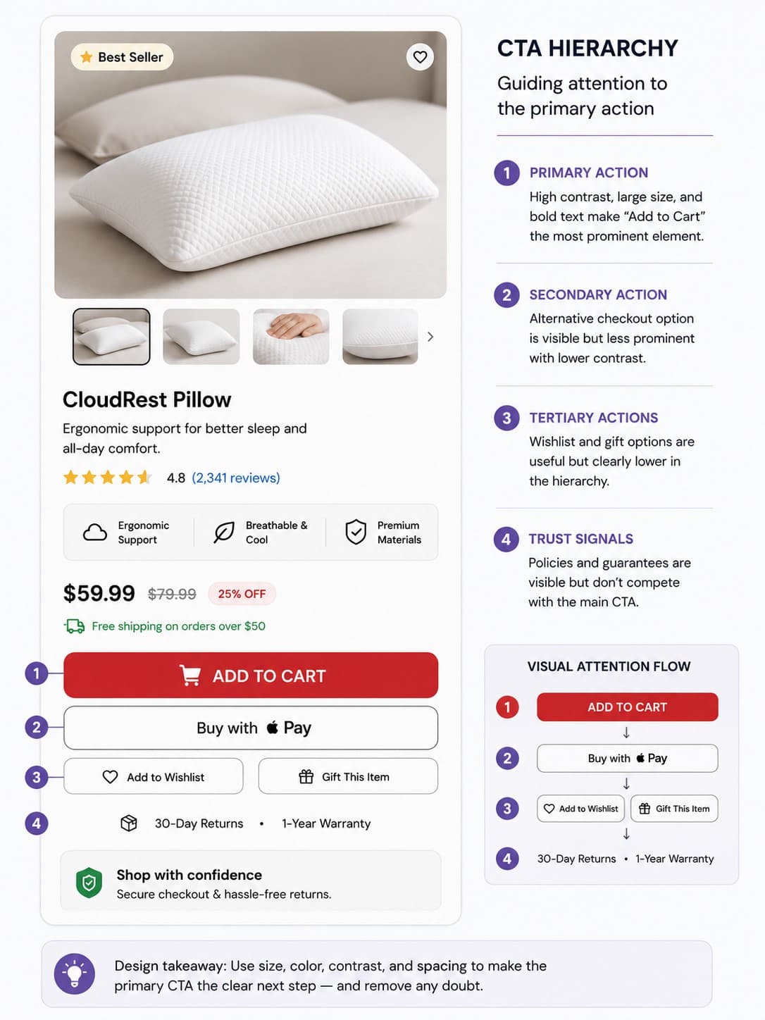
A shopper should never have to search for the next action. The add-to-cart button needs strong contrast and a position close to buying evidence. In Ecommerce web design, CTA hierarchy guides attention without making the interface feel aggressive.
Product pages often fail when secondary actions compete with the main purchase step. A size guide can be useful, and a support prompt can reduce doubt. They become harmful only when they visually outrank the buying action.
Sticky add-to-cart buttons are useful on mobile because product pages can be long. They keep the primary action available while users review images or specifications. The best pattern is simple: let customers explore freely while keeping purchase access constant.
Offer Flexible and One-Click Payment Options
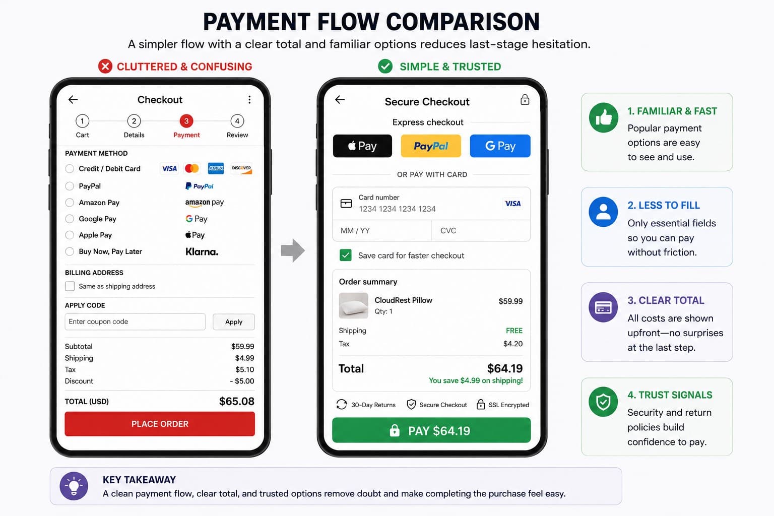
At the payment stage, convenience matters because the buyer has already decided to act. Digital wallets reduce typing, while saved payment details make repeat orders easier. Convenience becomes a competitive advantage when products and pricing look similar.
One-click payment works because it removes repeated work from a familiar buyer. It is especially useful for replenishment products or low-consideration accessories. The design should still make the order totally clear before confirmation.
Payment options should not overwhelm the checkout screen. Prioritize familiar methods for the store’s market. This is where web design for Ecommerce needs input from analytics and customer support.
Show Personalized Product Recommendations to Increase Order Value
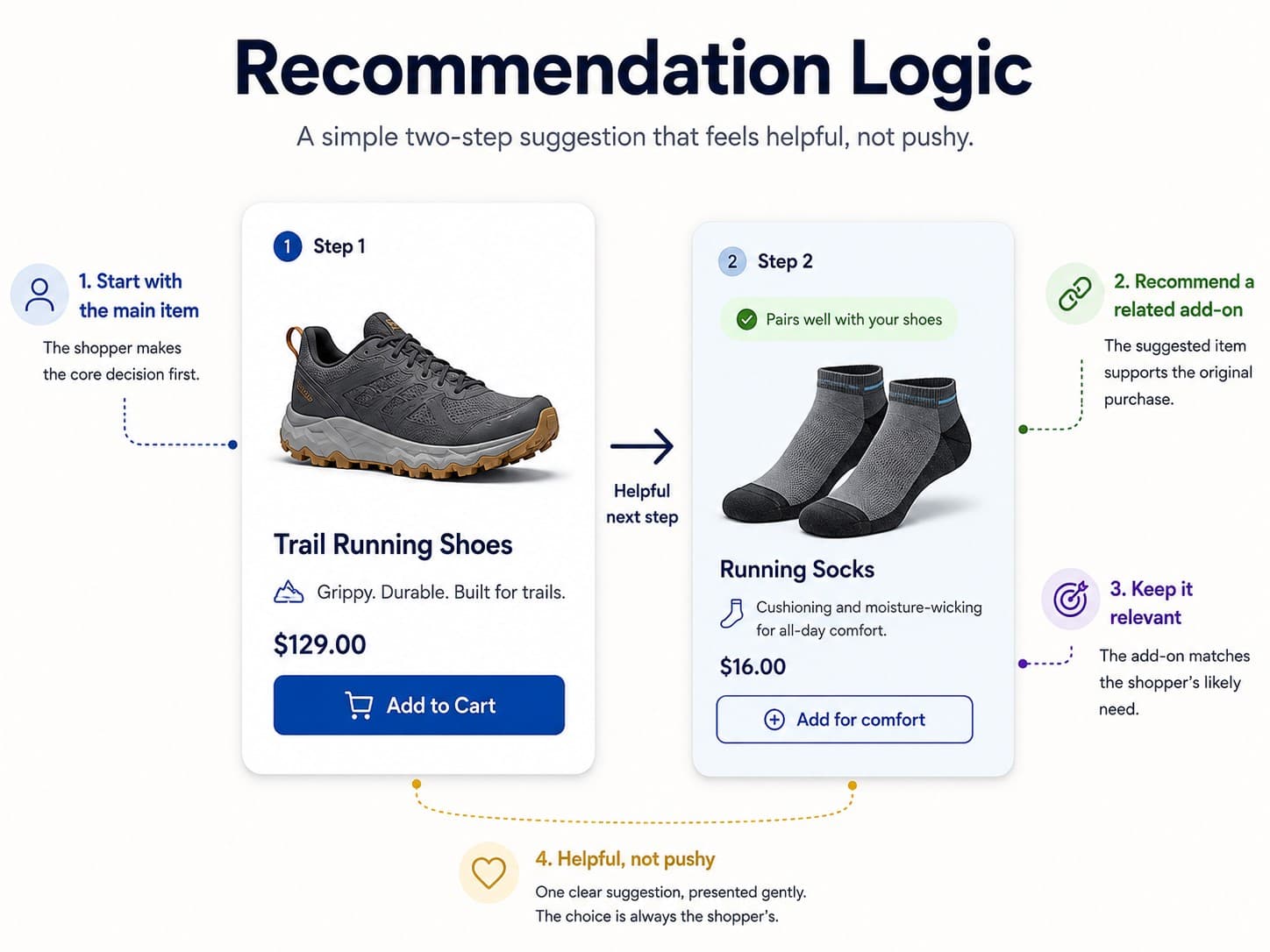
Personalized recommendations increase order value when they improve relevance. “Frequently Bought Together” works because it helps shoppers notice items that fit the same task. Amazon popularized this behavior by making recommendations feel like part of discovery rather than a separate sales pitch.
Recommendation placement matters. On product pages, complementary items should support the current decision. In the cart, recommendations should feel low-risk and should not distract from checkout.
Recommendation logic should reflect customer behavior and inventory reality. Good Ecommerce website design keeps suggestions useful enough to feel like service. That is what separates helpful discovery from pressure.
Design Product Discovery Around Search, Filters, and Site Architecture
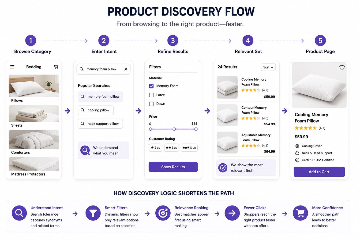
Product discovery is where many stores win or lose customers before a product page loads. Strong site architecture helps users narrow down their options from a broad range of choices. Category names should match how customers describe what they need.
Filters should reflect buying criteria instead of internal catalog language. When filters mirror the decisions customers make, website navigation becomes easier. Search should also tolerate imperfect language so that shoppers can still reach useful results.
Stores planning an online store design should prototype discovery flows before finalizing the visual design. Sorting should support the most common buying intent and not just what the business wants to promote. When relevant results appear early, customers feel that the store understands their needs.
Use Landing Pages for Campaign-Specific Buying Intent
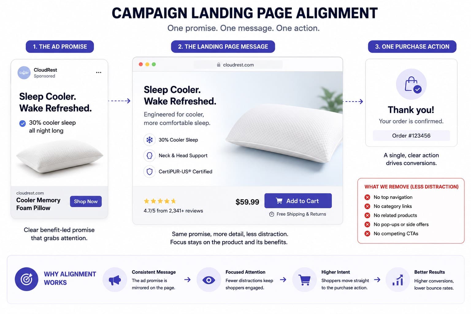
Campaign landing pages work because paid traffic often arrives with narrow intent. A visitor from a seasonal ad should not have to decode the entire store before seeing the relevant offer. Focused Ecommerce landing pages can match the ad promise and CTA in one streamlined flow.
Landing pages should still feel connected to the main store. Shared typography and product photography preserve trust. The difference is that the page removes unrelated paths so the campaign message stays clear.
This practice is useful when a team wants to test a specific offer. It gives marketers a cleaner environment than a homepage redesign. The results can inform broader website design optimization.
Keep Usability Rules Visible During Design Decisions
Ecommerce website usability improves when teams agree on practical rules before designing individual pages. Clear web design principles help teams protect usability when priorities compete. These rules should keep design debates focused on buyer behavior.
Useful Ecommerce usability rules include:
- Keep key products easy to reach
- Support guest checkout by default
- Prioritize product discovery on mobile
- Update cart changes without reloads
- Show users where they are in the journey
Without rules, the loudest request can win even when it weakens the shopping experience. A shared framework protects intuitive navigation while leaving room for brand expression. This is where the choice between custom website design vs templates starts to affect daily design decisions.
Conclusion
High-performing store design is built around how shoppers actually decide. It reduces uncertainty with proof, improves speed, and keeps the next action visible. These practices matter because online buying is a sequence of small decisions, not one final click.
The strongest stores connect design choices to measurable outcomes. Navigation affects discovery, product pages affect confidence, and checkout affects completion. Teams that understand this system can improve performance without relying on guesswork.