Many businesses have found that their website traffic has dropped because their target audiences are turning to AI instead for answers. For B2B businesses, this isn’t the case, though.
Only 5% of B2B businesses have reported AI has decreased their web traffic, according to HubSpot’s The State of Marketing 2025 Report. What’s more, the same report found that websites, blogs, and SEO are the marketing channels that generate the highest ROI for B2B brands.
So, instead of changing your marketing strategy altogether, you can afford to focus only on website enhancement. Whether it needs major functional changes or purely visually tweaks, here are the best practices that a B2B website design agency typically uses to convert that website traffic into leads.
What Is B2B Website Design?
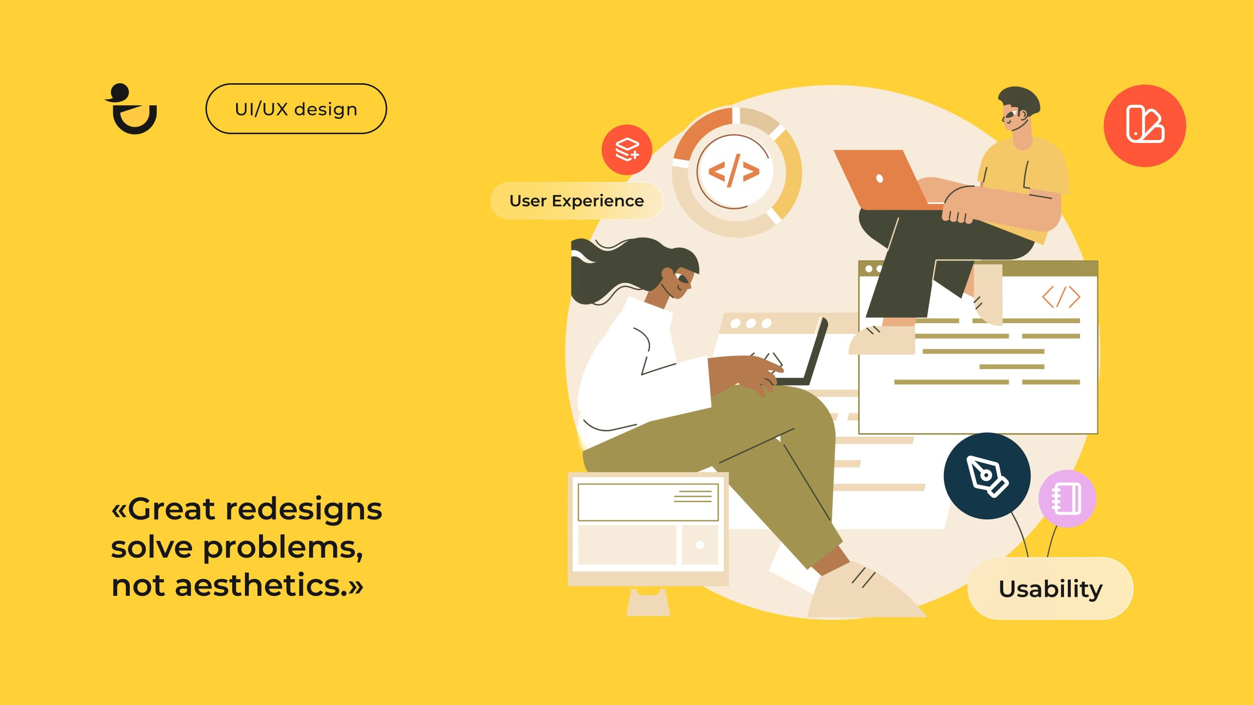
B2B website design refers to the process of designing websites for businesses that sell their offering to other businesses, instead of directly to individual consumers. As it’s designed for decision-makers, it favors logic and long-term value over emotional triggers like urgency and scarcity. The design is professional, clean and built around in-depth content to build trust and educate potential buyers.
Why Effective B2B Web Design Is Important for Lead Generation

According to Salesforce’s ninth edition of their State of Marketing report, advertising gets the biggest slice of B2B companies’ marketing budgets with about 19% of budgets being allocated for ad spend. While advertising design for print ads, direct mail, etc. definitely deserves to be a top focus, web design is the fundamental element that ties all your marketing efforts together.
After all, what will be the next stop for prospective buyers after receiving your brochure at a trade show? A direct visit to your head office that’s hundreds of miles away?
B2B buyers are busy professionals looking for quick, relevant information. Effective B2B web design takes a user-first approach and prioritizes intuitive navigation and clear messaging to ensure that the information they’re searching for is readily available.
Now, if you apply conversion-centered design, your website becomes more than just a channel to introduce your business and share information. It becomes a means for high-quality leads to introduce themselves and their pain points to your sales team.
Read Also: 12 Basic Web Design Principles for an Effective Website
Key Elements of B2B Web Design
As everyday consumers aren’t the target market, website design for B2B businesses will take a different approach to your website. The following are the key elements that will appeal to clients:
- A value proposition that explains your product or services and who’ll benefit clearly
- Intuitive menus
- Logical user flow for different buyer personas
- Product/service/solution pages
- On-brand aesthetics
- Resources like case studies, guides, and white papers
- Lead capture tools such as gated content and contact forms
- Social proof and trust signals like testimonials, client logos, certifications, and recent awards
- A chatbot
- Strong call-to-action prompts and buttons

Source: Duck.Design
Best Practices for B2B Website Design That Works

If you want to improve a website for a B2B business so that it more effectively generates leads, you need to take a goal-oriented approach. It’s a matter of changing your language to be more action-driven and then applying that messaging consistently to build trust and credibility.
Arrange a call
Apply Elements That Drive Action Throughout the Site
The target audiences of B2B businesses research, compare, and research some more before they reach a decision. What this means for your B2B website design is that it should drive action at every step to help facilitate and fast-track the process.
To do this, you can use design elements like:
- A clear value proposition
- A short, explainer video
- Action-driven calls to action like “Talk to sales” or “Book a demo”
- Interaction elements like tools or configurators

Source: Duck.Design
| WHAT TO DO | WHY IT WORKS |
| Place a benefit-oriented value proposition above the fold on your home page | B2B buyers want to understand the problem that you can solve immediately. |
| Add contextually relevant CTAs throughout the website | B2B buyers are often only researching and need to take various steps before they’re ready to buy. |
| Include a quiz and contact form so that they can receive their results via email | It engages website visitors and can generate leads. |
| Add a chatbot on your product, pricing, and support page | It reduces friction and can capture leads. |
Your website’s menu structure will play one of the most significant roles in navigation. To prevent confusion, restrict it to between five and seven categories. Then, use clear labels that your audience understands.

In the case of web design for B2B, it will typically be menu items like:
- Pricing
- Capabilities
- Our Works
- No-Code
- About Us
- Blog
When visitors land on the right page, you can use content hierarchy to aid navigation further. After learning about your company, the next logical step is to explore your product range or services.
Once they know your offerings, they typically seek proof (enter case studies and success stories).
You can then use visual cues to highlight key, high-priority actions. Want them to download more case studies? Use contrasting colors to let your “Schedule a demo” CTA stand out.
Place Key Information About the B2B Company in Visible Sections of the Website
The top part of your home page should be reserved for communicating what your company does, who you serve, and your offering’s core benefit. Sure, you’ll still have a dedicated About Us page, but creating a condensed “About” section on your home page with a CTA button to learn more about your company will help establish trust early.

To build on that trust, you should incorporate social proof elements throughout the B2B website design. This can take the shape of a scrolling banner with client logos above the fold, statistics like the number of projects completed/clients served, and case study highlights in sidebars.
You’ll also want to create a “Why Us” section that you place in a visible section of your website. This information should be written from an angle that explains how your company is different (or better) than your competitors. Ways to do this include highlighting key differentiators (e.g. certification or industry-specific experience) or client results.
While your footer is not immediately visible, it’s custom to share key information like your business locations, social media links, and contact details here. Visitors naturally look for these details in the footer and placing them here will reduce friction.
Design Visually Compelling CTAs
It should be obvious to website visitors which actions they can take to engage further with your company. Like your social proof, CTAs should be scattered throughout your web design. Don’t leave it for the footer. You can introduce a CTA as early as your hero section on all of your major pages.
To encourage engagement from leads at various stages of the funnel, offer a variety of CTAs. These can include:
- Request a free demo
- Sign up for a free trial
- Book a consultation
- Schedule a meeting
- Download our product catalog
- Contact us
As you can see, all these CTAs are clear and action-oriented. Instead of simply saying “sign up” or “download”, ensure to include what they’ll be downloading or joining.
For example, on one page you can have a “Sign up for the next webinar” CTA, while another page will use “Sign up for the waiting list”. Let the content on the page guide you when you decide which CTA text to use.
Then, to make your CTAs visually compelling, use color strategically. It’s best to use a high-contrast color that fits in with your brand’s color palette but stands out against the background. With a few A/B tests, you can identify which color combos deliver the best click-through rates, allowing you to make data-driven design choices.
Another way that you can make these buttons stand out further is by sizing it appropriately, including enough white space around the button, or using interaction design principles like adding a hover effect or an arrow icon. This will also increase the usability of your B2B website, especially for mobile users.

Source: Duck.Design
Maintain a Consistent Style Across the Website
It’s best to adopt a professional style for B2B website design which you apply consistently across your website. These are examples of how it will look in practice:
- Applying the same preferred terminology (e.g. “customers” and “our customers” instead of “you” and “clients”)
- Using the same high-contrast color for all your CTAs
- Displaying your logo in the top left-hand corner on all the web pages
- Using the same button style
- Standardizing headings in product pages
Before you even start designing your website, it’s best to create a brand style guide. In this document, you’ll share all the brand guidelines for visual elements like your logo, color scheme, and typography as well as other aspects such as voice, tone, and punctuation preferences.
Then, as you start with the actual B2B web design, you can create a library where you save reusable components and templates to keep your marketing design for your different blog posts aligned. It’s an extra step, but will end up saving you loads of time.
Even with a brand style doc, templates, and asset library, inconsistencies can make their way onto your web page. As such, you’ll also need to perform periodic website audits. If you find off-brand images or messaging, update both your website and style guide. It might just be that your style guide was the root of the error.
Book a Call
Make Space for In-depth Content
B2B businesses face a longer buyer’s journey. As such, you’ll need to incorporate more in-depth content to guide them through the decision-making process. However, even the best content will underperform if your B2B website design doesn’t support it.

With some thoughtful user-centered design, your content assets will be accessible, scannable and visually appealing, preventing your website from becoming text-heavy. You can, for instance, use visual hierarchy to highlight key takeaways and integrate lead magnets so that they don’t disrupt the user journey.

Source: Duck.Design
Leverage Trust-building Visuals
B2B services and products are typically higher priced. Trust signals can help to convince decision-makers that it’s worth the price tag, helping to improve website conversion notably.
Instead of simply relying on a carousel with reviews and a few certifications in your footer, you can create a dedicated page for case studies. If you service other industries in addition to the B2B segment, include filters so that visitors can limit the search to this industry.

What makes investing in case studies such a good idea is that some of them can also be repurposed as gated content. Potential clients won’t mind parting with their contact details to learn more about which strategies generated results for their competitors.
Plus, it can complement the B2B visual storytelling format when you design it like a mini-landing page with icons, graphs, before-and-after photos, etc. You can even reach out to a few clients to hear if they’ll be keen to share their success story in video format.
Then, remember to feature the faces who made that success happen. Incorporating photos of your team members makes your business more trustworthy and relatable. Instead of using stock photos to illustrate your process, use real photos of your team brainstorming in one of your offices.
Boost Conversions with B2B Website Design by Duck.Design Team
As Duck.Design is a custom website design agency, your website will set your company apart from the start. This means that if your primary goal is to generate leads, we’ll build a lead generation website from scratch instead of tailoring a template focused on driving sales.
Your website might have a singular goal, but to achieve that you need various design services. That’s why we include a range of related services in addition to web design services in our packages. This includes explainer videos to communicate your value proposition, infographics to break down complex concepts more commonly found in the B2B industry, and adaptive design solutions to mention only a few.
Just because B2B customers typically take longer to decide doesn’t mean that it needs to take as long to hire an agency that specializes in web design for B2B. Our comprehensive subscription plans simplify the hiring process. It can take companies a month or more to hire web designers, but as soon as you sign up to our subscription you’ll be assigned a talented team of pre-vetted designers.
What’s more, we also understand that you to have a number of decision-makers who need to share their input. To accommodate your team, our process and plans make enough room for interaction. Our designs take a user-focused approach, while the process behind our designs are completely client-centered. We’ll refine your B2B web design until it matches what you envisioned.