Graphic design encompasses all the ingredients of visual communication. This includes websites, print ads, social media ads, banners, and product packaging. Its primary goal is to establish brand identity and generate awareness.
Advertising graphic design, in contrast, centers on creating promotional materials to market products or services. Its main objective is to sell a product or service.
While these two concepts have subtle differences, they each have unique goals, research techniques, and execution methods.
Graphic design is crucial because a well-crafted design can result in an effective ad campaign.
For this reason, this blog will explore the function of graphic design in advertising. We’ll examine the basics of a good design ad and look at some of the most successful ad campaigns known for their outstanding graphic design.
Let’s begin.
The Role of Graphic Design in Advertising
Graphic design has a big effect on advertising. It shapes how brands communicate their value to people and build connections with customers.
Here are some key insights from various studies and articles that highlight the importance of graphic design in advertising.
Makes Visual Communication Better
Advertising is a type of graphic design that uses a lot of visual communication. Visual communication means using graphics, videos, and images to share your brand’s message or ideas.

Look at this example from Heinz, a well-known ketchup brand. They use pictures, colors, and text to tell a story. The message? Their ketchup comes from real top-quality tomatoes, with nothing fake added.
When you tell stories with pictures, it sticks in people’s minds. It makes them feel something about the brand, so they remember it better and feel more connected to it.
Creates Better First Impressions
According to a study, visual stimuli like colors, images, and illustrations pique consumer interest and create a first impression in the customers’ minds. This directly influences their purchase decision.

Your marketing design (brochures, product packaging, website layouts) must aim to build brand identity and foster connections with customers. That’s because your advertising graphic designs are often the first interaction a potential consumer has with your brand.
A professional logo, a fast-loading website, or optimized digital ads can all create a positive first impression and set the tone for the upcoming customer journey.
Increases Brand Recognition
Consistency is one of the most fundamental factors of a good advertising graphic design. It builds a cohesive brand identity that customers can easily recognize. Stick with a few brand colors, fonts, and sizes.

When we worked with YLOODrive for UI/UX designing and branding, we decided to go with Supreme Variable font and only 5 shades of colors. This helped us create a consistent brand aesthetic.
This consistency is vital for establishing trust and credibility among consumers, as professional designs are often associated with quality and reliability.
Boosts Conversions and Engagement
According to an experiment by the International News Media Association, Facebook posts with photos see higher impressions (114% more) and higher engagement (100% more) than those without.

Indeed, as per research conducted at Near East University (Nicosia), graphic design advertisements serve as an attention grabber that pushes consumers toward subscribing to the brand’s social media platforms.
When brands create visually beautiful content, they acquire more potential customers, see a boost in conversions, and maintain customer loyalty effortlessly.
Makes Your Brand Memorable
When someone says “coffee,” more often than not, you think about Starbucks. That’s called a brand recall. A good advertisement is the one that leads to brand recall.

A design with well-placed graphic elements and a clear message sticks to the audience’s mind. That’s why advertising graphic design emphasizes the appropriate combination of colors, forms, fonts, photography, illustration, and animation is used.
Creating a recallable brand design requires an expert advertising graphic designer. They must be imaginative and have excellent communication skills. You can either go through all the trials and errors of hiring a good designer or team up with an affordable web design company like Duck Design.
Gives Better ROI in Digital Marketing
A study by Gartner discovered that companies spend 11% of their revenue on marketing, of which 3/4th is spent on digital marketing.

With the rise of digital marketing, graphic design in advertising has become even more critical. Social media platforms rely heavily on visual content to engage users.
Studies show that advertisements on social media lead to stronger customer interactions and improved branding effectiveness. This is particularly important in a crowded digital landscape where capturing attention quickly is essential.
Graphic Design Principles Every Advertisement Needs
To create effective advertisements, understanding and applying key graphic design principles is essential.
Here are some of them that every good advertisement needs:
Balance

Balance describes where all the elements in an advertisement are distributed. This can be done in multiple ways —
- Symmetrical: Perfectly balanced with equal amounts of elements across a central axis, symmetric looks are stable and pleasant.
- Asymmetrical: Varied visual weight is balanced through contrast and scale.
- Radial: Elements that are emanating as rays from the center. This adds dynamic structuring to your designs.
The most important thing for an advertisement is creating a perfect balance so that your designs are eye-catching and interesting without overwhelming the viewer.
Alignment
Alignment involves arranging elements in a way that creates a clear visual connection. Proper alignment helps establish order and guides the viewer’s eye through the advertisement.

Use left alignment for body text in articles or advertisements. This creates a consistent starting point for the reader’s eye, making it easier to follow the text.
Align your secondary information to the right, such as dates or prices, making them stand out without competing with the main content. Headings can be centrally aligned to grab attention immediately.
A grid system is your best friend when striving for perfect alignment in design projects. Take a business website, for instance – implementing a three-column grid on your homepage helps you neatly arrange text, visuals, and headers, resulting in a clean, structured appearance.
When elements align properly, your design becomes easier to read and exudes a more sophisticated, well-crafted feel.
Contrast
Think of contrast as your secret weapon for making elements stand out from each other – whether it’s playing with light against dark, skinny versus bold, vibrant opposing muted, or big compared to small.
This design superpower helps you guide viewers straight to important messages or CTAs in your ad.

Want your key design element to steal the show? Give it the strongest contrast. Try pairing colors opposite each other on the color wheel – think blue with orange or red with green – to create eye-catching combinations that grab attention.
Playing with size contrast? Mix up your font sizes and weights strategically – chunky headlines paired with sleeker body text. To add that extra design flair, combine complementary business fonts like Helvetica with Garamond or Lora with Montserrat.
Just remember – while contrast packs a punch in boosting readability and visual appeal, keep it in check to avoid overwhelming your audience.
Hierarchy
Establishing a hierarchy in design means visually ranking your design elements. It is not a design style but the order of importance of various graphic elements.
The best example of how to establish the right hierarchy in your design is to look at a website’s homepage.

Usually, you will see a logo on the left, a navigation bar in the middle, and a CTA button on the right. Why? Because these are the most important elements of a website. You can even even throw in a language switcher like we have.
Next, you can see a big, bold heading that captures attention, addresses a pain point, and assures that you are at the right place. The secondary text is in a small font size to complement the primary text.
Another CTA button to emphasize booking a call with Duck Design, and on the right, you can see our social media icons, so anyone interested can quickly check us out on social media platforms.
A key principle of visual hierarchy is making essential elements stand out the most. By playing with different sizes and colors and positioning your text and visuals, you can naturally direct your audience’s attention to what matters most.
Marketing success starts with a great design! At Duck Design, we create amazing custom graphics that drive results. We understand your marketing goals and plan a data-driven marketing campaign that makes a lasting impression.
Proximity
Proximity refers to the spatial relationship between elements and how near they are to each other. Grouping related items together helps create a visual relationship, making it easier for viewers to process information.
This principle helps organize information visually, logically guiding the viewer’s eye through the design. Here are some ways to maintain proximity:
- Grouping Related Elements: Place navigation links close together in a website header to signal that they belong to the same functional group. Similarly, position a headline directly above related text to show their connection.
- Use Consistent Spacing: Keep consistent spacing between grouped items to enhance clarity and structure.

When it comes to proximity, white space plays a vital role. It gives breathing room to your design elements and improves the visual appeal of the overall design.
White space helps distinguish between groups, making it easier for viewers to navigate the design intuitively. A balanced use of white space prevents over-grouping, reducing clutter and confusion while allowing each group to stand out.
Read Also: Good vs. Bad Graphic Design: Key Differences to Know + Examples
Repetition
Repetition is the consistent recurrence of certain design elements throughout the ads to enhance the pattern or the texture of the design. These elements can be used with the abovementioned principles to maintain continuity or flow in your graphic design.
A repetitive element could be repeated lines, shapes, forms, colors, or even other design elements. Consistently use these elements to build brand recognition and make advertisements more memorable.

As you can see in the above examples, the left image shows repeated circles with perfect alignment and a repeated pattern of colors. On the right, as you can see, the circles are scattered, have unrelated colors, and include an element (square) that does not belong there.
Color
Color plays a significant role in advertising design by influencing emotions and perceptions. Choosing the right color palette can evoke specific feelings and responses from the audience.
Bright colors stand out, particularly if the colors around them are lighter. This helps the eye to naturally be drawn to a color that looks different from the others.

It’s important to consider color theory and how different colors interact with each other to create effective designs that resonate with viewers. Always choose complementary colors as your brand colors to make your graphic design advertisements engaging.
Elements of Effective Graphic Design in Advertising
Advertising and graphic design must be in sync if you want to create effective ads that not just look good but lead to conversions as well.
Here are some of the most important elements that are a must in advertising design.
Visual Communication
Visual communication is the use of images, illustrations, and colors to convey messages and emotions. It helps create a visual identity for your brand in the minds of consumers.

Example: A sports drink company might use dynamic images of athletes in action, vibrant colors that evoke energy (like bright orange or green), and bold graphics. This captures attention and communicates the product’s purpose—providing hydration and energy for active lifestyles.
Good Typography
Your brand’s personality shines through its typography choices. Pick fonts that truly reflect your brand’s character and make them work together seamlessly. Stick to two or three font families and play with their styles (like bold and italic) to create eye-catching contrast while keeping your text easy to read.

Example: Picture a fresh tech startup using a sleek, modern sans-serif font in their logo and headlines to showcase their forward-thinking approach, paired with a clean, readable font for the main text. Think of how impactful “Dream Big” looks in bold letters, supported by lighter text beneath it.
Layout and Composition
The arrangement of design elements is what we call layout. When you nail your layout structure, it makes things super easy to read and naturally draws people’s eyes where you want them to go.
Playing around with mock-ups and rough sketches helps you test different ways to line things up, space them out, and put everything together.

Example: In a flyer promoting an event, you might place the event title at the top center in large font, followed by an engaging image below it, with details like date and location aligned neatly underneath. Using consistent margins and spacing between elements helps maintain an organized appearance.
Branding
Branding means weaving your visual DNA—those unique logos, signature colors, special typefaces, and design elements—into every piece you create, making your brand instantly recognizable.
When you choose the right graphic design style for your brand and stay true to its elements, your audience trusts and connects with you.

Example: Coca-Cola consistently uses its signature red color and distinctive cursive font in all its advertisements. This consistency reinforces brand recognition and loyalty among consumers.
Audience-Centric Designs
Knowing who you’re designing for is crucial to making visuals that truly click with your audience. Getting insights through market studies and questionnaires reveals what they like, what interests them, and who they are.

Example: Picture a skincare line for young adults using bright, energetic palettes and genuine representation in their ads, connecting with young people’s values of representation and realness. The tone stays playful and expressive, beyond just discussing how well products work.
Medium-Specific Adaptation
Different advertising channels have unique requirements regarding size, format, and audience demographics. Adapting your designs ensures they are effective across various platforms.

Example: When crafting graphic design advertisements for different platforms, size matters immensely. A mobile app design needs compact elements that work on smaller screens, while billboard artwork demands bold, large-scale visuals that catch attention from afar.
Getting these proportions right ensures your design communicates effectively across all mediums.
Call-to-Action (CTA)
An effective call-to-action motivates people to act right away—be it exploring your website, joining your mailing list, or completing a purchase. The best CTAs are straightforward, brief, persuasive, and stand out visually from the rest of your design elements.

Example: For our website, we prioritize getting visitors to schedule a consultation, so we’ve strategically positioned our CTA button saying “Book a Call.” The button’s contrasting colors make it pop against the page, naturally drawing clicks from users.
Emotional Appeal
Designs that tap into feelings can powerfully drive purchase choices and make brands memorable. Thoughtfully selected visuals and messages that connect emotionally help build lasting relationships with your audience.

Example: When nonprofits showcase authentic photos of their impact alongside moving testimonials in their campaigns, it creates an emotional connection. This personal touch often inspires viewers to contribute or participate because they feel genuinely moved by the mission.
Accessibility
Creating accessible design advertising means everyone can interact with your content meaningfully. This involves choosing readable color combinations and including descriptive text for visual elements.

Example: Every website should feature colors that provide strong contrast (like dark copy on light backgrounds) to help visually impaired users read easily, while including detailed alt text for images ensures screen reader users don’t miss any important visual information.
Application of Graphic Design in Advertising: Key Types and Examples
Graphic design plays a vital role in advertising, and it encompasses various types that cater to different needs and platforms.
Here are some of the key types of advertising graphic design in advertising, along with examples for each:
Direct Mail
Direct mail advertising involves sending promotional materials directly to consumers via postal mail or email. This can include vertical or banner ads within emails that aim to engage the audience personally.

For example, Amazon often uses direct mail campaigns to promote deals and offers. Their emails feature vibrant images of products, clear calls-to-action (CTAs), and personalized recommendations based on past purchases, making the graphic design ads visually appealing and relevant to the recipient.
Outdoor Advertising
Outdoor advertising encompasses various formats, such as billboards, digital screens, and banners placed in high-traffic areas. This type of advertising captures attention through large visuals and concise messaging.

For example, McCafe, part of McDonald’s UK, implemented a weather-responsive outdoor advertising campaign. The digital billboards displayed advertisements for specific frozen drinks based on real-time weather data.
Print Ads
Print advertising includes materials such as pamphlets, brochures, magazines, and newspapers. These ads rely on strong visuals and compelling text to communicate messages effectively.

For example, National Geographic uses stunning photography in its print ads to promote its magazine subscriptions. The vivid images of wildlife and landscapes draw readers in, while the accompanying text highlights the magazine’s focus on exploration and education.
Social Media Ads
Social media ads are tailored specifically for platforms like Facebook, Instagram, Twitter, and TikTok. This type of advertising graphic design is designed to be catchy and engaging, often utilizing vibrant visuals and interactive elements.
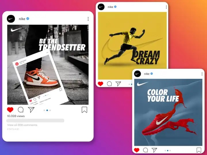
For example, Nike frequently runs social media campaigns featuring short videos or eye-catching graphics that promote new product launches or motivational messages. Their bold imagery and relatable content encourage shares and engagement among users.
Video Ads
Video advertising includes commercials designed for platforms like YouTube and social media channels that support video content. These ads can be informative or entertaining, often telling a story that resonates with viewers.
For example, Apple’s product launch videos effectively showcase new devices by highlighting features through engaging storytelling. Their advertisements often evoke emotions by focusing on how their products enhance everyday life, making them memorable for viewers.
Book a Call
Display Ads
Display advertising consists of visual paid ads placed on websites or search engines to attract clicks from users browsing online. These ads can include banners, sidebars, or pop-ups with eye-catching graphics.

For example, Booking.com utilizes colorful display ads featuring enticing images of travel destinations alongside clear CTAs like “Book Now.” These ads are strategically placed on travel-related websites to capture the attention of potential travelers.
Event Ads
Graphic design advertising is not just about digital designs. It is also about physical designs for launch events, seminars, exhibitions, and other events.
Event advertising involves promotional materials created for specific events such as trade shows, festivals, or product launches. This can include stalls, hand-out pamphlets, banners, and other materials designed to attract attendees.

For example, Samsung often sets up visually striking booths at technology expos featuring large screens displaying their latest products. They distribute brochures highlighting product features while engaging visitors with interactive demonstrations at their stalls.
Top Modern Graphic Design Trends in Ads
Let’s dive into some exciting trends we’ve spotted after analyzing countless graphic design advertisements. We have chosen ads that really make designs pop and leave a lasting impression.
Read Also: 7 Essential Steps in the Graphic Design Process to Elevate Your Brand
1. Immersive Experiences with Augmented Reality (AR) and Virtual Reality (VR)
Ready to push creative boundaries? AR and VR are revolutionizing how we connect with audiences. These tools let brands create mind-blowing interactive experiences where customers can play with products virtually before making a purchase.
Check out how IKEA’s killing it with their AR app – customers can now visualize furniture in their space before committing. Pretty neat, right?
2. Personalized and Data-Driven Design
Here’s where your analytical side meets creativity! By tapping into user data, we can craft super-targeted graphic design ads that speak directly to individual preferences.

Netflix nails this by customizing show thumbnails based on viewing patterns – smart move!
3. Sustainability and Eco-Friendly Design
Going green isn’t just trendy – it’s essential! Sustainable design practices are making waves, helping brands connect with environmentally conscious audiences.
Take Coca-Cola’s “World Without Waste” campaign beautifully merges product promotion with environmental responsibility, emphasizing recycling and sustainability through thoughtful visuals.
4. Motion Graphics and Animated Content
Motion graphics and animations are absolute attention-grabbers compared to static designs. Plus, they’re perfect for breaking down complex ideas into digestible bits.
Slack’s animated explainers are a masterclass in using motion to showcase features without overwhelming viewers.
Read Also: The Ultimate Guide to Motion Graphics: What is It, Design, and Real-Life Examples
5. Minimalist and Clean Design Aesthetics
Sometimes, less really is more. Clean, minimalist designs help key messages shine through without visual noise. Just look at Apple’s ads – they let products speak for themselves against pristine backgrounds.

Apple’s advertising often features minimalist designs that highlight products against clean backgrounds, allowing the product to take center stage without distractions.
6. Authentic and Story-Driven Visuals
Authentic storytelling through visuals creates powerful emotional connections. It’s about crafting narratives that feel genuine and relatable. Brands can use authentic imagery that reflects real-life scenarios to engage consumers personally.

Dove’s Real Beauty Campaign exemplifies story-driven authenticity perfectly, featuring real women and celebrating diverse beauty standards that resonate deeply with audiences.
7. Dynamic Color Gradients and Duotones
Playing with vibrant gradients and duotones isn’t just trendy – it’s a game-changer for making your ads pop in today’s crowded digital spaces. These color techniques add an amazing depth and contemporary flair that elevates your work.

Speaking of awesome gradient usage, have you seen how Spotify rocks it? Their promotional materials are absolutely killer, using dynamic gradients that make playlists visually stunning and capture the energy and vibe of the music they’re showcasing.
8. Voice Activated and Audio Driven Interfaces
Here’s something exciting – graphic design advertising is moving beyond just visuals. With voice-activated tech becoming huge, we can now create ads that engage users through sound. It’s perfect for our increasingly hands-free world.
Check out how Amazon Alexa’s ads cleverly demonstrate voice commands – they make it look super intuitive and fun to interact with their devices through audio cues.
9. Interactive Storytelling
Interactive storytelling lets us directly involve consumers in the narrative through their choices and actions. It’s like creating a choose-your-own-adventure for brand engagement.
Goldfish Crackers demonstrated interactive storytelling in their ad perfectly. They created this brilliant AR experience on Snapchat where teens could test their attention spans with a slow-moving Goldfish cracker.
10. Cross-Platform and Integrated Campaigns
Here’s the key to modern design advertising success – consistency across all platforms while adapting to each one’s unique vibe. It’s like orchestrating a symphony where every instrument plays its part perfectly.

Take Nike’s iconic “Just Do It” campaign – from TV spots to social media, print ads to in-store displays, they nail that consistent message while tweaking it just right for each platform’s audience.
These graphic design trends aren’t just about looking cool – they’re your toolkit for creating campaigns that connect emotionally and functionally with audiences.
By thoughtfully incorporating these elements in your graphic design ads, you’re not just following trends – you’re setting them!