



Key Findings
- SaaS visuals work hardest when the product cannot explain itself instantly.
- More design assets do not automatically create stronger visual communication.
- The right graphic depends on what the buyer needs to understand next.
- Visual detail becomes more useful as prospects move closer to product evaluation.
- A graphic earns its place when removing it makes the message harder to understand.
SaaS graphic design turns software capabilities into visuals prospects can understand, remember, and act on. It connects product value with brand identity across websites, ads, sales materials, onboarding, and other customer touchpoints. Effective design does more than make software attractive. It reduces the effort required to understand why the product matters.
That distinction is important because software is difficult to evaluate from copy alone. Prospects cannot hold a SaaS product or inspect it before signing up. Screenshots, diagrams, interface previews, and visual explanations make an otherwise abstract product more tangible.
Why SaaS Visibility Starts With Strong Graphic Design
Strong graphic design makes a SaaS company easier to notice, identify, and understand before prospects evaluate individual features. Buyers encounter brands across search, social media, ads, review platforms, websites, and sales content. Visual consistency connects those fragmented interactions into one recognizable identity.
Features alone rarely create that recognition. Competing platforms often describe similar capabilities using comparable language: automation, analytics, integrations, collaboration, security, or AI. Visual identity gives those claims a distinctive and repeatable context.
Color, typography, illustration, layout, and imagery work together as recognition cues. Their role is not simply aesthetic. They help prospects distinguish one company from another before they remember every product claim.
A SaaS visual identity is doing its job when prospects can:
- Recognize the brand before seeing its logo.
- Connect different assets to the same company.
- Distinguish its visuals from competing SaaS products.
- Recall the brand after encountering it elsewhere.
- Identify important information without relearning the visual hierarchy.
The broader importance of graphic design for SaaS companies becomes clear through repeated brand recognition. A prospect might first encounter an ad, later read a report, and finally visit a pricing page. Repeating the same visual logic helps connect those interactions to the same brand.
That does not mean every asset should look identical. Strong branding for SaaS establishes recognizable principles while allowing individual formats to solve different communication problems.
The Must-Have Graphic Design Elements for SaaS Companies
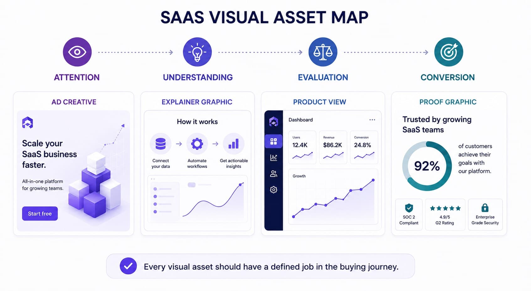
The most useful SaaS graphic design assets correspond to specific buyer questions. Instead of creating graphics because a channel requires content, teams should identify what prospects need to understand at each stage. Each asset then receives a defined communication job.
This approach also helps teams choose the right types of graphic design for different SaaS touchpoints. A product diagram and a paid-social creative should not communicate information in the same way.
| Design element | Primary job | Best use |
| Product screenshots | Make the software tangible | Website, sales pages, comparison content |
| Feature diagrams | Explain relationships or workflows | Feature pages, sales decks, onboarding |
| Data visualizations | Turn results into evidence | Reports, case studies, thought leadership |
| Branded illustrations | Explain abstract concepts | Blog content, social media, campaigns |
| Ad creatives | Create attention and message recognition | Paid social, display, retargeting |
| Customer proof graphics | Make outcomes easier to scan | Landing pages, sales content, social |
| Product walkthrough visuals | Demonstrate sequence and interaction | Onboarding, demos, help content |
When internal capacity is limited, SaaS graphic design services can help teams produce these assets consistently. Regardless of who creates them, every asset should still have a defined communication purpose.
Product screenshots deserve particular attention. Buyers need enough product detail to evaluate the experience, yet 20% of SaaS sites fail to showcase their UI effectively. The goal is not to display more interface, but to reveal the parts that help prospects understand the product.
A screenshot, however, is not automatically useful. A full dashboard containing dozens of controls can create more cognitive work than a concise paragraph. Cropping, highlighting, sequencing, and annotation should direct attention toward the feature being discussed.
A product visual earns its place when it helps prospects:
- See where an important action happens.
- Understand what changes after that action.
- Connect a feature to a recognizable use case.
- Compare information without reading a long explanation.
- Verify a claim made elsewhere on the page.
SaaS data visualization performs a different job. It can transform performance data, workflows, comparisons, or relationships into structures that prospects can scan quickly. The best visualization is determined by the question, not by visual novelty.
The same principle applies to custom graphics for SaaS businesses. Their value comes from communicating something product-specific that generic imagery cannot show. Decorative assets without a defined communication role increase visual volume without increasing understanding.
SaaS Graphic Design Practices That Drive More Conversions
Conversion-focused SaaS graphic design reduces uncertainty between encountering a product and taking the next step. Graphics should make value easier to understand, provide evidence, and direct attention toward the information needed for a decision. Decoration alone cannot perform those jobs.
Design decisions can influence more than visual appeal. An analysis of 25,027 landing pages examined how design characteristics relate to conversion rates. This makes hierarchy, structure, and presentation relevant variables when optimizing a page for action.
Show the Product’s Value Visually
Start with the outcome rather than the interface. A screenshot of an analytics dashboard shows software, but it does not necessarily explain why the dashboard matters. The graphic needs enough context to connect the interface with a user result.
A stronger sequence is:
- Identify the problem the feature solves.
- Isolate the relevant product interaction.
- Show what changes after that interaction.
- Connect the change to a meaningful user outcome.
For example, a workflow product might show scattered tasks becoming one organized process. An analytics platform might connect raw inputs to a decision-ready dashboard. Effective graphic design for SaaS makes that transformation clearer. This reflects a central principle of graphic design for software companies: prospects buy outcomes, not interface components.
Simplify Complex Features With Graphics
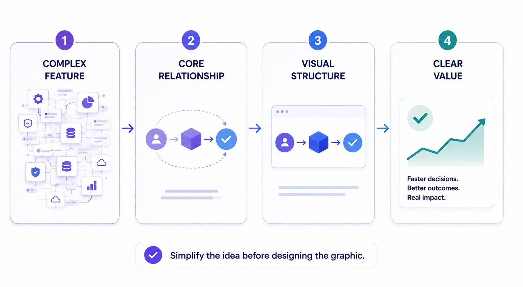
Complexity should be reduced before it is visualized. Adding icons, arrows, colors, and labels to an already complicated explanation rarely makes it clearer.
Start by identifying the relationship that matters. A feature might be a sequence, comparison, hierarchy, loop, system, or cause-and-effect relationship. That structure determines the visual format.
For example:
- Sequence → step-by-step flow
- Comparison → side-by-side matrix
- Hierarchy → layered framework
- Recurring process → loop
- Connected functions → system map
- Input and outcome → cause-and-effect diagram
This approach makes SaaS visual communication functional. The graphic does not reproduce the paragraph. It gives the reader a faster way to understand its underlying structure.
Maintain a Consistent Visual Identity
Consistency in graphic design for SaaS helps prospects recognize the same company across channels without requiring identical layouts. Core elements such as typography, color behavior, iconography, illustration style, and information hierarchy should remain connected.
This is where a defined graphic design process becomes useful. Teams need repeatable rules for translating brand principles into individual assets rather than redesigning the visual language for every campaign.
A practical SaaS design system should define rules for:
- Prioritizing product messages within each asset.
- Showing screenshots and interface elements consistently.
- Combining product visuals with marketing content.
- Handling recurring data, proof, and feature graphics.
- Deciding what can change between formats and what cannot.
Context determines how those rules are applied. A LinkedIn graphic, product page, report, and sales deck differ in available space, reading behavior, and information depth.
That distinction separates consistency from repetition. Visual consistency across SaaS marketing channels means preserving recognizable principles while adapting composition to each environment.
Design for Each Stage of the Customer Journey
The same graphic should not serve every buyer stage. Someone discovering a problem needs different information from someone comparing products or preparing to start a trial.
| Journey stage | Buyer question | Visual priority | Useful asset |
| Awareness | Why should I care? | Problem and outcome | Concept graphic |
| Consideration | How does this work? | Mechanism and differentiation | Feature diagram |
| Evaluation | Can it solve my case? | Product evidence | Screenshot or workflow |
| Decision | Can I trust the result? | Proof and reduced risk | Customer result graphic |
| Adoption | What should I do next? | Guidance and progression | Onboarding visual |
This distinction prevents teams from overloading awareness assets with interface details or using abstract illustrations when decision-stage buyers need evidence. Journey-based design instead connects each graphic to the question prospects are most likely asking.
Turn Product Benefits Into Engaging Graphics
Benefits are easier to visualize when they describe change. Statements such as “advanced automation” or “powerful analytics” remain abstract because they describe capabilities rather than outcomes.
Translate each benefit into a before-and-after relationship:
- Manual → Automated
- Fragmented → Connected
- Raw Data → Clear Insight
- Slow Process → Faster Workflow
The resulting graphic communicates a clear transformation. It helps prospects understand what becomes different after adopting the product.
Teams exploring different graphic design styles should choose styles after defining that communication objective. Style should reinforce the idea rather than become the idea.
Include Real Product Examples in Your Graphics
Real product examples reduce the distance between marketing claims and the software itself. Use screenshots, interface fragments, workflows, or realistic product states when prospects need evidence of how a feature works.
Product visibility becomes especially important during evaluation. In this survey, SaaS buyers ranked interactive demonstrations as the most useful website resource for startup and SMB providers. Concrete product evidence can therefore answer questions that marketing claims alone cannot resolve.
The strongest product examples usually capture moments that matter to evaluation:
- A completed workflow rather than an empty dashboard.
- A meaningful result generated by the product.
- A feature solving a recognizable user problem.
- A realistic before-and-after product state.
- An interaction that demonstrates how quickly value appears.
Product evidence should still be curated. Remove irrelevant navigation, highlight the relevant state, and add only annotations that improve understanding. Showing everything can make the product appear harder to use.
Adapt Graphics to Every Marketing Channel
Channel adaptation is essential to effective graphic design for SaaS. Each environment changes available space, viewing time, surrounding content, and user intent.
A website feature graphic can support detailed exploration. A paid-social creative might have seconds to communicate one message. A sales deck can reveal information progressively as someone presents it.
| Channel | What the Visual Should Prioritize | What to Reduce |
| Website | Product understanding and detail | Unrelated decorative elements |
| Paid social | One message and immediate recognition | Secondary benefits and explanations |
| Organic social | Fast insight and shareable value | Dense product information |
| Sales deck | Progressive explanation and proof | Standalone context already provided verbally |
| One supporting message and clear action | Complex diagrams and excessive detail |
Effective graphics for SaaS products therefore preserve the core message while changing hierarchy. SaaS teams should monitor relevant graphic design trends without allowing trends to override clarity. A fashionable treatment that weakens product understanding has little strategic value.
Book a Call
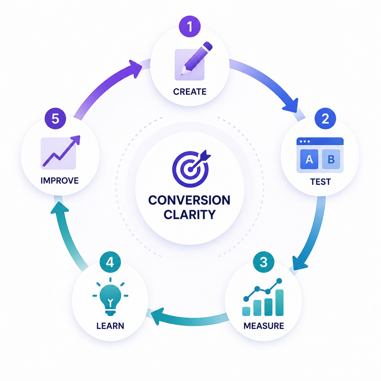
Test Designs to Improve Conversions
Design testing should begin with a hypothesis about user behavior. “Try another color” is not a useful hypothesis. “Make the product outcome more prominent so more visitors start the trial” is.
Prioritize tests that change information hierarchy or product understanding:
- Product visual versus abstract illustration
- Outcome-focused graphic versus feature-focused graphic
- Annotated screenshot versus unedited screenshot
- One visual message versus multiple competing messages
- Customer result graphic versus generic proof treatment
Measure the action closest to the visual, such as CTA clicks, demo starts, trial registrations, scroll progression, or onboarding completion. Avoid judging every experiment only by final revenue. Measurement should match the visual’s actual role in the funnel.
Understanding good vs bad graphic design becomes more useful when quality is connected to behavior. A visually polished asset can still fail if users misunderstand its message.
SaaS Graphic Design Checklist: What to Review Before Launch
A SaaS graphic design review should test communication before aesthetics. Effective graphic design for SaaS requires a clear message, recognizable brand connection, appropriate hierarchy, and technically sound execution. The final question is simple: does the visual help the intended audience understand or act?
Use this checklist before approving an asset:
- Purpose: Can the team state the visual’s job in one sentence?
- Value: Is the product benefit visible without additional explanation?
- Hierarchy: Does the most important information attract attention first?
- Readability: Is essential text legible at the actual publishing size?
- Brand: Does the asset clearly belong to the same visual system?
- Product accuracy: Does the graphic represent current functionality correctly?
- Channel fit: Does the composition suit its placement and viewing behavior?
- Responsiveness: Does the asset remain useful across required screen sizes?
- Accessibility: Does meaning remain clear without relying only on color?
- Conversion: Is the next action or intended response easy to understand?
The review should also identify unnecessary information. Every label, screenshot fragment, illustration, and decorative element competes for attention. Removing weak elements can strengthen the message more effectively than adding emphasis.
Teams producing large volumes of visual assets for SaaS companies also need operational consistency. Templates can accelerate repeatable formats, while custom work should handle new concepts, major campaigns, or complex product explanations.
| Review area | Pass when | Rework when |
| Message | One core idea is immediately clear | Multiple messages compete |
| Product | Value is connected to real functionality | Visual could represent any SaaS |
| Brand | System remains recognizable | Asset feels disconnected |
| Format | Hierarchy survives the target channel | Important details disappear |
| Action | Intended next step is obvious | Visual creates attention without direction |
This framework also clarifies how graphic design supports SaaS growth. Design contributes when it improves understanding, recognition, evaluation, or action at a defined point in the journey.
Conclusion
SaaS graphic design works best when every visual has a communication job. Strong assets make product value tangible, simplify complexity, reinforce recognition, and provide evidence when prospects need it.
The strongest systems connect design decisions to journey stage, channel, and measurable behavior. SaaS-specific graphic design is therefore less about adding more visuals and more about choosing the right visual for each decision.