Most people won’t give a fintech app another shot. One clunky tap, a login screen that looks off, and users uninstall before they’ve even explored what’s inside. Poor fintech app design can wipe out months of product work in a single session.
There’s a clear pressure for fintech companies since the industry has doubled in size since 2017, and by 2025, there will be over 29,955 fintech startups worldwide. That surge in the fintech sector means sloppy design stands out, and not in a good way. For fintech businesses, it isn’t about stacking features anymore. Survival depends on making the app experience feel effortless the second someone signs in.
This article breaks down eight best practices for fintech application design that go deeper than looks. Sign-in flows, dashboards, engaging savings tools, and navigation that doesn’t get in the way. Each one shows how design builds trust and keeps people around. Color consistency and real-time feedback tighten the user journey across multiple devices.
The Power of Design in Creating Trustworthy Fintech Apps
Fintech app users often start with a small transfer, not to see if the tech works, but to see if the user experience feels safe. A mismatched color, a cluttered screen, or a delay in balance updates makes users question if the app is reliable. Once doubt creeps in, it sticks.
Strong fintech application design makes trust visible. Security isn’t hidden away in the backend. It shows up in the user interface, in how error messages are phrased. Apps also signal trust when the iOS, Android, and web versions line up. If the first deposit runs smoothly, they’ll try again. If it glitches, they’re gone.
User-centered design prevents that from happening. Testing flows with real users reveals those issues before launch. Some design signals make people lean in. Others push them away:
- First-time experience
- Cross-platform continuity
- Transparency
- Consistency
- Clarity in copy
Accessibility ties into trust as well. Readable fonts, solid contrast, navigation that works across devices—people see those as signs the product is built right. Skip them, and the question becomes: what else did this team overlook?
Design sets the tone at every critical moment in a fintech app. First login. First transfer. Handle those well, and doubt fades.
Best Practices for Fintech App Design
Every step in a fintech app, from login to logout, can either confirm safety or plant doubt. Here’s where fintech app design matters most.

1. Follow Security Principles in App Design
Without clear signals, user trust cracks before people even try the features. Every fintech app design should make safety visible. A padlock beside account details. A microcopy that says, “Your transaction is encrypted.” A fingerprint prompt before a transfer. These elements show protection is active, not invisible.
Revolut shows this in action. At sign-up, it runs ID checks and explains why they matter. Biometric login locks the account to the device, limiting the impact of stolen credentials. Freeze and spending controls are available within the app. People see the safeguards as they go.

Security is also reinforced through compliance cues. PCI DSS badges, GDPR notices, or a “regulated by” line signal accountability. People notice when a product is tied to real standards, not just its own claims.
Push too far, though, and the design backfires. Ask for three codes, two passwords, and a selfie at every login, and people will quit before they finish onboarding. Smart design adds heavy checks only when the stakes are high and uses lighter checks when the risk is low.
In fintech app design, security has to be evident and consistent. When that happens, people stop worrying about safety and focus on what they came to do.
2. Use a Unified Brand Color Palette
Color shapes how people read and react to an interface. In fintech app design, it signals where someone is, what’s important, and whether the brand feels reliable enough to hold their money. A steady palette builds design consistency and recognition.
Blue has been the default for fintech clients. It works because people link it to reliability, which helps reassure them when the app asks for card numbers. But it doesn’t have to stop there. Progress notes that many modern fintechs are trying brighter palettes without losing trust.
Wise is a strong example. Bright green appears consistently across ads, transfer calculators, and app screens. The choice is strategic. Green suggests speed and financial flow, and because it shows up everywhere, users don’t wonder if they’ve been dropped into a spoofed page. The color itself becomes part of the brand identity.

Consistency doesn’t mean rigidity. Dark mode is standard now, so palettes need to shift without losing identity. Contrast matters as much as hue. Weak contrast or clashing shades can exclude color-blind users or make text unreadable in dim light. Unified palettes make app functionality easier, too. Use one color for actions, another for caution, and keep backgrounds neutral. That pattern lowers mistakes when the task involves money.
Color choices aren’t guesswork. Pick a palette that reflects your values, stick with it, and adapt it where needed. A unified scheme turns branding into recognition and recognition into trust. Strong palettes are part of thoughtful fintech app design, where visual identity works alongside function.
Book a Call
App navigation isn’t just a menu; it shapes the user journey, pointing to the next step without forcing people to stop and think. Navigation quickly reveals if a fintech application design works or not. If people can’t find the transfer tab or trade screen in seconds, they leave.
Robinhood is a good example. Its trading screen lines up “Buy,” “Sell,” and “Call” side by side. The grouping cuts hesitation during fast trades. Color cues highlight the active choice, so people don’t hit the wrong button.

Good navigation also knows when to step back. Early menus stay simple. Advanced tools appear later, only when they’re needed. Shortcuts should emerge from user behavior. If someone places the same trade every week, a “Repeat Order” option should sit near the dashboard. This is careful interaction design at work.
Ergonomics matter. Most users hold a phone with one hand. Tabs and controls need to sit in the thumb zone, not tucked into corners. Robinhood’s main tabs stay within reach, so actions feel natural even in motion.
Cross-platform flow builds trust. Moving from desktop to mobile should feel seamless. The fintech app design doesn’t need to match pixel for pixel, but the logic of menus and labels should line up. One product, not two stitched together.
Error recovery belongs in navigation, too. People mis-tap, and in finance, those slips cost money. Breadcrumbs, undo buttons, or a clear “Back” option let people fix mistakes without panic.
4. Show Financial Data with Engaging Visualization
The way charts, colors, and cues are arranged in a dashboard decides if the app interface feels insightful or cluttered. In fintech app design, data visualization does that work. It turns rows of transactions into data people can act on.
Stripe’s dashboard highlights payment volumes, success rates, and disputes in real time. Tiles update as numbers shift. Green flashes for gains, red for losses. Trend lines track changes across weeks, so users see direction, not just totals. That immediacy keeps engagement alive because it feels current, not stale.

The best visualization cuts straight to what matters. Key metrics stand out up front. Deeper layers expand only when needed. A shop owner can check performance at a glance, then dig into failed payments if something looks wrong. Interactivity helps—details appear when users tap or hover, avoiding long menu paths. Speed counts, too. A chart that lags loses trust. In fintech apps, where data streams nonstop, speed belongs to design as much as engineering.
Visuals also tell stories. An annotation marking when a new rule went live, or a note pinned to a sudden dip, helps people link numbers to events. Goal-based cues add another layer. A savings bar creeping upward or a milestone tick keeps people coming back because the chart tracks progress. Strong visualization supports conversion-centered design by pulling attention toward action—process payments, fix a dispute, or move forward.
5. Implement Real-Time Feedback and Notifications
Money moves fast, and people expect their apps to keep up. In fintech app design, real-time alerts show movement: a cleared transfer, a posted charge, and even a blocked login. Without them, engagement falls because users feel cut off from their own money.
Eurobank shows this in action. Notifications cover big and small account movements, delivered by eBanking, SMS, or email. Users set how often they’re notified, from daily summaries to every single transaction. That control matters. A $5 coffee doesn’t need the same ping as a $5,000 wire.

Mobile push notifications in fintech average 50–60% open rates, way higher than email. That kind of response keeps people checking the app. Pushes become the main touchpoint, not inboxes.
Still, alerts have to respect attention. A fraud attempt gets an instant push. A $2 charge can wait in a digest or appear only when the user opens the app. Many apps now let people set quiet hours so late-night pings don’t wake them.
Regulation raises the stakes. In the EU, PSD2 requires strong authentication and real-time alerts for certain transactions. Notifications are now part of compliance, holding app performance accountable.
Feedback belongs inside the app, too. A spinner flipping into a green check after a payment, or a timeline showing funds “in transit,” gives assurance. These micro-confirmations matter as much as backend speed. They prove security is working.
A good design provides choices, sends immediate alerts for critical events, and ties every update to accountability. Every alert is also part of marketing design; it allows the brand to connect with users and build trust when it matters most.
Read Also: Leading Fintech Design Agencies for Building Visually Strong Websites and Apps
6. Prioritize Accessibility in Your Fintech App for All Users
In mobile app design for fintech, the difference in accessibility is simple—either people can use it, or they can’t. Text that adjusts in size, voiceover tools, and colorblind palettes are the baseline for trust.
NAB shows what that looks like. Its mobile banking supports screen readers on iOS/Android. It offers large-text modes. Navigation works consistently across devices. VoiceOver and TalkBack users move through the same paths others do. That kind of continuity proves reliability as much as uptime.

Accessibility involves weighing usability against aesthetics. Contrast ratios and font sizing shouldn’t only look good in marketing materials; they need to work in high-glare conditions, on low-end phones, or in dim light. A green-on-grey palette that looks sharp on a billboard can fail inside the app. These choices directly affect usability and trust.
In the US and UK, platforms are expected to meet WCAG standards. In Australia, the Digital Service Standard sets the bar for mobile banking. Skip them and it’s not just bad UX; it’s a legal and financial risk.
Accessibility is part of advertising design. A fintech that runs glossy campaigns but leaves users with disabilities locked out kills its own promise. The brand only holds if the app backs it up. Inclusive design should be part of the product’s foundation, spanning devices and contexts. Apps that are built with accessibility as a strategy, not an afterthought, end up with more reach and lasting trust.
7. Add Special Features to Make the App More Interactive
Personalization, budgeting dashboards, and AI chat hold users’ attention because the app feels alive. Interactivity builds habits. Habits stop people from deleting after a week.
Deel, for instance, doesn’t just list services. It uses bold visuals, playful animations, and interactive tools like the Visa Eligibility Checker or Misclassification Quiz. Even its glossary works like part of the product, answering in the same voice as the app. That gives the fintech product a personality instead of leaving it flat.

Micro-interactions carry weight. A form that gives immediate feedback as you type or a calculator that updates in real time reduces drop-offs. Interactive CTAs work the same way. “Book a demo,” “Take a quiz”—they nudge people forward instead of leaving them stuck. And AI chat only works when it stops being canned. When it pulls transaction histories, flags irregularities, and explains payroll in plain words, that’s when it becomes part of the daily flow.
Done right, interactive features keep people coming back by rewarding action, teaching patterns, and adapting as behavior changes. That’s how a fintech app shifts from a one-off tool to something people are excited to use every day.
8. Boost Engagement with Gamification
A streak to hold, a point system, or even a bar creeping forward, gives people a reason to come back. Gamification changes the dull “log in, look, leave” loop into something people want to engage with regularly.
Fortune City shows how this works. Every expense logged builds a city. Buy coffee, and a building pops up. Pay rent, a tower rises. Instead of a chart, your budget becomes a town you don’t want falling apart.

Gamification works best when it respects attention and grows with the user. Early rewards grab attention, but if mechanics don’t evolve, people burn out. The strongest mechanics come out of app prototyping and user research. Streaks work because no one wants to see a counter reset to zero. Group savings challenges stick because splitting goals makes them easier to hit. Leaderboards turn finance into a team game.
But gimmicks kill momentum. Points with no value or badges that never unlock anything get ignored. Continuity matters, too. A streak that vanishes when switching from mobile to desktop feels frustrating. Reliable app UI/UX design services keep rewards and histories synced across devices so the flow stays intact.
Key Components of Successful App Design for Fintech
Fintech app design carries more weight than looks. If usability slips or trust signals fail, the whole product feels shaky. And people won’t wait around for a fix.
Here’s where best practices either hold up or fall short. Many of these details overlap with web application design, where structure and flow are just as important as appearance.
| Component | What it looks like | Why it matters |
| 🔒 Security Principles | Safety has to be seen: padlocks, biometrics, compliance badges. | Visible safety builds user trust and reassures people that their money is protected. |
| 🎨 Unified Brand Palette | Keep the same palette across screens and modes so the brand feels like one product. | Design consistency signals stability and reduces worries about phishing. |
| 🧭 Clear Navigation | Menus, thumb-zone controls, and cross-platform flow cut hesitation. | Smooth app navigation supports quick actions during high-stakes tasks. |
| 📊 Data Visualization | Real-time dashboards, charts, and annotated trends. | Turns numbers into direction, not static counts. |
| 🔔 Real-Time Feedback | Push alerts, in-app confirmations, and layered notification settings. | Real-time cues boost engagement and prove app performance. |
| ♿ Accessibility | Scalable fonts, strong contrast, and screen reader support on iOS and Android. | Inclusive usability widens reach across multiple devices. |
| 🌀 Interactive Features | Personalization, calculators, and adaptive AI chat. | Smart app customization makes a fintech product feel alive. |
| 🏆 Gamification | Streaks, points, and savings challenges. | Playful loops transform finance into daily engagement. |
Real-World Examples of Effective Fintech App Designs
These fintech companies prove that strong app design for fintech is what keeps people logging in. They take different approaches—clarity, trust, play—but the point is the same: design decides if people stay or leave the app.
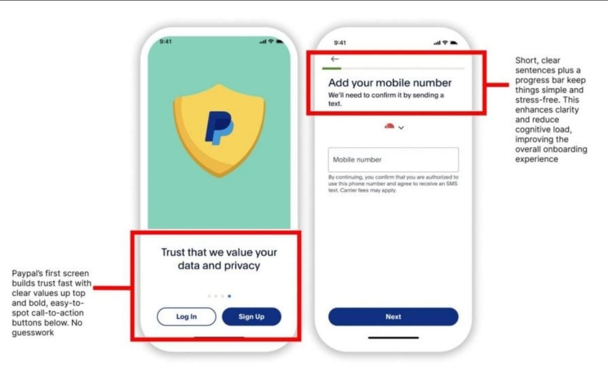
PayPal
PayPal keeps onboarding light. Progressive disclosure means one or two steps at a time, not a wall of fields. Minimal inputs, clear prompts, quick access—that’s why its sign-up still feels current after two decades. For businesses, simple guides and visual walkthroughs make integrations less of a headache.
Justworks
Justworks is a payroll platform, and it has to show it won’t fail on payday. The homepage puts reviews and testimonials up front. Contrast and icons guide the eye. Copy stays plain, not loaded with jargon. Even B2B mobile applications need that kind of human-first design.

Cred
Cred turns payments into a game. Its “spin the wheel” feature hands out daily rewards: vouchers, bitcoin, and small prizes. That hook keeps people coming back. It works because the rewards are clear, the odds are visible, and users don’t feel tricked.

Start Now
Our Case Study: Designing an App for Ionise That Users Love
This one’s ours. At Duck.Design, we worked with Ionise, a DeFi protocol on the Zilliqa chain. They needed a brand and fintech app design tough enough to stand out in a crowded market but simple enough for everyday users.
Our method was the same as with other fintech clients: build trust and usability first, then give it character.
- Branding: We built a geometric logo and a holographic palette. The gradients gave Ionise an identity that moved, breaking away from the safe blues that fill the sector.
- Dashboard design: Tiles for Net APY, balances, and daily earnings were set up for quick scans.
- Navigation: We shaped the Market section so lending and borrowing felt straightforward. No hidden menus, no second-guessing.
- Cross-device access: Responsive layouts carried the same cues across iOS, Android, and desktop. That mobile application consistency made it a single cohesive product.

The numbers told the story:
- 45% jump in engagement: Users spent more time in the app.
- 25% boost in adoption: Daily actives and transactions grew.
- 30% drop in bounce rate: People stayed past the first tap.
Those results came from the same principles we’ve outlined: clear flows, strong branding, visible trust, and systems built to scale.
Build Trust in Fintech Applications Through Design with Duck.Design Team
Duck.Design ships real products for fintech businesses that need trust at the interface level. We work on a subscription basis; no cap on requests, no cap on revisions, and same-day replies. Our app design pricing shows the tiers upfront, so teams know the cost before we start. That structure fits the fintech industry, where roadmaps shift weekly and bottlenecks kill launches.
Our services cover all layers of fintech design. UX/UI design for fintech is a main focus, but we also build branding systems, motion graphics, and product design kits that stay consistent across web, iOS, and Android. Each deliverable is built around usability and app functionality, including onboarding flows that reduce drop-offs and dashboards that turn raw numbers into clear signals.
The proof comes from results and outside reviews. Clutch ranks us 4.8/5 across 40+ clients. They call out our speed, clean UI systems, and pricing that stays predictable without cutting scope. Duck.Design works the way fintech does: fast iterations, high trust, and products that scale smoothly.